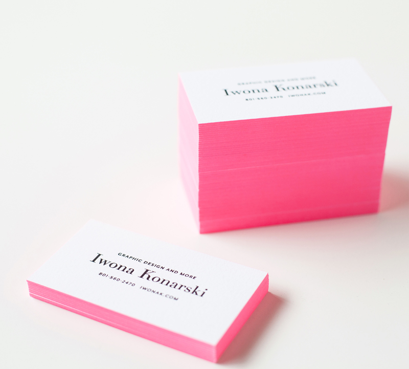
Wooohoo! My new letterpress business cards are finally here! And I absolutely love them! However, I have to
admit, designing them hasn’t been easy. As most designers can attest branding yourself is difficult. I love minimal
and clean design so I knew from the start that my logo and branding would have to reflect that. Keeping the design simple proofed to be difficult. I wanted to keep my branding in black & white but feared it’ll be dull and ordinary.
After a month trying to figure out what I want my brand to look like, and what I want my clients to feel about me and my work, I’ve got up the nerve to narrow down the design and sent my business cards off to be printed.
I knew my business cards would be letterpress and I wanted them to stand out and leave an impression. So I went with black letterpress text and added a bit of a wow factor by painting the edges in bright pink. I love how they turned out! They’re elegant yet cheerful and definitely eye-catching! I’m thrilled to have them in-hands, and I love seeing people stroke them….
Photography: Rachel Nickel
