This past weekend we took a day trip to the Hood Canal to spent the last sunny weekend outdoors. Hood Canal
is only 20 miles west of Seattle, however getting there from the Seattle area takes a couple of hours as you have to take a ferry. Of course, our day got thrown off as we missed it (we just assumed it wouldn’t be busy on
a off-season weekend) and missed the low tide. Instead of enjoying fresh oysters on the beach our children and
us spent the morning gathering shells and looking for crabs. We visited one of Luke’s clients who lives in the area and had fun running around and enjoying the fruit in his garden. Don was very generous to send some with us and we came home with bags full of the sweetest plums, pears, raspberries and strawberries. It’s probably no secret now that I really enjoy home canning. I rolled up the sleeves and got to work on making the most delightful plum jam or powidła (in polish.) This jam, so deliciously European, is my my favorite – naturally sweet and so aromathic! I knew, before I even made the jam, that I wanted to dressed them up with custom labels.

I calligraphed these labels with black ink on a heavy cotton paper and glued to the jar with a double stick tape.
I couldn’t help but add cute little branches with plums illustrations and some swirly doodles. I love how easy they’re done with a good calligraphy pen and nib. I’m so pleased with the results, in both aesthetics and taste! Yeah, I could eat this plum jam by the spoonful…
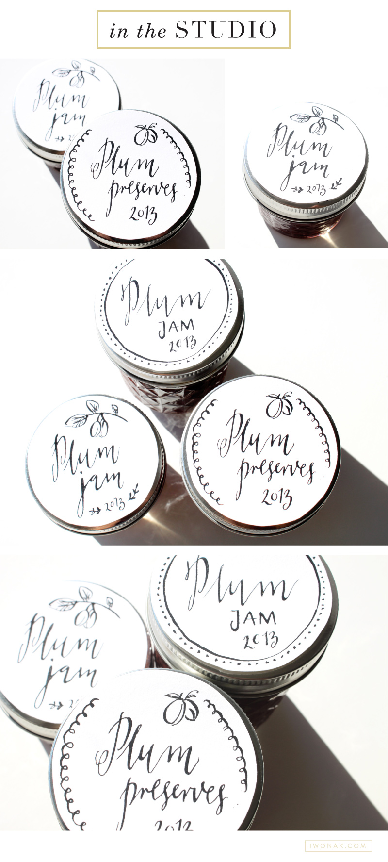
 

Plum-Jam-Labels-And-Calligraphy-by-Iwona-Konarski

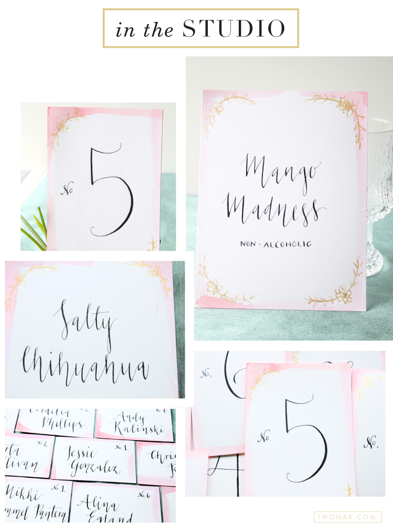
This week was pretty crafty. I took on a challenging project, designing and calligraphy of the day of the wedding stationery. I had been wanting to try artsy, hand painting project in a while and I was finally able to do so with watercolors. I was also able to put my calligraphy skills to use on place cards, table numbers and signs. They turned out great considering I have ways to go before I master the art of the pointed pen. I’ve been practicing it for a while and the whole process takes a whole lot of time and patience. Here is a little peek at all the watercolor and calligraphy I’ve done so far.

InTheStudio_CalligraphyAndWatercolors_IwonaK

These watercolor place cards were done on an uncoated heavy Mohawk stock (just had some laying around the office) with just basic watercolors in beautiful shades of pink. I used black and gold calligraphy inks to add a little sparkle….

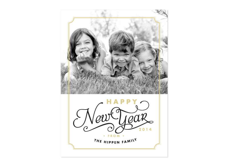
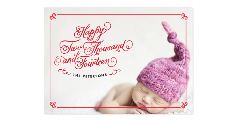
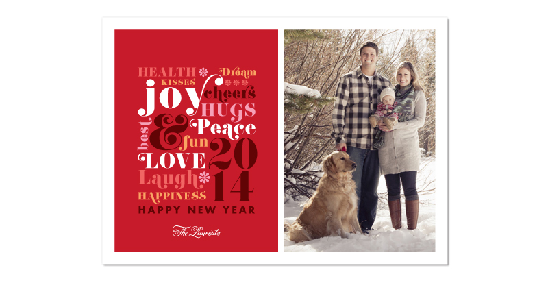
I have decided to enter another Minted.com challenge. I have designed four designs for The Happy New Year’s Cards Challenge. Pretty weird to be designing for winter holidays in the Summer but somehow I’ve put myself in the mood. Christmas music on and voila! There is 584 submission for this challenge, so keeping my fingers crossed. Please help me out and cast your vote! If you rate 50+ designs in the challenge, you will get 10% off your next Minted order. I appreciate all the help & support!

Elegant And Sparkly Minted By Iwona K
Elegant And Sparkly New Year’s Cards

Simple Frame Minted By Iwona K
Simple Frame New Year’s Cards

Spelled Out Minted By Iwona K
Spelled Out New Year’s Cards

Words Minted By Iwona K
Words New Year’s Cards

Iwona K com Business Cards

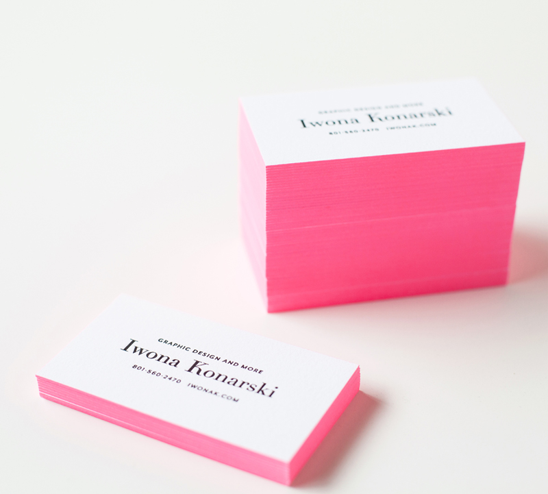
Wooohoo! My new letterpress business cards are finally here! And I absolutely love them! However, I have to
admit, designing them hasn’t been easy. As most designers can attest branding yourself is difficult. I love minimal
and clean design so I knew from the start that my logo and branding would have to reflect that. Keeping the design simple proofed to be difficult. I wanted to keep my branding in black & white but feared it’ll be dull and ordinary.

After a month trying to figure out what I want my brand to look like, and what I want my clients to feel about me and my work, I’ve got up the nerve to narrow down the design and sent my business cards off to be printed.
I knew my business cards would be letterpress and I wanted them to stand out and leave an impression. So I went with black letterpress text and added a bit of a wow factor by painting the edges in bright pink. I love how they turned out! They’re elegant yet cheerful and definitely eye-catching! I’m thrilled to have them in-hands, and I love seeing people stroke them….

Photography: Rachel Nickel

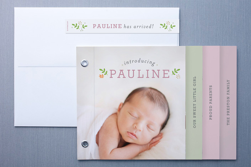
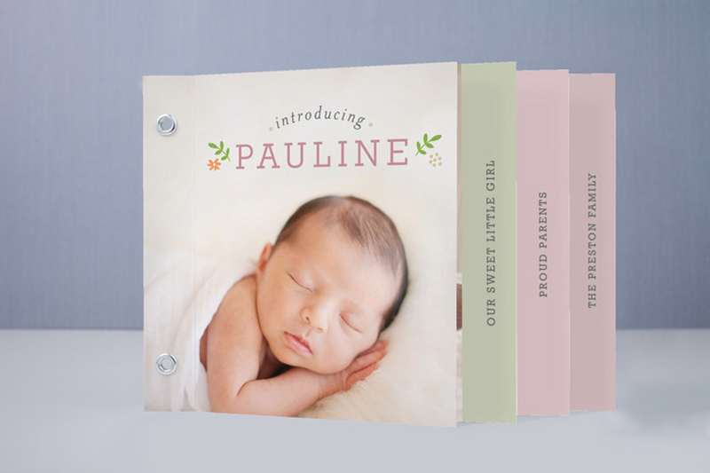
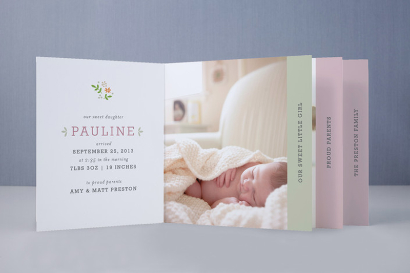
I recently joined the Minted community and entered my first design challenge: Minibook Birth Announcements Challenge. I submitted two designs in this competition, and am happy to announce that one of them was a winner. Sweet Pauline is available for purchase through www.minted.com!

P.S. A Minibook is a unique piece of stationery featuring chic grommets and seven pages that can be personalized with photos and text.

Sweet Pauline Mini Book By Iwona K assembled

Sweet Pauline Mini Book By IwonaK front

Sweet Pauline Mini Book By Iwona K open


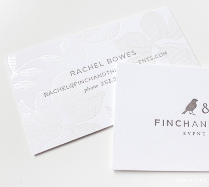
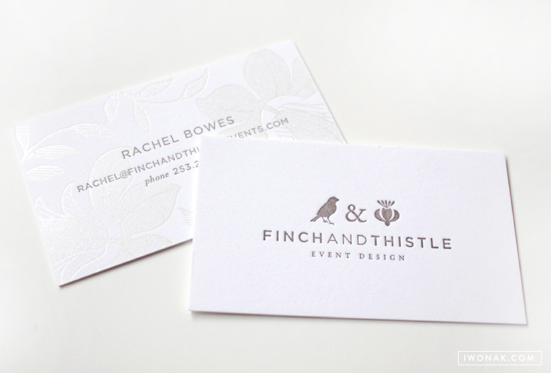
Hooray! I finally get to share Rachel’s new business cards! Rachel has been my best friend and client and just recently she came to me wanting to totally rebrand her event design and floral business, Finch And Thistle. I talked about her Her new business cards are modern yet sophisticated and classic. I couldn’t be happier with the way they turned out!

Pearl #foil stamp and warm gray #letterpress printed business card  |  design by Iwona Konarski @iwonak.com  |  #branding #stationery #businesscard #letterpressed Pearl #foil stamp and warm gray #letterpress printed business card  |  design by Iwona Konarski @iwonak.com  |  #branding #stationery #businesscard #letterpressed


Hooray! I finally get to share this project with you. I don’t often take on identity projects as my life is just too busy at the moment, but I had to make an exception. Those fabulous business cards were designed and printed for the talented Rachel Bowes. Rachel has been my best friend and client and just recently she came to me wanting to totally rebrand her event design and floral business, Finch And Thistle Events. I introduced you to her new branding here. Her new business cards are modern and sophisticated yet timeless. I couldn’t be happier with the way they turned out!

And I must say this, getting them printed was quite the challenge. This was a demanding letterpress printing job (in terms of registration) and I had a hard time finding the print shop that would take this job. The vintage illustration knocks out, requiring very tight registration. In the end, I was able to find a very skilled letterpress shop that kept a critical eye on the registration while on press and I’m thrilled with how tight the cards came out. The floral foil design and letterpressed type align perfectly!

The business cards were foil stamped in pearl and letterpress printed in grey ink on Reich Savoy 100% Pure Cotton Brilliant White 236# Cover. This sumptuous, elegant paper is made from 100% pure cotton, is tree free, archival, acid free, recyclable, biodegradable and elemental chlorine free.

Finch & Thistle Event Design branding and identity by Iwona Konarski |  #finchandthistle #branding #rebrand #stationery #iwonak #beautifulbrand


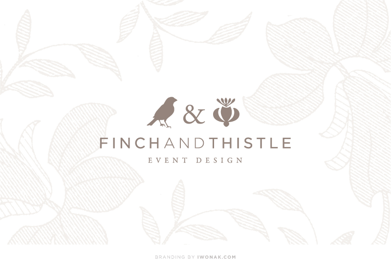
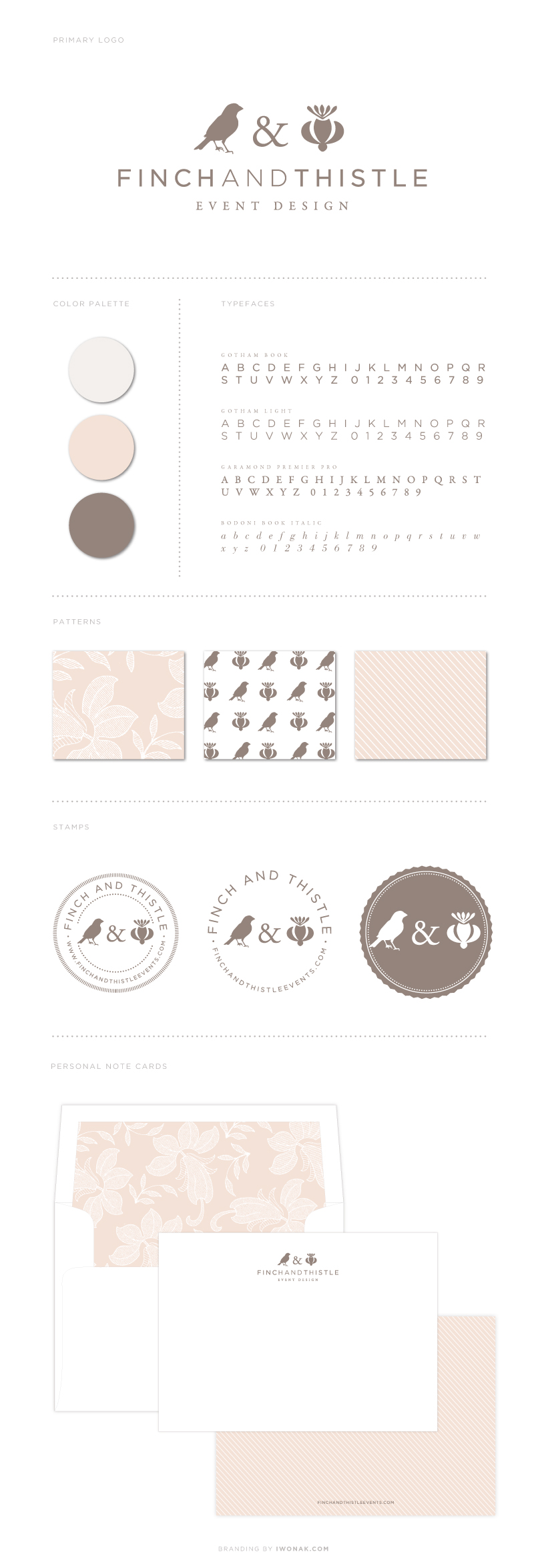
Over the past few months (ok, a year!) I’ve been working on a rebranding project for one of my favorite people – the uber talented Rachel Bowes of Finch & Thistle Event Design. Finch & Thistle Event Design provides event design, floral and event planning services for weddings and events throughout Washington State and across the country. With a strong portfolio of exquisitely designed and impeccably executed events, Rachel was seeking a brand re-haul and wanted a sophisticated, charming new identity that would grab the attention of brides-to-be and help her stand out in the crowd of wedding planners in the city. I had a wonderful time working with Rachel as we went in several different directions trying to create a brand that would represent her best. I’m very happy how it ended up. I took her already established logo (that I designed few years back), modified it a notch and then added new design details, both vintage and modern. The result is new identity and branding that is just as unique as she is – sophisticated and refined and true to Rachel’s own aesthetic.

Working with Rachel is a blast! Cheers to her new look!! Please come back to see her new business cards. I’ll be posting pictures as soon as we get them back from the print shop. Think letterpress, foil, luxurious paper stock… In the meantime, take some time exploring her site and blog, there is so much beauty to see…

Finch & Thistle Event rebrand. By Iwona Konarski

Happy 2013

I am more than ready to say goodbye to 2012 and hello to 2013! It has been a very, very busy year and I’m looking forward to 2013. I plan to relax, work less (is it even possible?!) and just have fun. Wishing you a very Happy New Year. May 2013 be filled with love, joy and happiness.

Cheers to 2013!

HolidayCardsWithMultiplePhotos_IwonaK

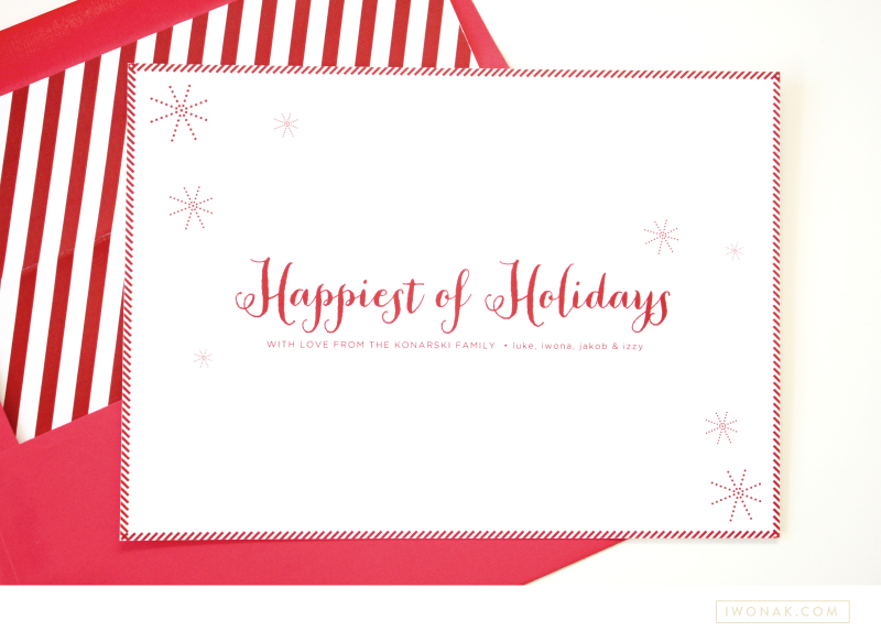
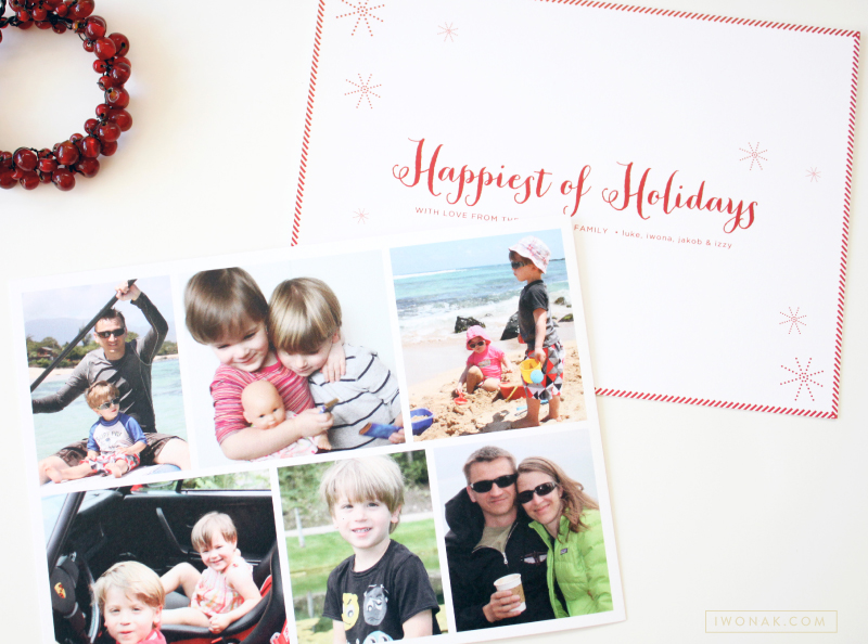
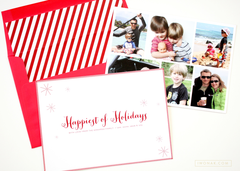
Our holiday cards arrived this week, and I couldn’t be more excited! Each year I design our cards and this year was no exception. I originally wanted a simple one-photo holiday card as I feel that reflects the personality and lifestyle of a family but I couldn’t decide which image is best. I guess we had way too much fun last year! Multi picture layout was the necessary solution.

I designed a clean front with holiday message typed in a calligraphy font and added multiple photos on the back of the card. I like that I was able to choose a few favorite photos… Last year, our extended family and friends were excited to see what we have been up to over the previous year and we wanted to tell a lot of stories with our card this year too. Our cards were printed on a heavy white cotton stock and matched with a red envelopes lined with a stripey liner. Happy Holidays!

HappiestHolidaysCard_IwonaK HolidayCardsWithPhotos_IwonaK