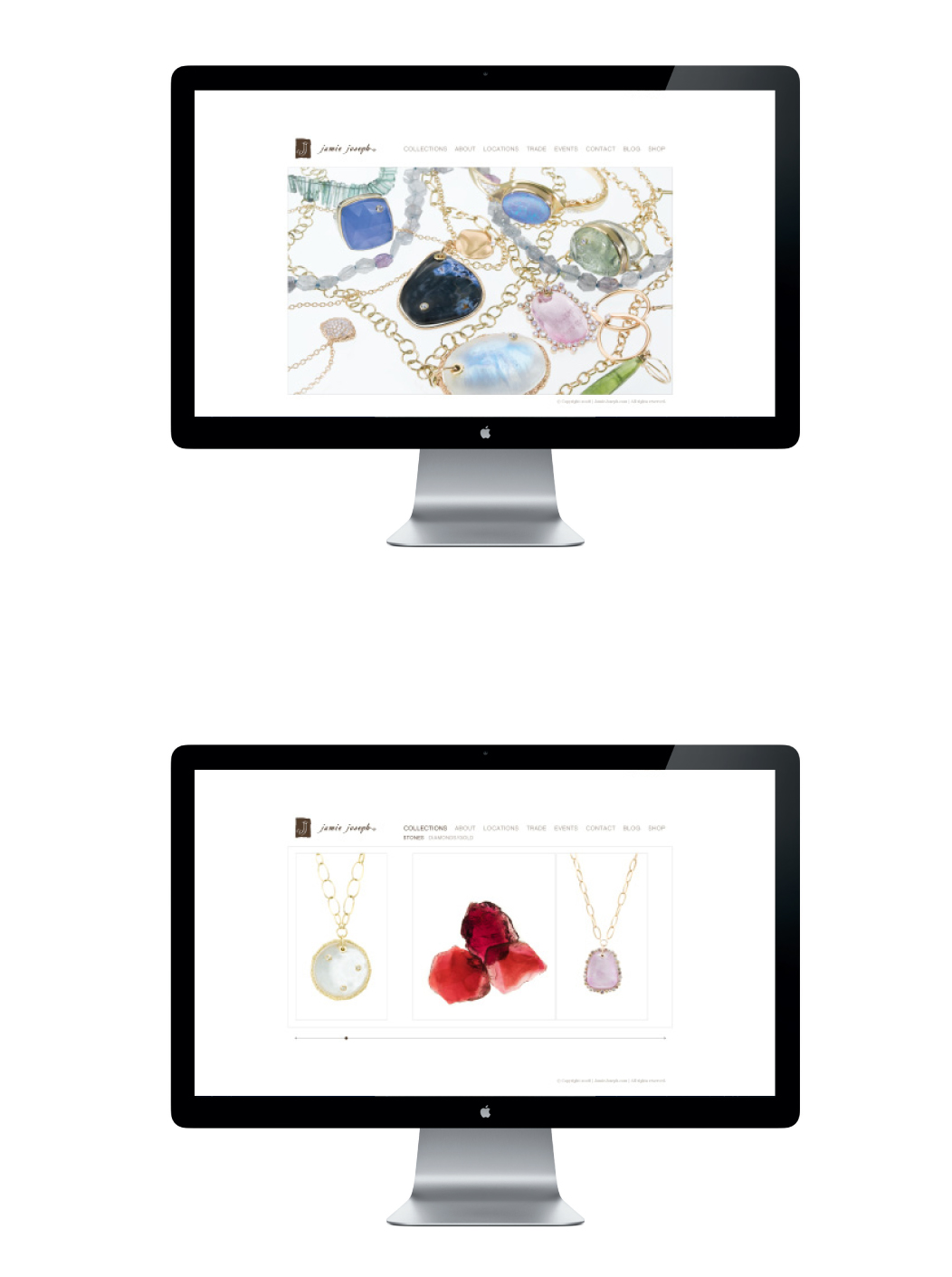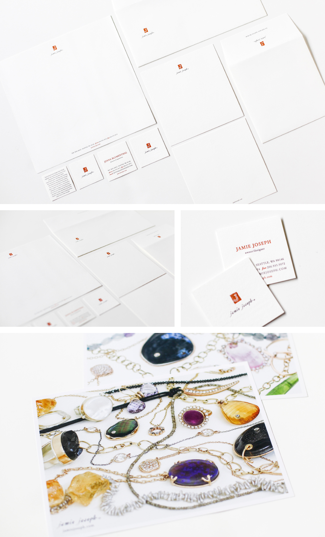
JAMIE JOSEPH
• BRANDING • IDENTITIES • PRINT •
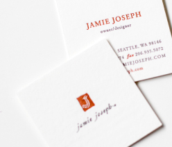
Jamie Joseph’s eponymous jewelry collections are renowned for artisan’s aesthetic, meticulous craftsmanship,
signature stone cutting techniques, and an abundance of color.
Jamie needed her brand to reflect the handmade quality of her jewelry, while keeping the look timeless
and distinctive with a slightly vintage feel. Her unique illustrative interlocking logotype, using two “J’s”
from the designer’s initials, was refreshed and paired with classic and elegant typography.
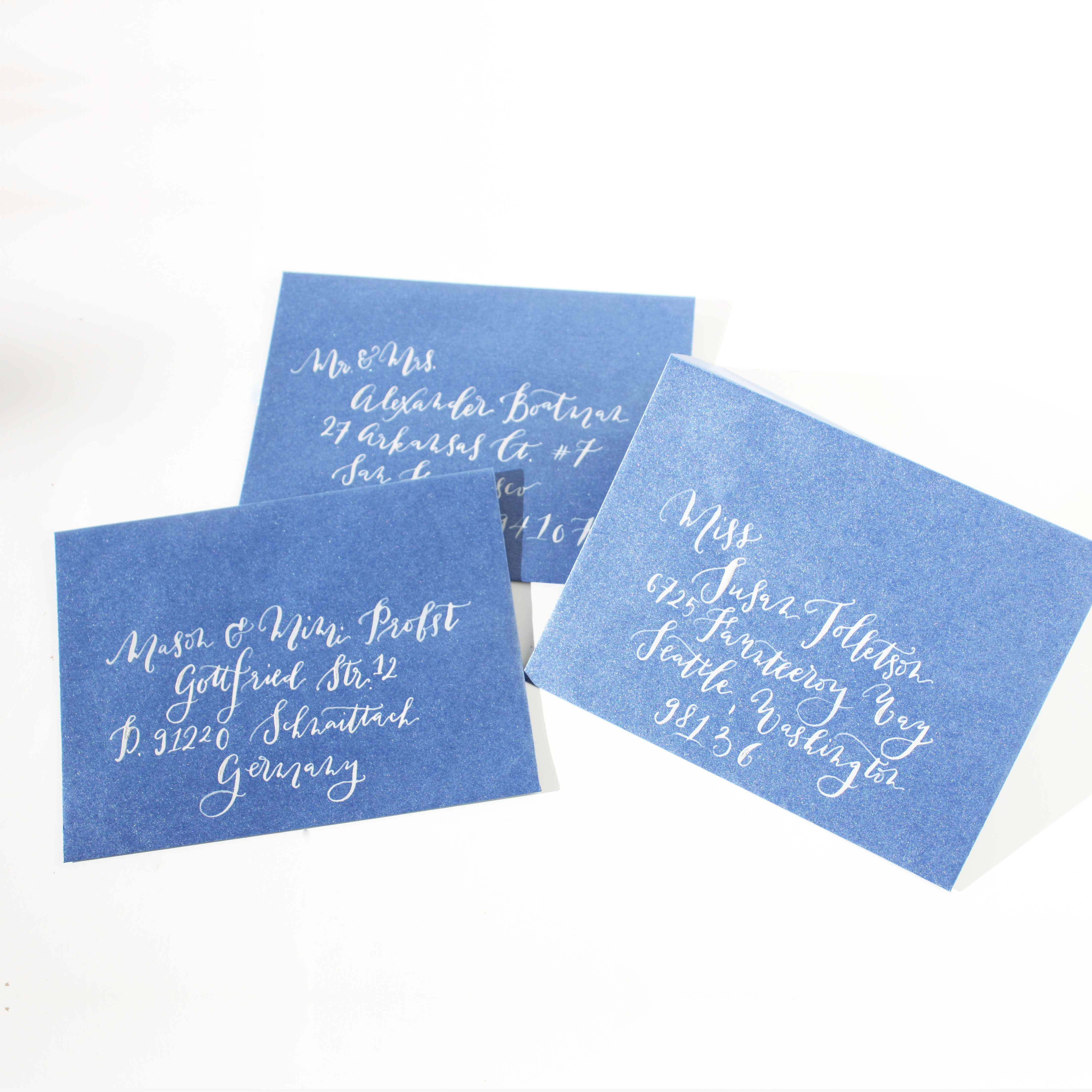
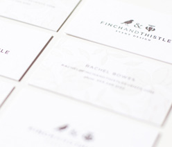
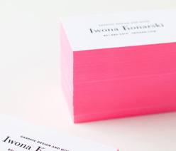
The new brand identity system was applied to the letterhead, business cards, authenticity certificate,
envelopes, thank you cards and website. Print processes added the finishing touch, with simple two color
letterpress and luxurious cotton paper.
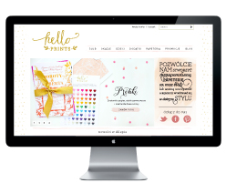
A clean and simple website was designed to showcase her collections and feature simply beautiful imagery.