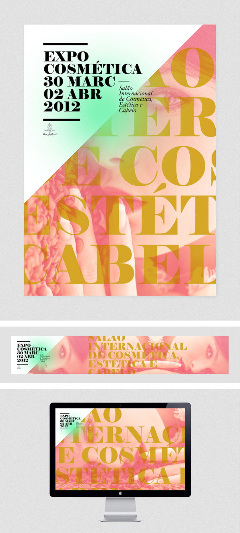
I’m loving this visual identity for the 2012 Expo Cosmética from João Ricardo Machado. Color and typography is so fresh and bold yet elegant. Exactly what inspires me lately. You can check out his work here.

I’m loving this visual identity for the 2012 Expo Cosmética from João Ricardo Machado. Color and typography is so fresh and bold yet elegant. Exactly what inspires me lately. You can check out his work here.

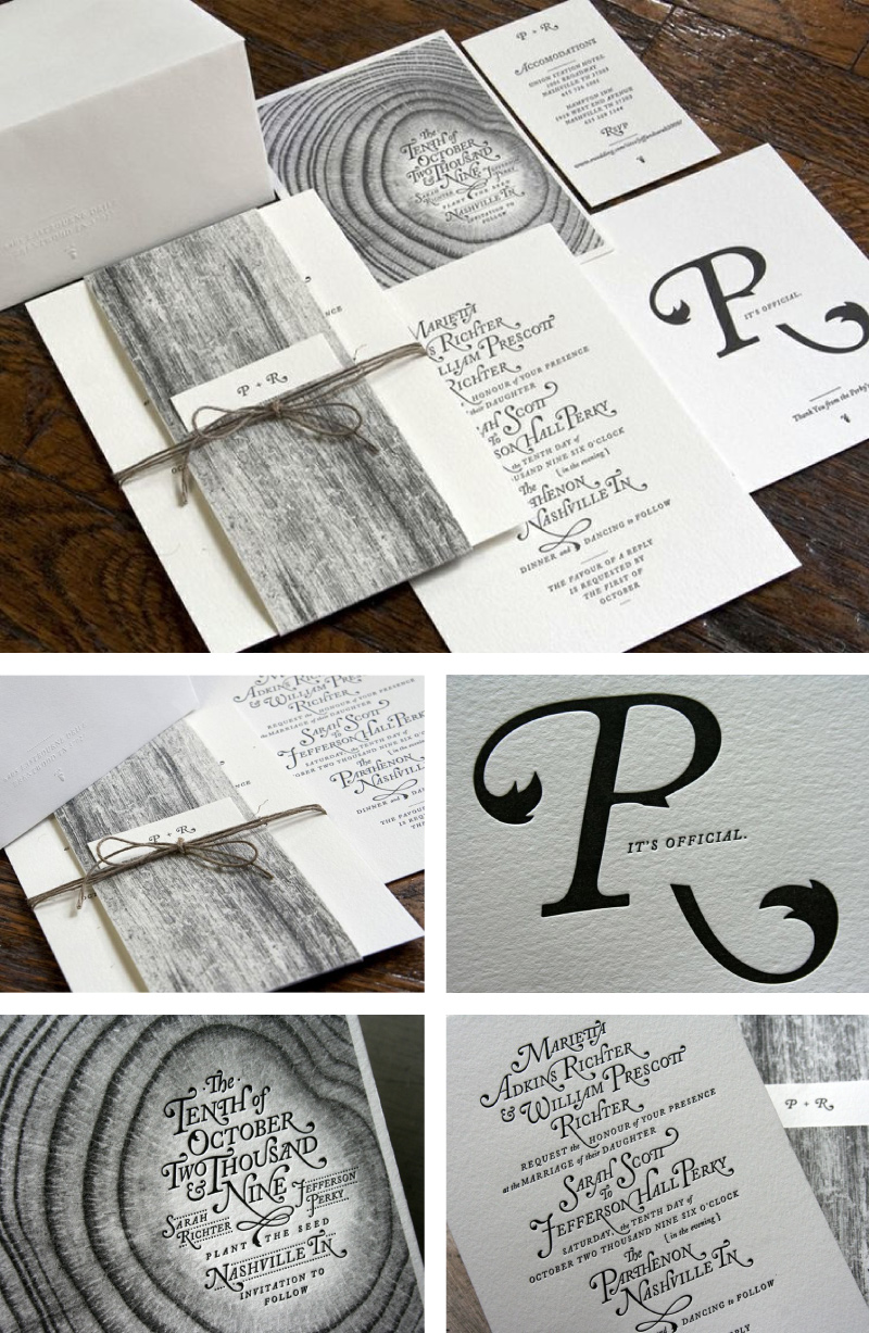
I’ve been admiring those beautiful invitations from Nashville-based creative studio, Perky Bros. The groom, Jefferson Perky of Perky Bros., designed these whimsical, yet elegant invitation set complete with custom lettering (aren’t the beautiful swashes of the Adobe Caslon Italic amazing) and natural wood elements and had them letterpressed by Studio On Fire. I love the cool monochromatic color palette and the whimsical, sophisticated yet organic feel of those invitations. Just gorgeous!
To find out more about the printing process and see behind the scene visit Studio on Fire blog. To check Perky Bros portfolio visit their website.