This week has been really busy but so fun. I’m working on new wedding invitations design and I’m so excited about this new direction. Layers, textures, watercolor – can’t get any better than this. Here are few little snippets from the process.
This week has been really busy but so fun. I’m working on new wedding invitations design and I’m so excited about this new direction. Layers, textures, watercolor – can’t get any better than this. Here are few little snippets from the process.
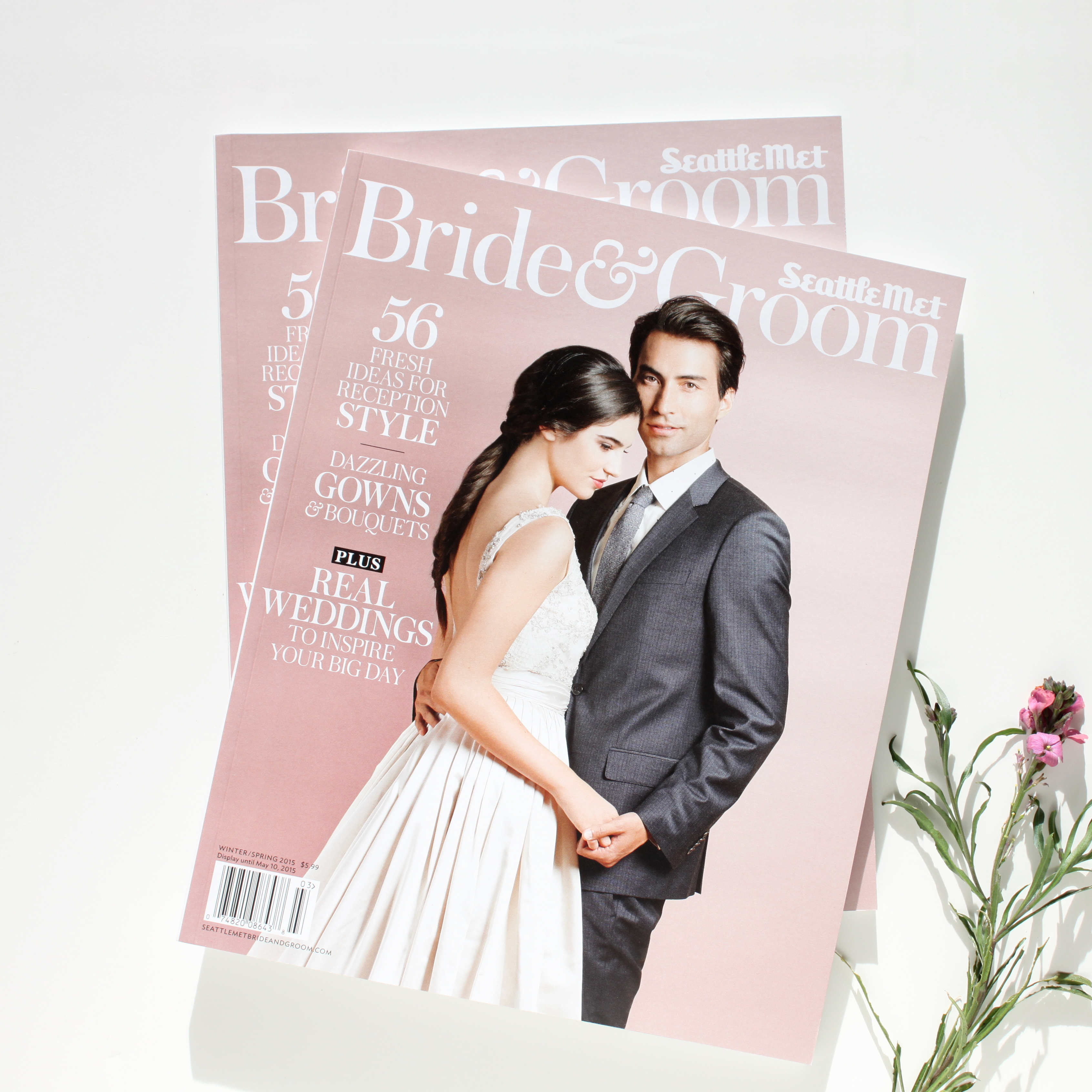
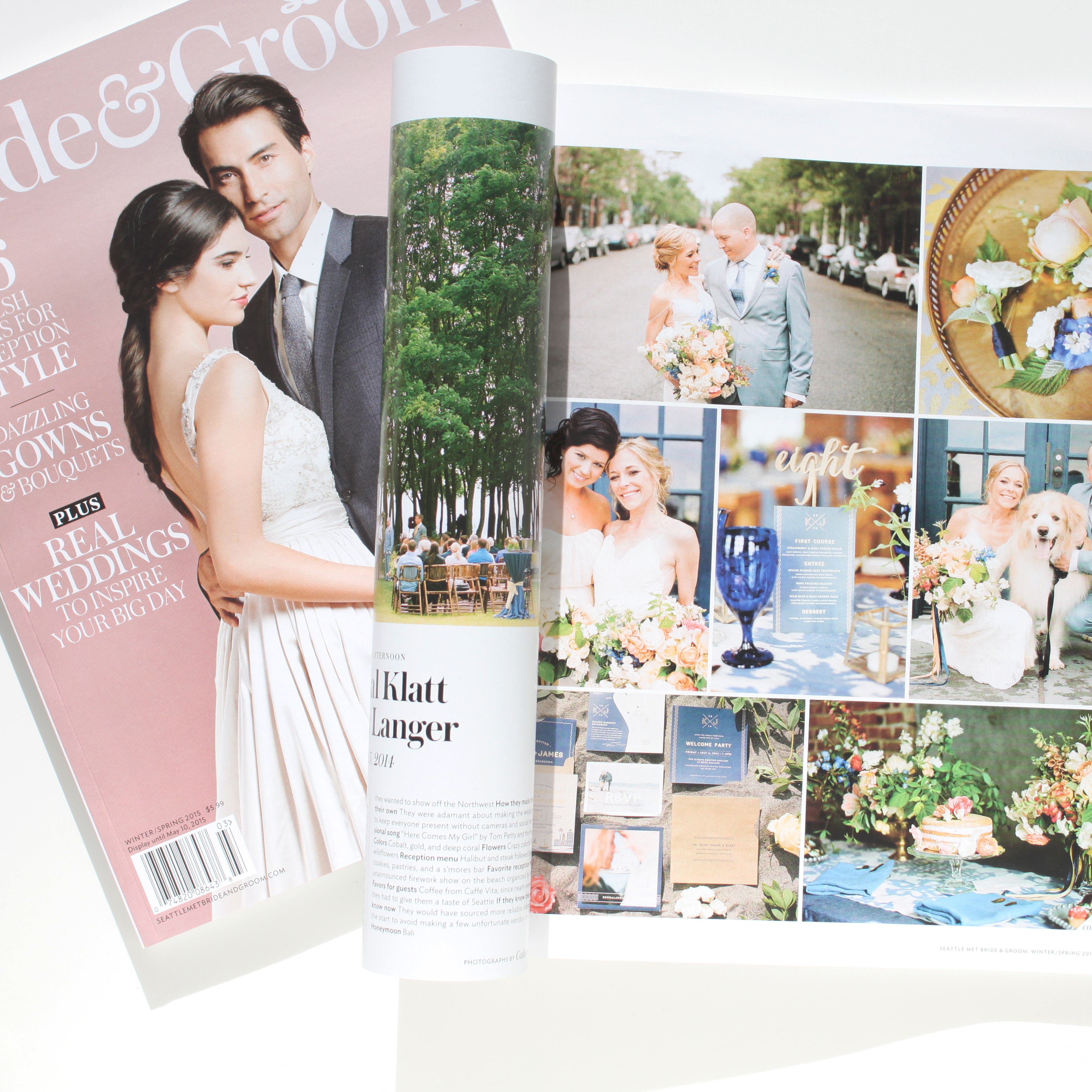
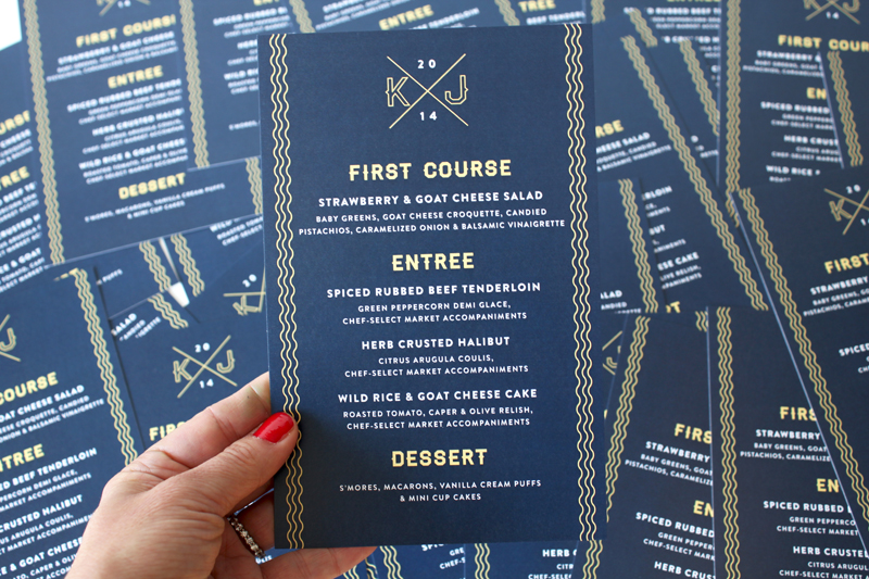
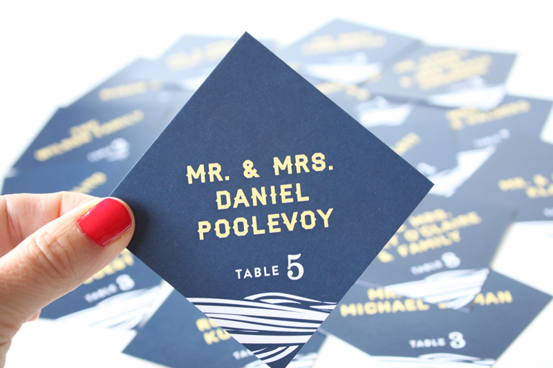
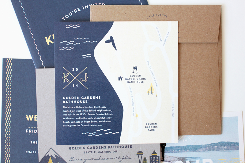
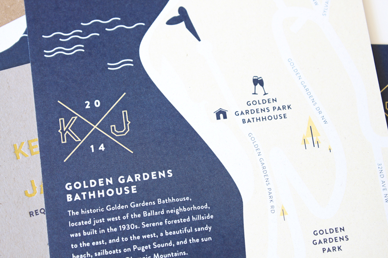
So fun to see a Seattle themed wedding invitations I designed last summer for Kendal & Jim in the Seattle Met Bride and Groom magazine. I finally got my hands on the newest edition and voila, now I can proudly share it. The main invitation is letterpressed in navy and yellow ink on eco friendly paper. I love how it turned out and can’t wait to share more. You can view more beautiful images from this wedding here.
Floral and event design: Finch & Thistle Event Design | Photography: Catherine Abegg
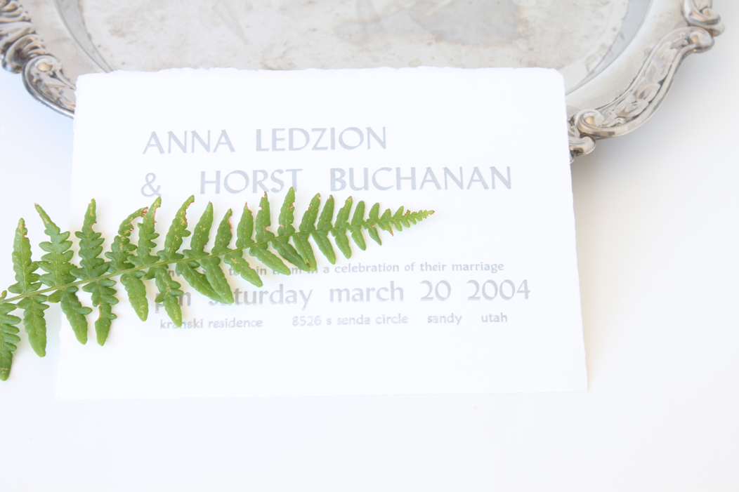
#tbt to my first wedding invitation. I’ve designed it and printed it for my friends who this year celebrated their 10th wedding anniversary. It was a fun but very time consuming project and I got to do it all manually, no computer involved. I worked with a vintage raised metal type that I set in the composing stick, setting letter by letter, line by line. It took me at least 3 attempts to find the type with complete alphabet that had all the letters I needed that weren’t damaged (“a’s” were always needed!) and yet I had to compromise on the ampersand that doesn’t match ;) I have to say I still like this invitation and it’s imperfections and how modern it looks given the traditional way of designing and printing it.
A quick sneak of the day-of-wedding stationery for the wedding this weekend. It’s been a crazy, fast turn around but I’m happy we made the deadline! My favorite designs from this wedding are the unique, square place cards. I absolutely can’t wait any longer to see more images from this wedding ;)
Here’s a peak at a recently wrapped up wedding collateral. This custom map not only captured the spirit and look of the wedding but also introduced the guests to the location of the wedding ceremony and reception. It’s always such a great idea to show a smaller area, a close-up view of the location. I’ll be sharing more images from this fun wedding invitation suite in the next few months.
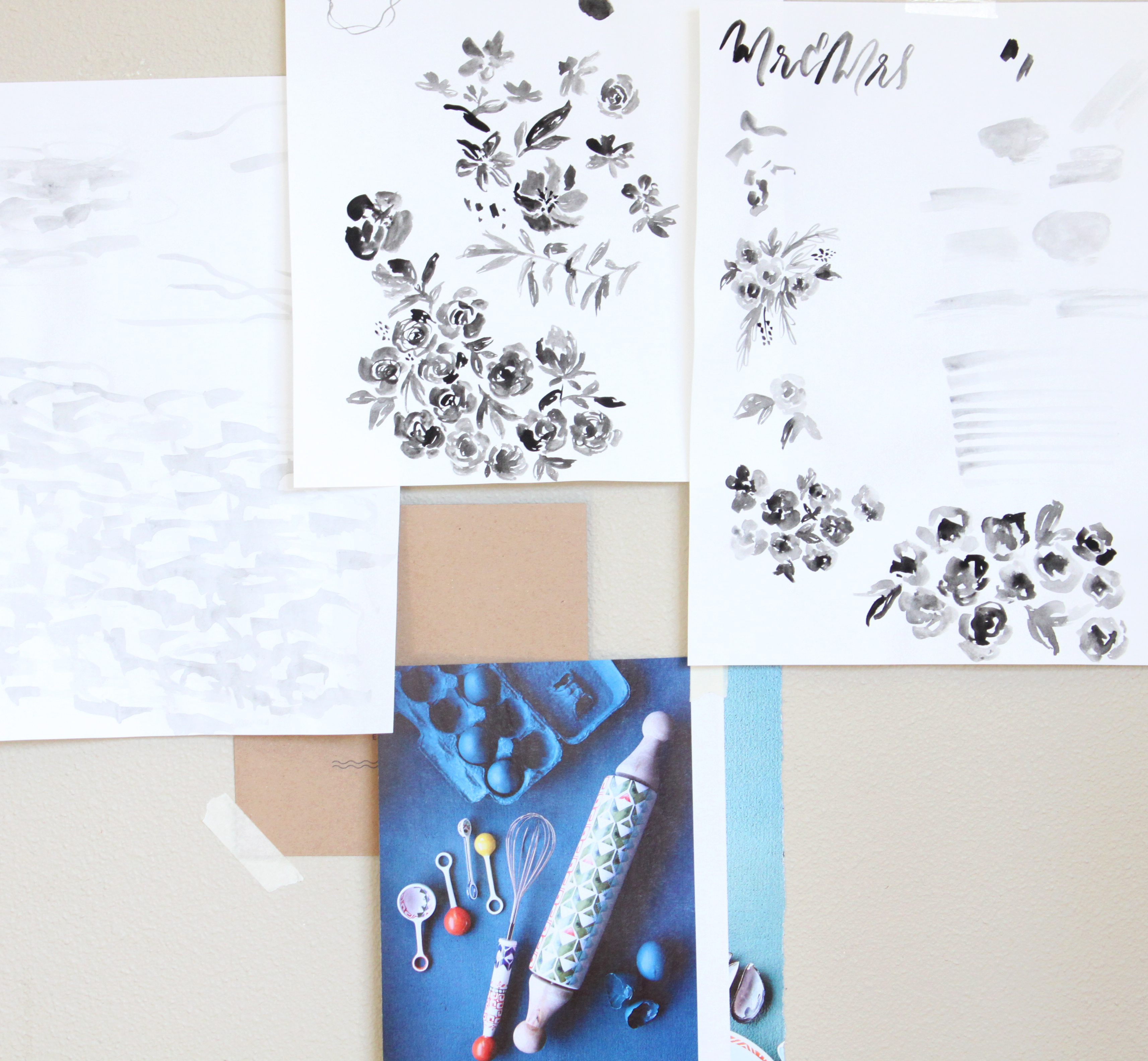
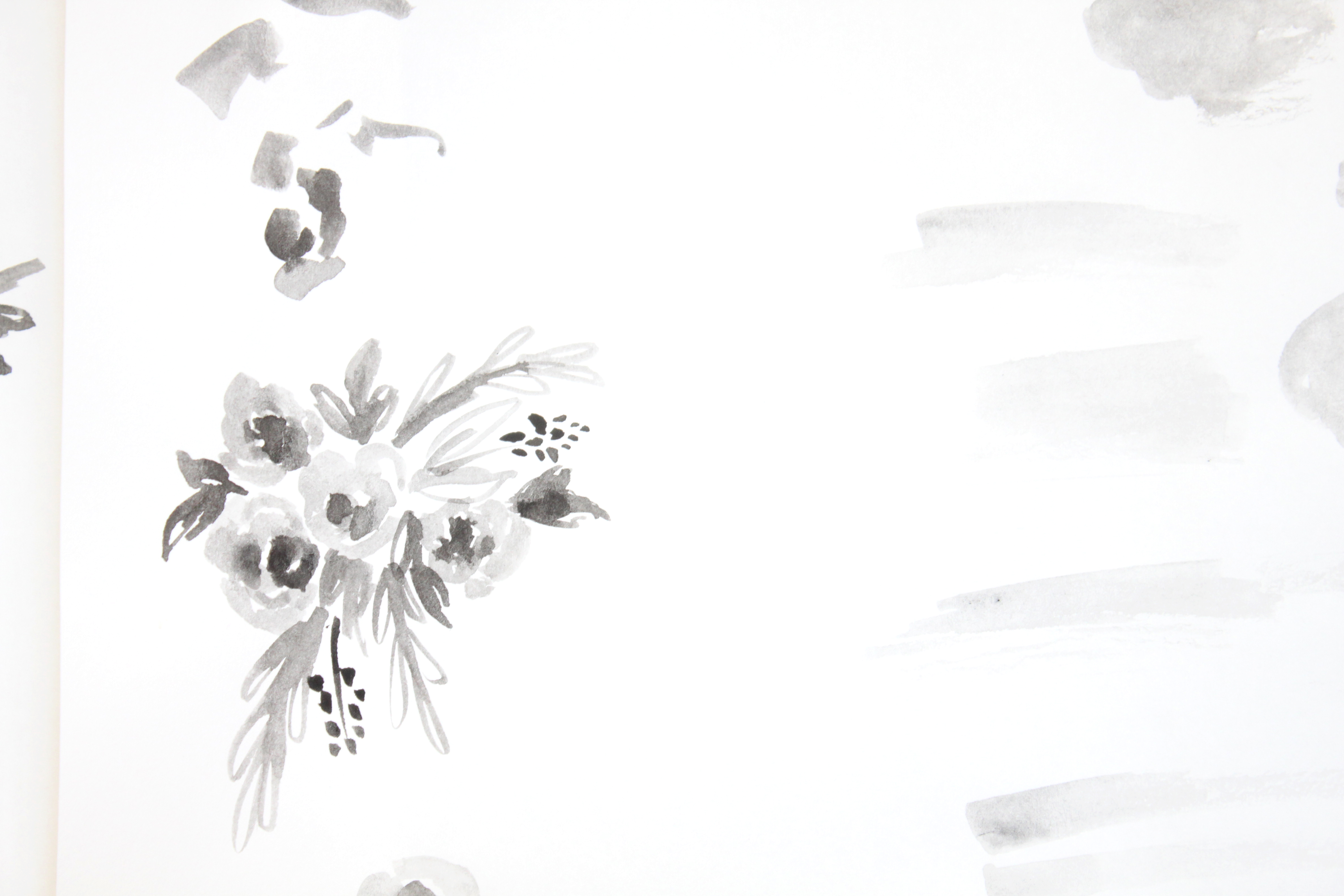
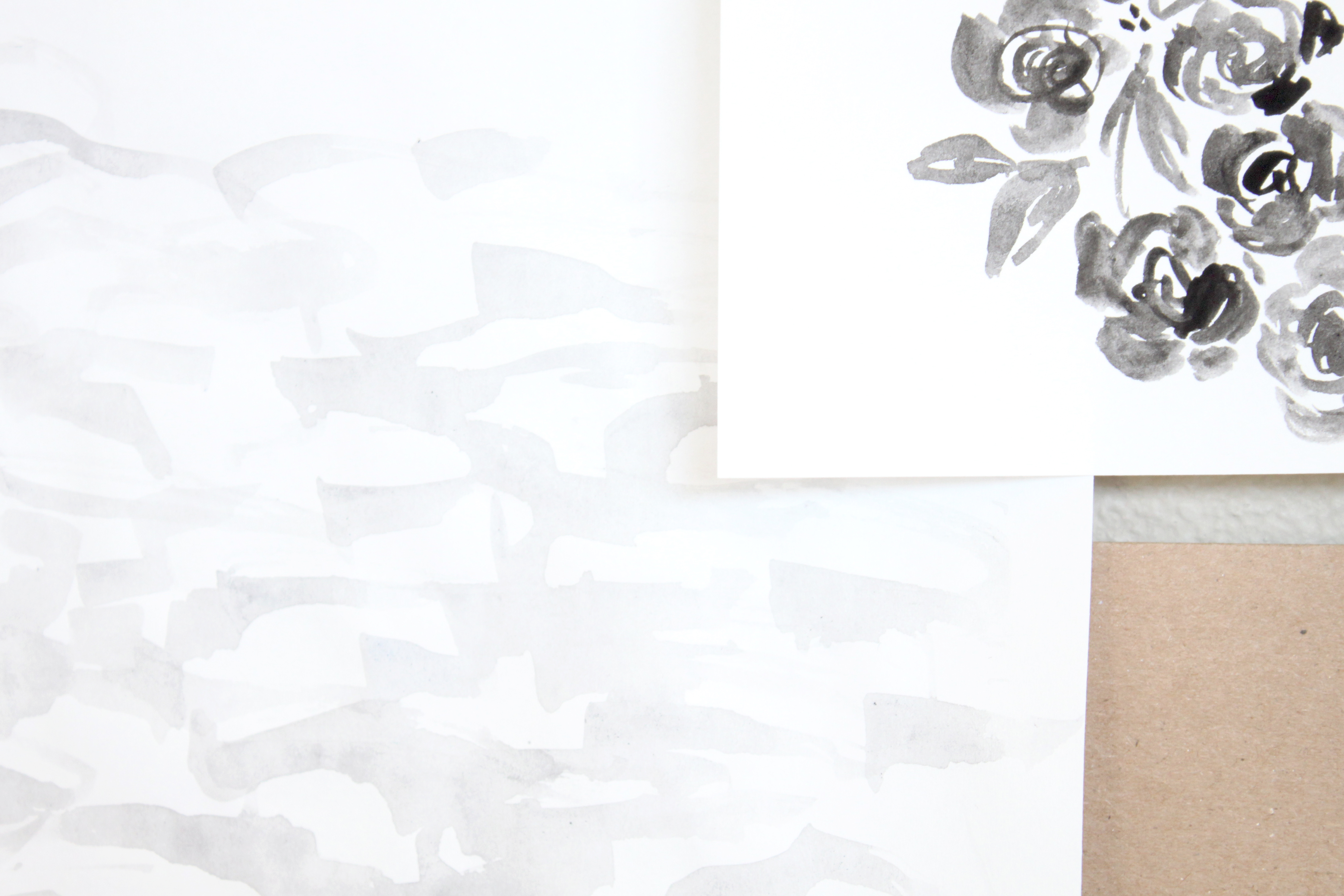
This week was pretty crafty. I took on a challenging project, designing and calligraphy of the day of the wedding stationery. I had been wanting to try artsy, hand painting project in a while and I was finally able to do so with watercolors. I was also able to put my calligraphy skills to use on place cards, table numbers and signs. They turned out great considering I have ways to go before I master the art of the pointed pen. I’ve been practicing it for a while and the whole process takes a whole lot of time and patience. Here is a little peek at all the watercolor and calligraphy I’ve done so far.
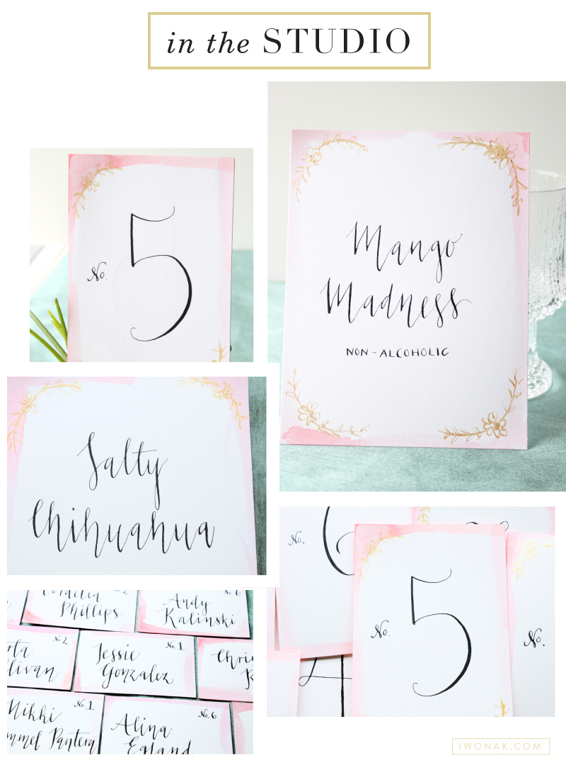
These watercolor place cards were done on an uncoated heavy Mohawk stock (just had some laying around the office) with just basic watercolors in beautiful shades of pink. I used black and gold calligraphy inks to add a little sparkle….
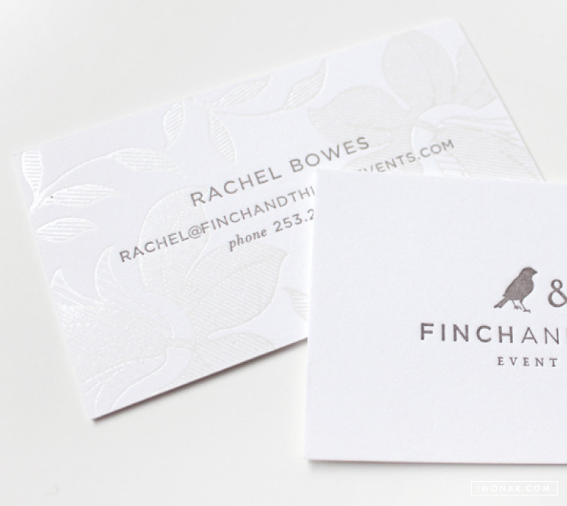
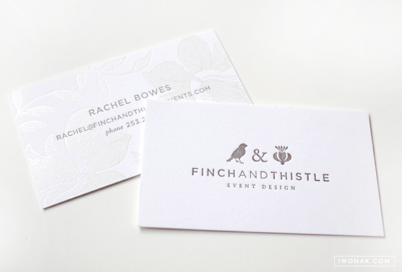
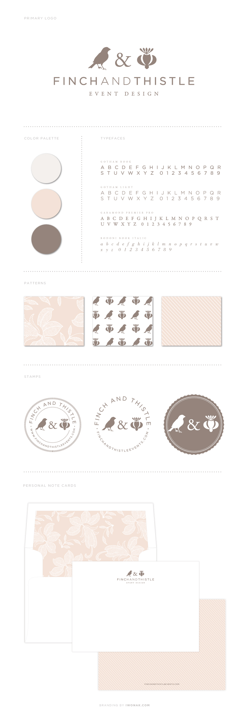
Hooray! I finally get to share this project with you. I don’t often take on identity projects as my life is just too busy at the moment, but I had to make an exception. Those fabulous business cards were designed and printed for the talented Rachel Bowes. Rachel has been my best friend and client and just recently she came to me wanting to totally rebrand her event design and floral business, Finch And Thistle Events. I introduced you to her new branding here. Her new business cards are modern and sophisticated yet timeless. I couldn’t be happier with the way they turned out!
And I must say this, getting them printed was quite the challenge. This was a demanding letterpress printing job (in terms of registration) and I had a hard time finding the print shop that would take this job. The vintage illustration knocks out, requiring very tight registration. In the end, I was able to find a very skilled letterpress shop that kept a critical eye on the registration while on press and I’m thrilled with how tight the cards came out. The floral foil design and letterpressed type align perfectly!
The business cards were foil stamped in pearl and letterpress printed in grey ink on Reich Savoy 100% Pure Cotton Brilliant White 236# Cover. This sumptuous, elegant paper is made from 100% pure cotton, is tree free, archival, acid free, recyclable, biodegradable and elemental chlorine free.
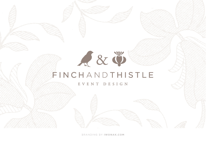
Over the past few months (ok, a year!) I’ve been working on a rebranding project for one of my favorite people – the uber talented Rachel Bowes of Finch & Thistle Event Design. Finch & Thistle Event Design provides event design, floral and event planning services for weddings and events throughout Washington State and across the country. With a strong portfolio of exquisitely designed and impeccably executed events, Rachel was seeking a brand re-haul and wanted a sophisticated, charming new identity that would grab the attention of brides-to-be and help her stand out in the crowd of wedding planners in the city. I had a wonderful time working with Rachel as we went in several different directions trying to create a brand that would represent her best. I’m very happy how it ended up. I took her already established logo (that I designed few years back), modified it a notch and then added new design details, both vintage and modern. The result is new identity and branding that is just as unique as she is – sophisticated and refined and true to Rachel’s own aesthetic.
Working with Rachel is a blast! Cheers to her new look!! Please come back to see her new business cards. I’ll be posting pictures as soon as we get them back from the print shop. Think letterpress, foil, luxurious paper stock… In the meantime, take some time exploring her site and blog, there is so much beauty to see…
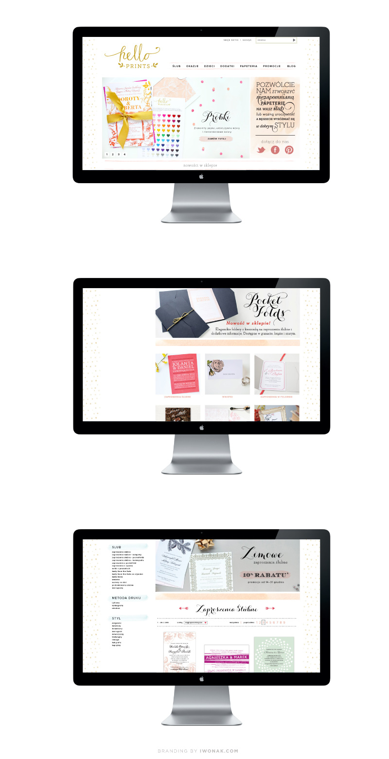
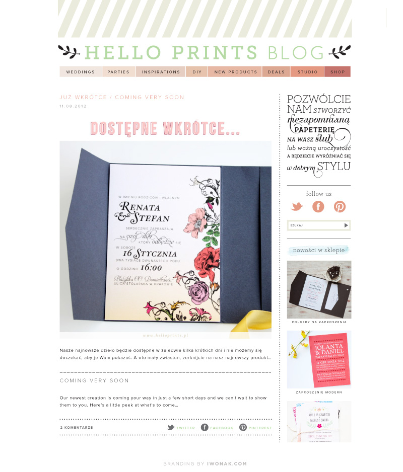
I’m absolutely thrilled to share with you this special project of mine. Hello! Prints is an online stationery shop filled with beautiful and unique stationery designs. It desperately needed a brand refresh and I had a blast redesigning the site and rebranding it. You can see it in its entirety right here. For now, the designs are avaialable for purchase in Poland and Europe only but I plan to open an online store here, in the U.S. Every visit and purchase means so much to us – please take a peek!
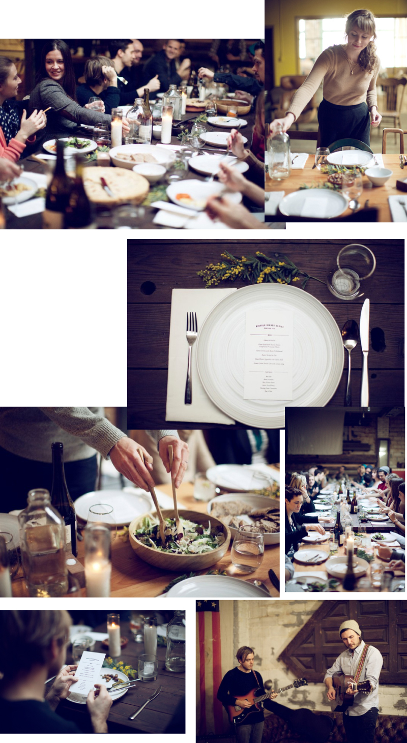
I have been inspired by Kinfolk’s enviable posts and publications for quite some time now. Naturally I’m loving their dinner series tour. Their first series event was held in Portland, Oregon. The folks at Kinfolk partnered with some great local businesses and looks like the event was exceptional.
www.kinfolk.com