Tag Archives: beautiful stationery

This week was pretty crafty. I took on a challenging project, designing and calligraphy of the day of the wedding stationery. I had been wanting to try artsy, hand painting project in a while and I was finally able to do so with watercolors. I was also able to put my calligraphy skills to use on place cards, table numbers and signs. They turned out great considering I have ways to go before I master the art of the pointed pen. I’ve been practicing it for a while and the whole process takes a whole lot of time and patience. Here is a little peek at all the watercolor and calligraphy I’ve done so far.

InTheStudio_CalligraphyAndWatercolors_IwonaK

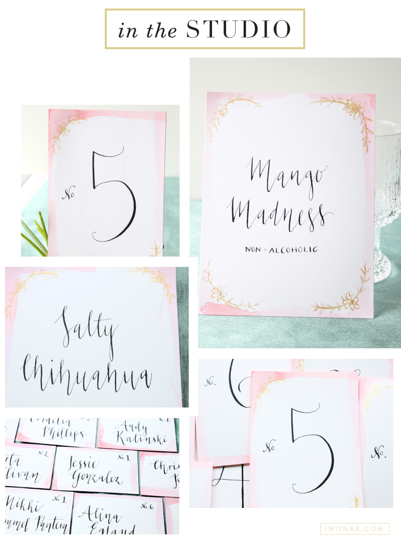
These watercolor place cards were done on an uncoated heavy Mohawk stock (just had some laying around the office) with just basic watercolors in beautiful shades of pink. I used black and gold calligraphy inks to add a little sparkle….

2 color #letterpress event invitation |  Designed by Iwona Konarski |  #invitation #letterpress #blindletterpress #eventstationery #stationery #branding #iwonak.com 2 color #letterpress event invitation |  Designed by Iwona Konarski |  #invitation #letterpress #blindletterpress #eventstationery #stationery #branding #iwonak.com blind #letterpress + warm grey pantone  |  event invitation designed by Iwona Konarski |  #invitation #letterpress #blindletterpress #eventstationery #stationery #branding #iwonak.com blind #letterpress + warm grey pantone  |  event invitation designed by Iwona Konarski |  #invitation #letterpress #blindletterpress #eventstationery #stationery #branding #iwonak.com

After spending the long weekend enjoy the sun, I thought I should get around to sharing this beautiful invitation. I designed it for the Symphony’s Maestro Circle Dinner – an annual affair that takes place at Maestro Schwarz’s house. Designing stationery for so many events is a perfect opportunity for me to try some printing that I haven’t done before, so this time I went with the combination of blind letterpress and warm grey ink on crisp white, heavy card stock. The blind letterpress is very beautiful but I wished I used pearl foil instead. It would give it a bit more shine and grandeur. I’ll definitely try it next time. And so far, this is my favorite invitation to date. Pretty, isn’t it?

OurHolidayCards_IwonaKonarski

Each year I plan to have my Christmas cards designed and printed early. And then life happens and they are always sent late. I am a graphic designer and design should be easy, yet it is always so much work. I usually have a hard time settling on the right design (let’s not even mention picking photos) and then, well the addressing of all those envelopes takes forever too. This year the biggest challenge was not designing but taking the photos of our little ones. We finally brought them home a day before Thanksgiving and life has been a whirlwind since. Due to their fragile conditions and our crazy and unpredictable schedule, we were unable to have a photographer to come to our house to take our family pictures. I was left with the job of capturing our precious babies. And it was a challenge. Babies tend to fuss and stretch out and don’t like being confined. After taking hundreds of photos we finally chose one that had both of them looking into the camera.


This year’s card was extra special because it was also Jakob and Izzy’s birth announcement! Originally I wanted to send out two separate cards, but there is no way I could have made that happen. This year our card will double as a Christmas card and baby announcement. And I am totally ok with that. Why not to celebrate the season as well as our bundles of joy. I am so happy with the way those cards turned out! Merry Christmas!

OurHolidayCardsBirthAnnouncements_IwonaKonarski