Tag Archives: stationer in seattle

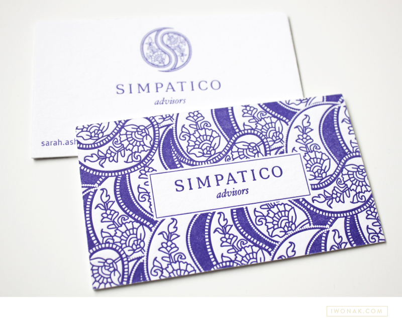
Hooray! I finally get to share newly completed project – Sarah’s new letterpress business cards. I just received my samples from the print shop and wow! They are striking. The cards feature one PMS color and are double-side printed on 600gsm Crane Lettra stock. Simple typography, unique logo and detailed yet elegant pattern allow these letterpress business cards to speak for themselves.

Simpatico-Letterpress-Business-Cards-branding-by-IwonaK.com

2 color #letterpress event invitation |  Designed by Iwona Konarski |  #invitation #letterpress #blindletterpress #eventstationery #stationery #branding #iwonak.com 2 color #letterpress event invitation |  Designed by Iwona Konarski |  #invitation #letterpress #blindletterpress #eventstationery #stationery #branding #iwonak.com blind #letterpress + warm grey pantone  |  event invitation designed by Iwona Konarski |  #invitation #letterpress #blindletterpress #eventstationery #stationery #branding #iwonak.com blind #letterpress + warm grey pantone  |  event invitation designed by Iwona Konarski |  #invitation #letterpress #blindletterpress #eventstationery #stationery #branding #iwonak.com

After spending the long weekend enjoy the sun, I thought I should get around to sharing this beautiful invitation. I designed it for the Symphony’s Maestro Circle Dinner – an annual affair that takes place at Maestro Schwarz’s house. Designing stationery for so many events is a perfect opportunity for me to try some printing that I haven’t done before, so this time I went with the combination of blind letterpress and warm grey ink on crisp white, heavy card stock. The blind letterpress is very beautiful but I wished I used pearl foil instead. It would give it a bit more shine and grandeur. I’ll definitely try it next time. And so far, this is my favorite invitation to date. Pretty, isn’t it?

Gold foil on brown paper |  Event invitations by Iwona Konarski | iwonak.com Gold foil on brown paper |  Event invitations by Iwona Konarski | iwonak.com


Gold. Shiny foil. Brown paper stock. Chartreuse envelopes with letterpress return address. Check! Check and check! I’m very excited to have my latest project printed. I was really worried about the fine lines in the floral art but it all turned out perfect. Yay! Now, back to another design… stay tuned. Lot’s of events happening at the Symphony this spring and summer.