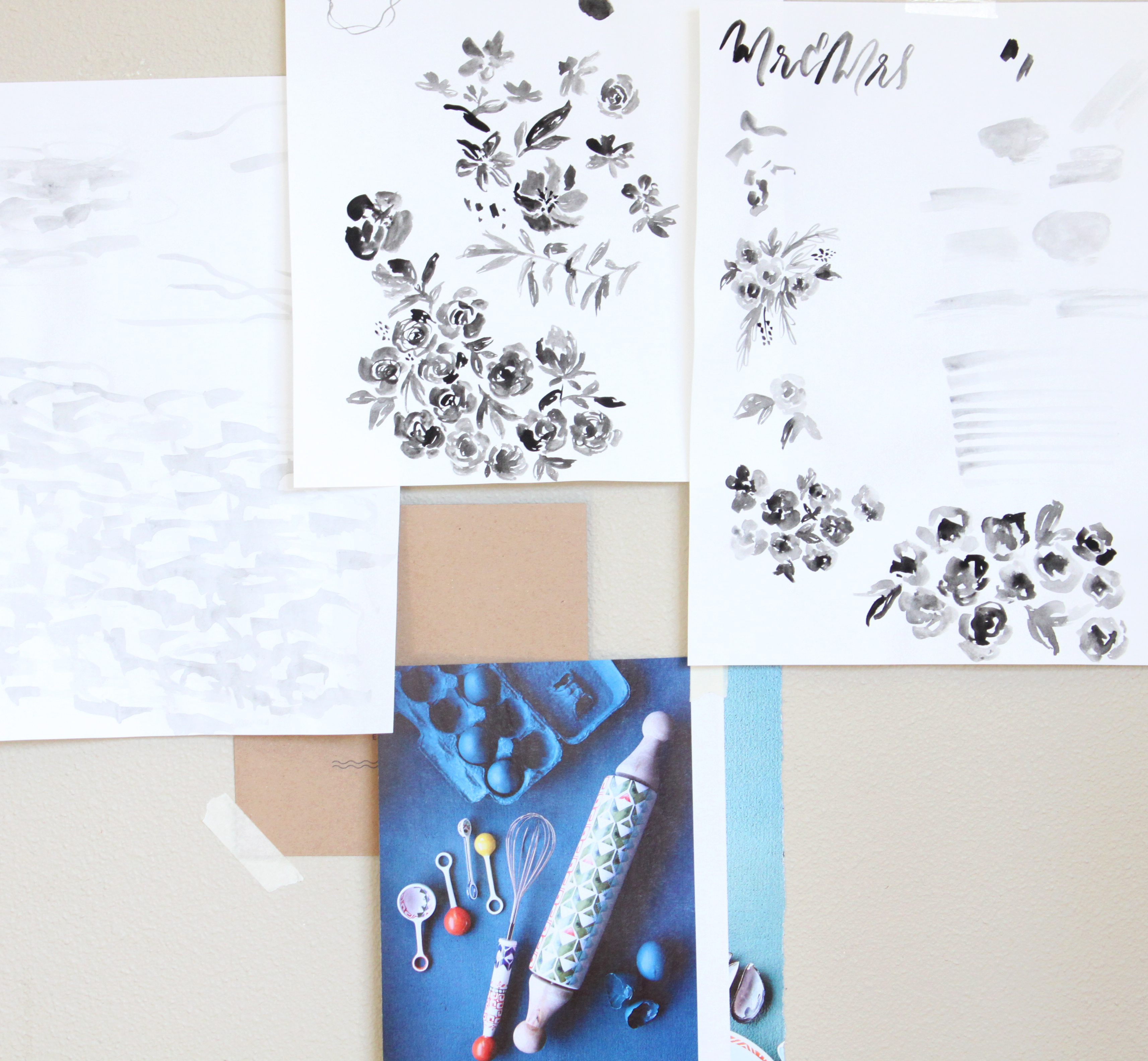
This week has been really busy but so fun. I’m working on new wedding invitations design and I’m so excited about this new direction. Layers, textures, watercolor – can’t get any better than this. Here are few little snippets from the process.
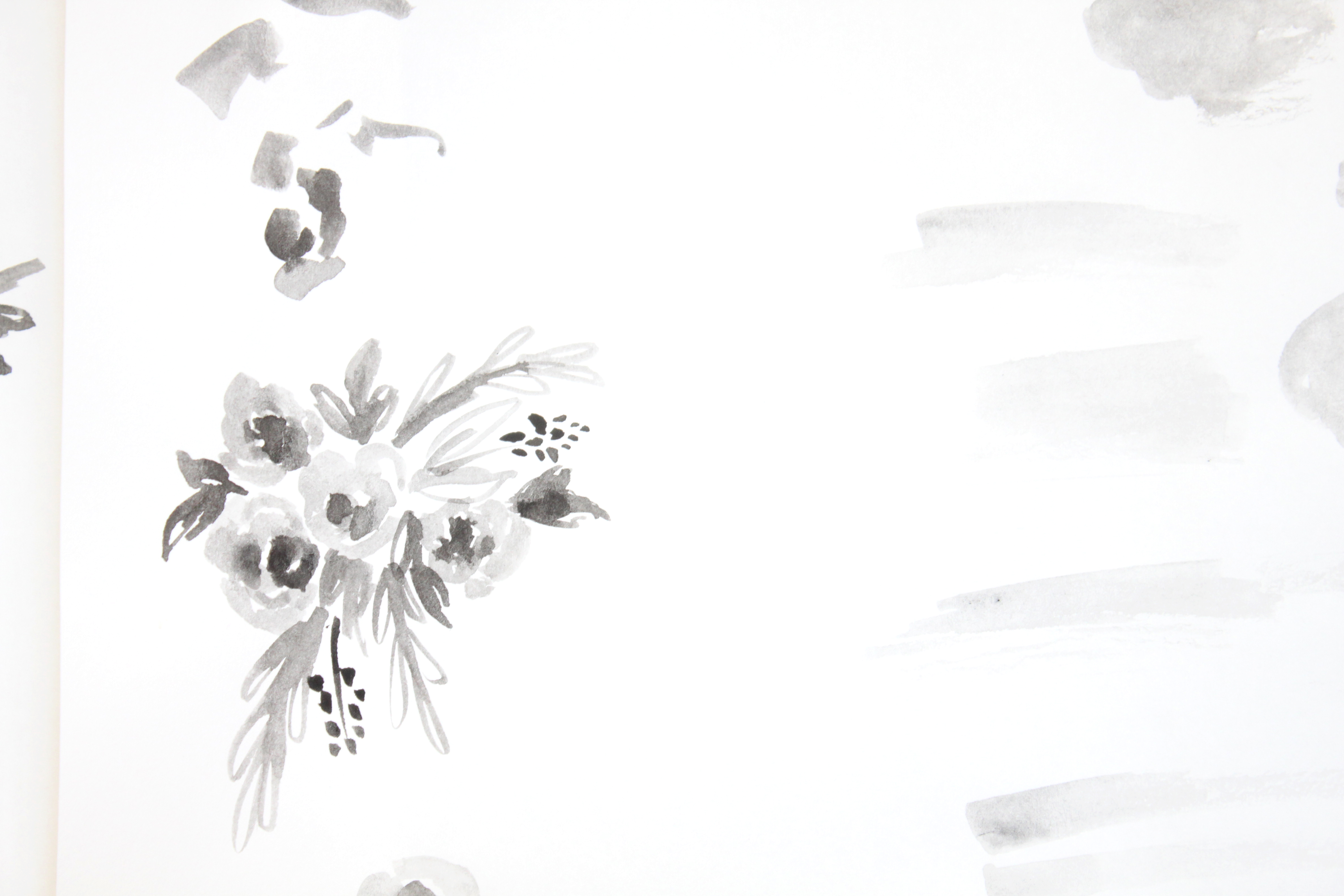
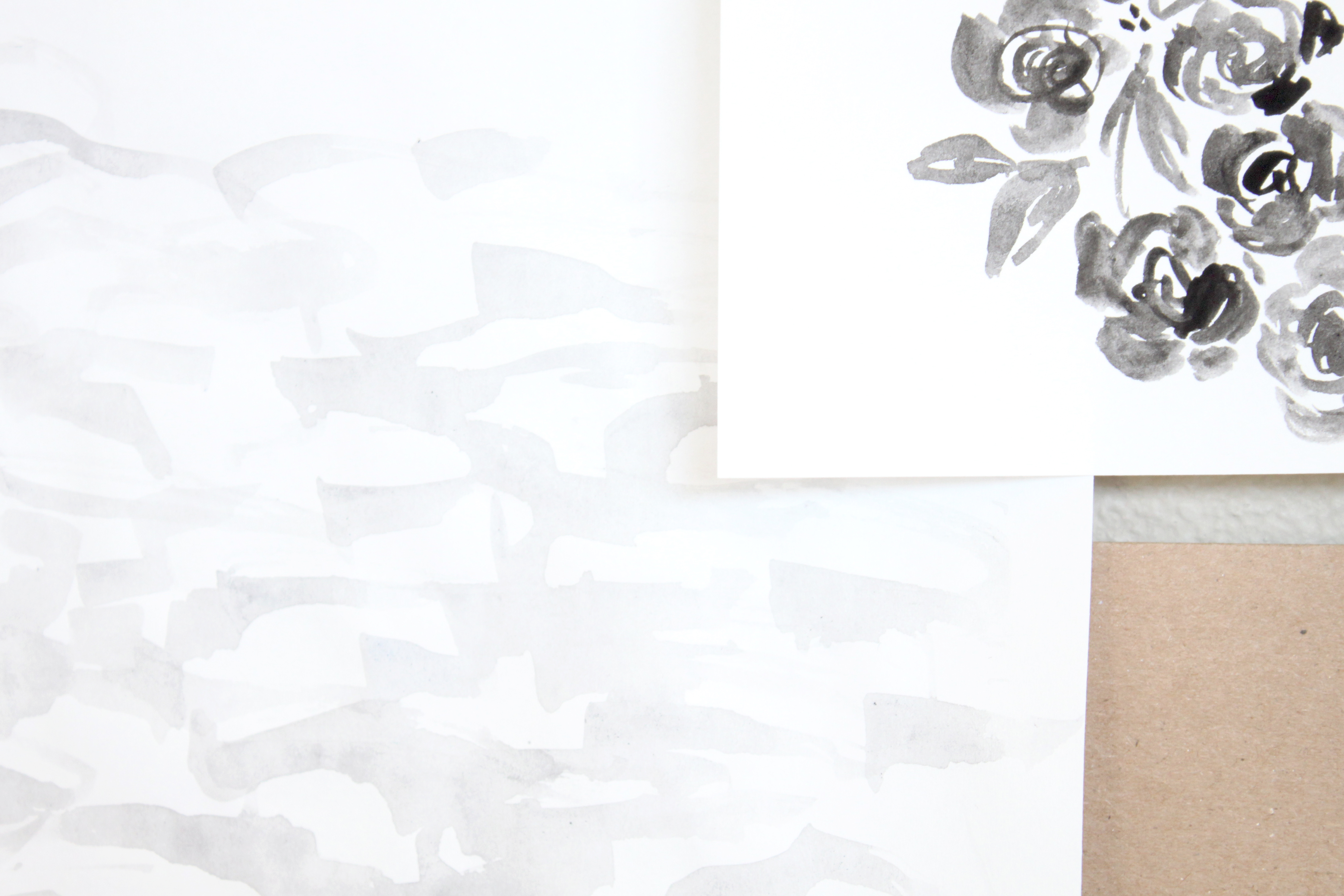
This week has been really busy but so fun. I’m working on new wedding invitations design and I’m so excited about this new direction. Layers, textures, watercolor – can’t get any better than this. Here are few little snippets from the process.
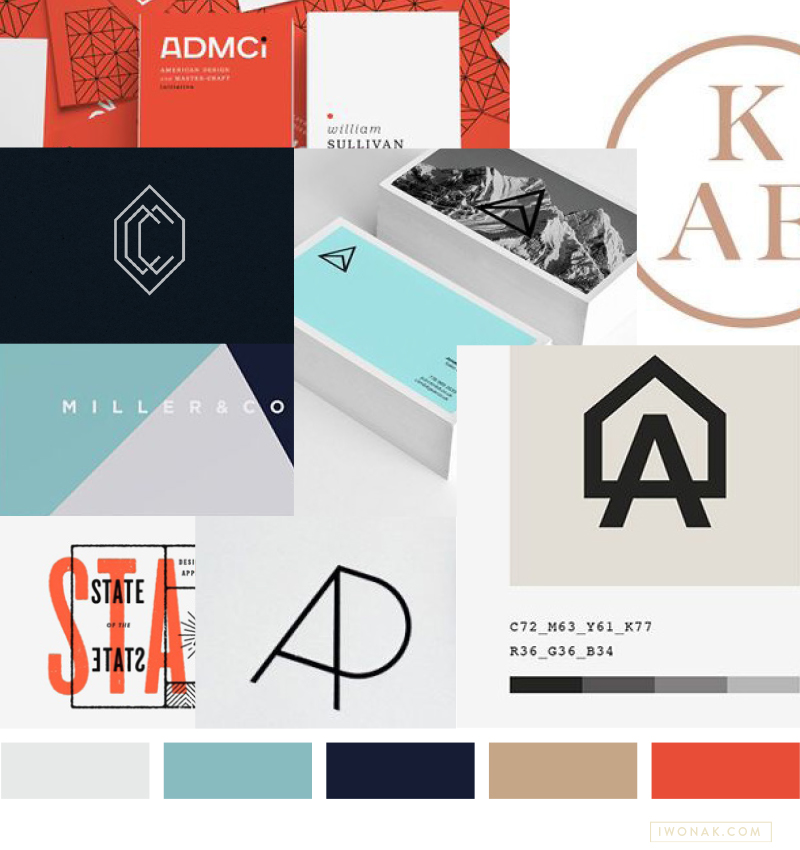
This moodboard is for a client who’s just starting up. I started this branding project with the board that defines their style: masculine, simple and bold. I can’t wait to translate this look into their identity and branding. It might be a while before I can show off the final pieces here, but I promise to share more as soon as it launches.
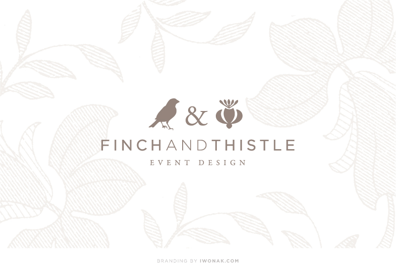
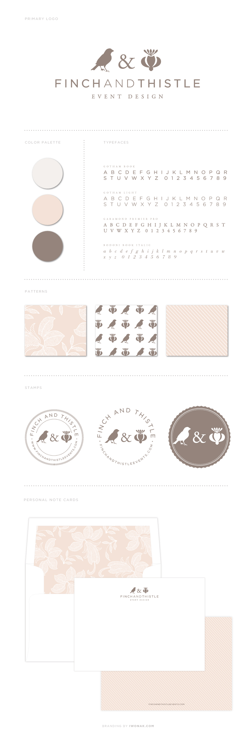
Over the past few months (ok, a year!) I’ve been working on a rebranding project for one of my favorite people – the uber talented Rachel Bowes of Finch & Thistle Event Design. Finch & Thistle Event Design provides event design, floral and event planning services for weddings and events throughout Washington State and across the country. With a strong portfolio of exquisitely designed and impeccably executed events, Rachel was seeking a brand re-haul and wanted a sophisticated, charming new identity that would grab the attention of brides-to-be and help her stand out in the crowd of wedding planners in the city. I had a wonderful time working with Rachel as we went in several different directions trying to create a brand that would represent her best. I’m very happy how it ended up. I took her already established logo (that I designed few years back), modified it a notch and then added new design details, both vintage and modern. The result is new identity and branding that is just as unique as she is – sophisticated and refined and true to Rachel’s own aesthetic.
Working with Rachel is a blast! Cheers to her new look!! Please come back to see her new business cards. I’ll be posting pictures as soon as we get them back from the print shop. Think letterpress, foil, luxurious paper stock… In the meantime, take some time exploring her site and blog, there is so much beauty to see…
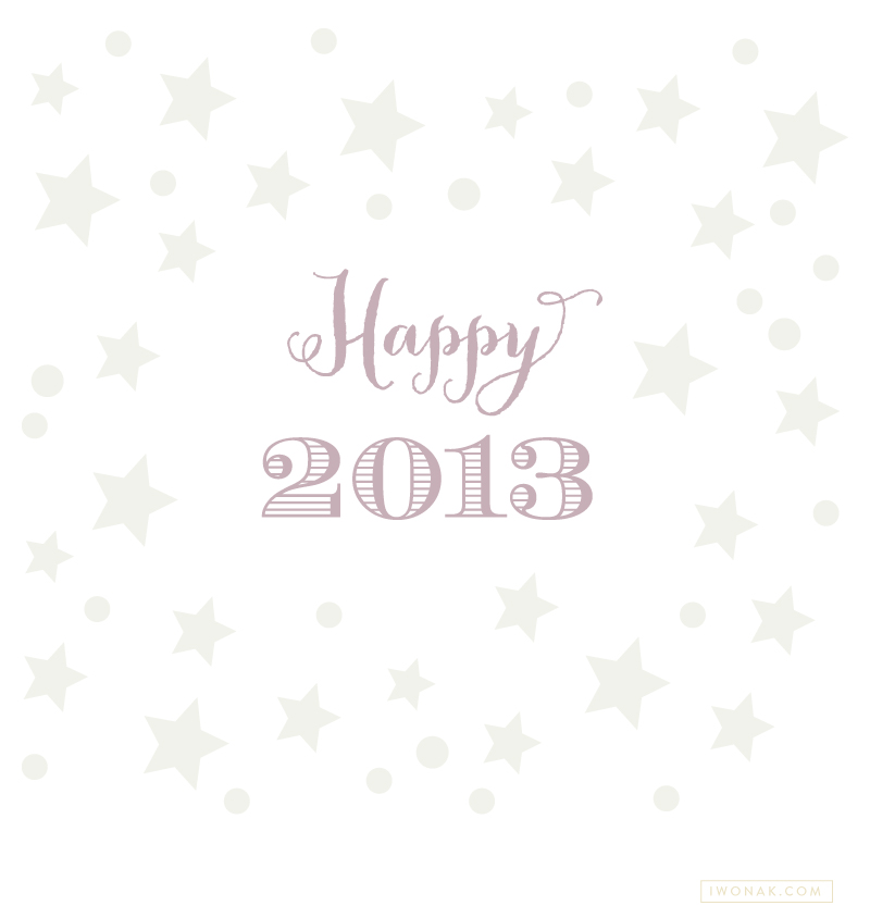
I am more than ready to say goodbye to 2012 and hello to 2013! It has been a very, very busy year and I’m looking forward to 2013. I plan to relax, work less (is it even possible?!) and just have fun. Wishing you a very Happy New Year. May 2013 be filled with love, joy and happiness.
Cheers to 2013!
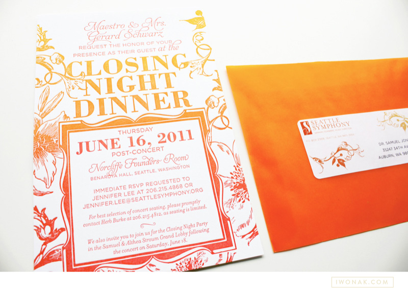
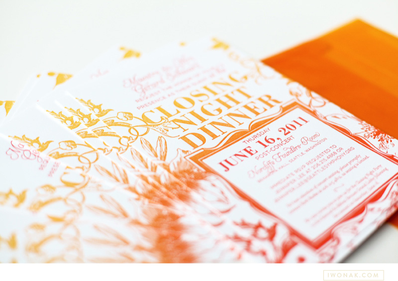
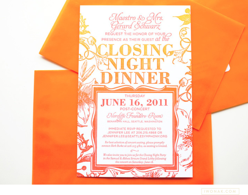
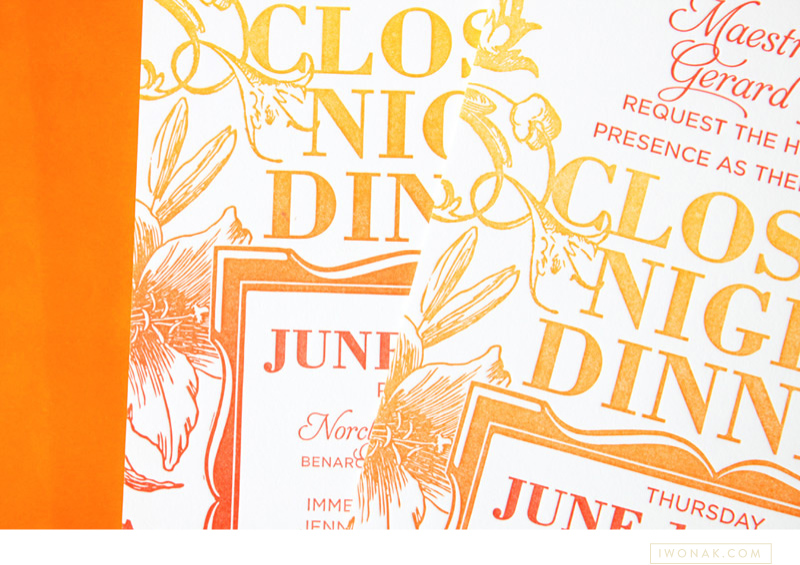
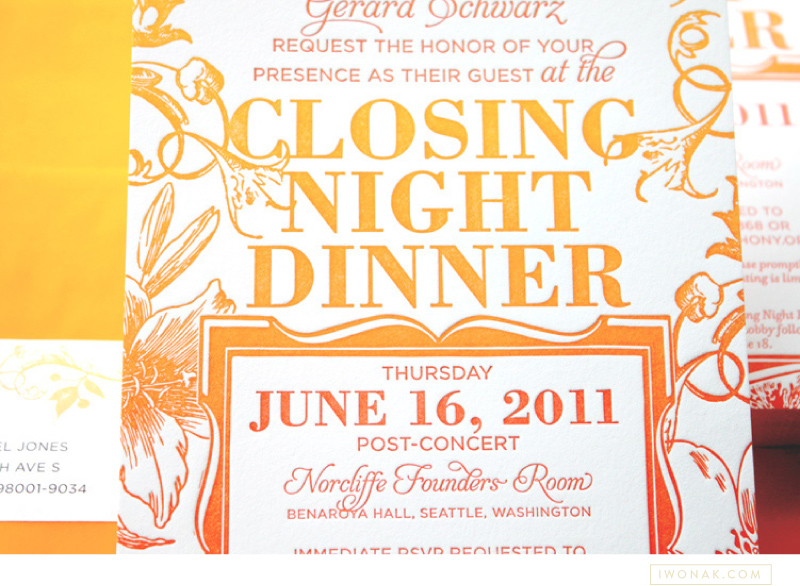
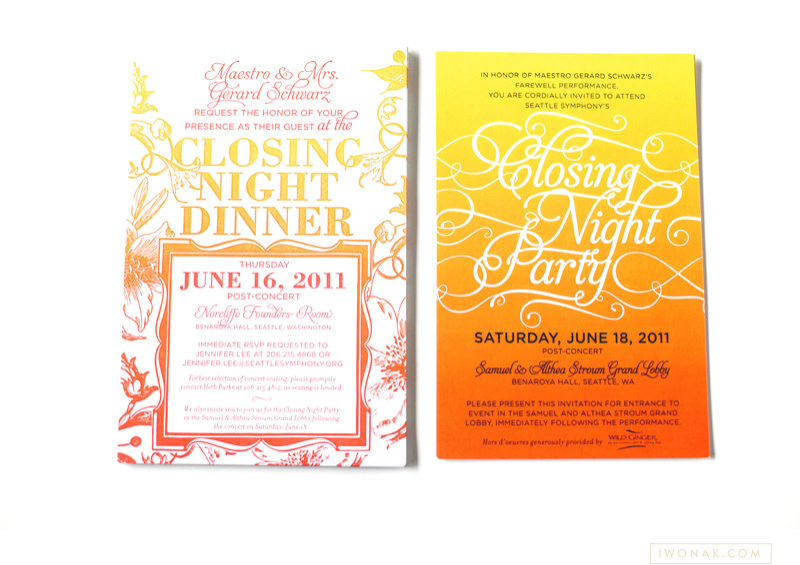
Have you heard of split ink? I haven’t until a few months ago when I spotted some inspirations on Pinterest. Of course, I had to try it! Ombre has been such an influence in fashion I had to try it on paper. Perfect project came along and voila! The most awesome ombre gala invitations are here. They are slightly larger than standard invitation (A8) as I felt the floral illustrations and the amount of text needed some room to breath.
I designed the invitations to be printed with a split ink fountain using yellow and red inks which blended to a bright orange in the middle – check them out below, the results are stunning. To maximize the drama I paired them with orange vellum envelopes and really love how they grab the the attention.
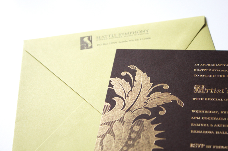
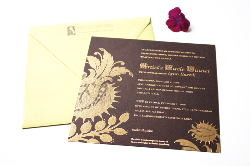
Gold. Shiny foil. Brown paper stock. Chartreuse envelopes with letterpress return address. Check! Check and check! I’m very excited to have my latest project printed. I was really worried about the fine lines in the floral art but it all turned out perfect. Yay! Now, back to another design… stay tuned. Lot’s of events happening at the Symphony this spring and summer.