Tag Archives: letterpress

Letterpress + Turquoise Watercolor + pink edge business cards | Design by IwonaK.com

I’ve been loving my business cards since they day I got them, but once in a while I get the idea to “spice” them up somehow. I’ve wanted something simple, organic, something that wouldn’t overwhealm the classic design of my cards. So, yesterday while working with watercolors on the new wedding invitation, I’ve decided to carry on and add some colors to my cards. I went over each one with a touch of watercolor and I’m surprised how nicely letterpress paper takes watercolor. I love they way they’ve turned out, how each one is different and how the turquoise watercolor works with the letterpress and pink edges.

Letterpress + Watercolor + pink edge business cards | Design by IwonaK.comWatercolor and letterpress | business cards | Design by IwonaK.comWatercolor + pink edge letterpress business cards | Design by IwonaK.comLetterpress + Watercolor + pink edge business cards | Designed by IwonaK.com

I’m finally getting into updating my portfolio section! This wedding collateral was designed for a sweet couple, Beth and Nate, who wanted a sophisticated suite that was also appropriate for a destination wedding in Seattle, Washington. The wedding happened few years back but their invitation is so lovely, I felt it needed to be shared here. Beth and Nate’s Fourth of July’s ceremony was held at Kubota Garden in Rainier Beach, and the weather couldn’t be more perfect with sunny skies and a rainbow. The heartfelt ceremony included poetry readings by friends and a surprise performance of Patti Griffin’s “Heavenly Day” by Beth. With an appreciation for paper goods and a killer sense of design, Beth was a dream to work with. This invitation suite was filled with a fun texture through the mixing of patterns, scrolls and typefaces and printing of gold foil and a turquoise and gold letterpress on off-white cotton paper. My favorite element was the tri-fold day of events program featuring lots of vintage scrolls and illustrations and a perforated rsvp card.

Beth Nate Wedding invitation suite by IwonaK.com   Gold foil and letterpress wedding invitation suite by IwonaK.com // #seattlewedding, #letterpress #foil #seattle #weddinginvitations Gold foil and turquoise letterpress wedding invitation suite by IwonaK.com gold and turquoise letterpress wedding celebration details and rsvp card / custom wedding stationery / design by iwonak.com // #invitations #seattlewedding #weddinginvitations #iwonak #foil #gold #letterpressBeth Nate Wedding invitation suite by IwonaK.com 4  gold and turquoise letterpress wedding details and rsvp card / custom wedding stationery / design by iwonak.com // #invitations #seattlewedding #weddinginvitations #iwonak #foil #gold #letterpressgold letterpress program and rsvp card / custom wedding stationery / design by iwonak.com // #invitations #seattlewedding #weddinginvitations #iwonak #foil #gold #letterpress  gold foil and letterpress  / custom wedding stationery / design by iwonak.com // #invitations #seattlewedding #weddinginvitations #iwonak #foil #gold #letterpress custom gold foil thank you cards / custom wedding stationery / design by iwonak.com // #invitations #seattlewedding #weddinginvitations #iwonak #foil #gold #letterpress Gold foil thank you cards / custom wedding stationery / design by iwonak.com // #invitations #seattlewedding #weddinginvitations #iwonak #foil #gold #letterpress

Here’s a peak at a recently wrapped up wedding collateral. This custom map not only captured the spirit and look of the wedding but also introduced the guests to the location of the wedding ceremony and reception. It’s always such a great idea to show a smaller area, a close-up view of the location. I’ll be sharing more images from this fun wedding invitation suite in the next few months.

Custom wedding map and wedding stationery by IwonaK.com Custom wedding map by IwonaK.com

Iwona K com Business Cards

Wooohoo! My new letterpress business cards are finally here! And I absolutely love them! However, I have to
admit, designing them hasn’t been easy. As most designers can attest branding yourself is difficult. I love minimal
and clean design so I knew from the start that my logo and branding would have to reflect that. Keeping the design simple proofed to be difficult. I wanted to keep my branding in black & white but feared it’ll be dull and ordinary.

After a month trying to figure out what I want my brand to look like, and what I want my clients to feel about me and my work, I’ve got up the nerve to narrow down the design and sent my business cards off to be printed.
I knew my business cards would be letterpress and I wanted them to stand out and leave an impression. So I went with black letterpress text and added a bit of a wow factor by painting the edges in bright pink. I love how they turned out! They’re elegant yet cheerful and definitely eye-catching! I’m thrilled to have them in-hands, and I love seeing people stroke them….

Photography: Rachel Nickel


Hooray! I finally get to share Rachel’s new business cards! Rachel has been my best friend and client and just recently she came to me wanting to totally rebrand her event design and floral business, Finch And Thistle. I talked about her Her new business cards are modern yet sophisticated and classic. I couldn’t be happier with the way they turned out!

Finch & Thistle Event Design branding and identity by Iwona Konarski |  #finchandthistle #branding #rebrand #stationery #iwonak #beautifulbrand


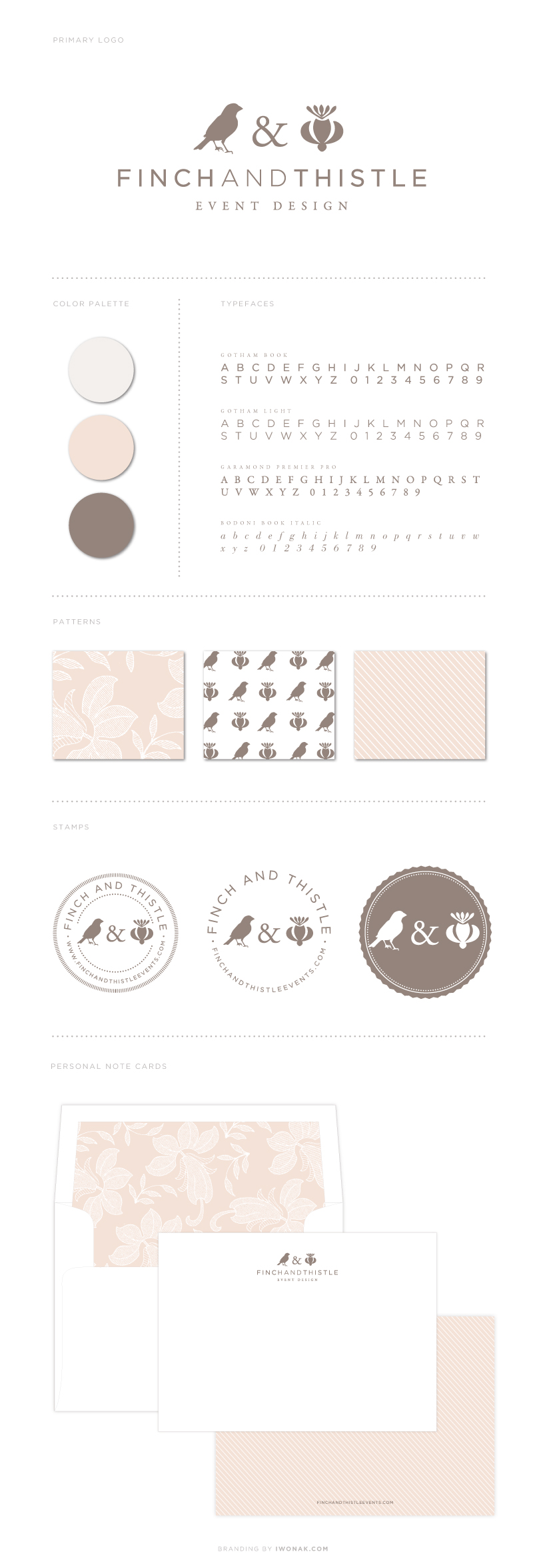
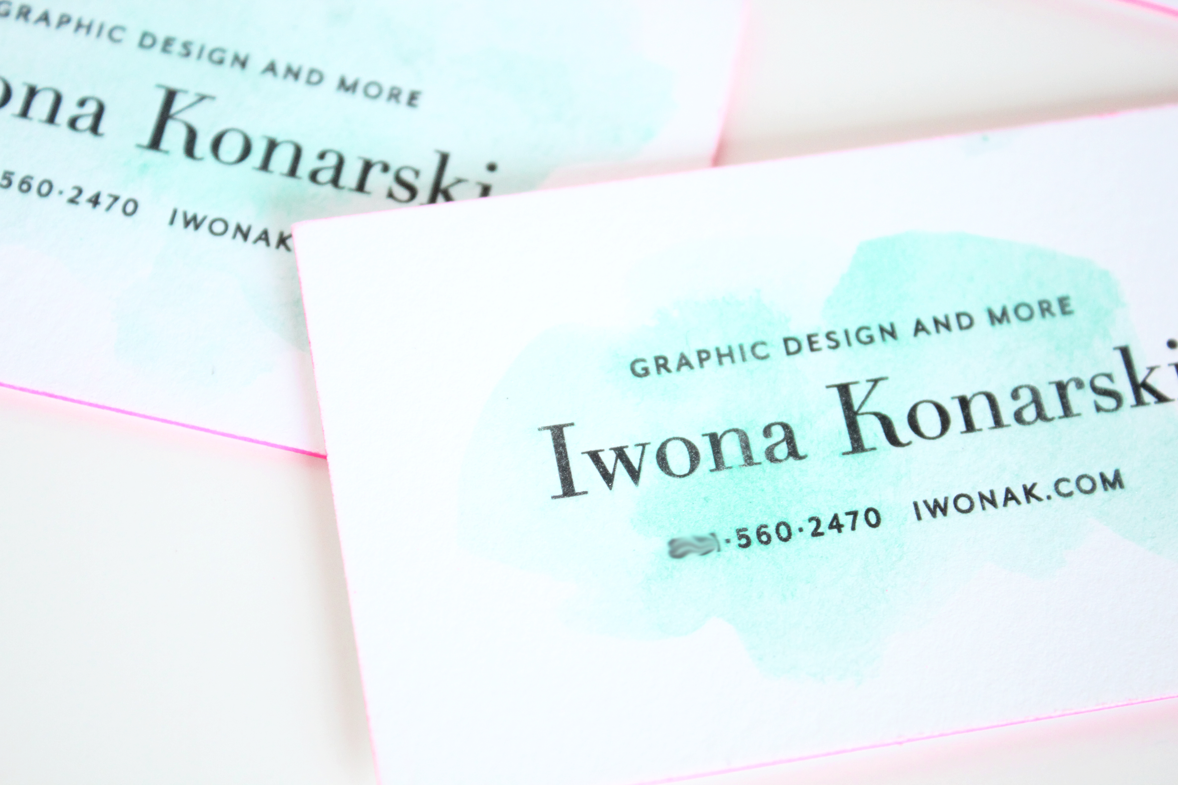
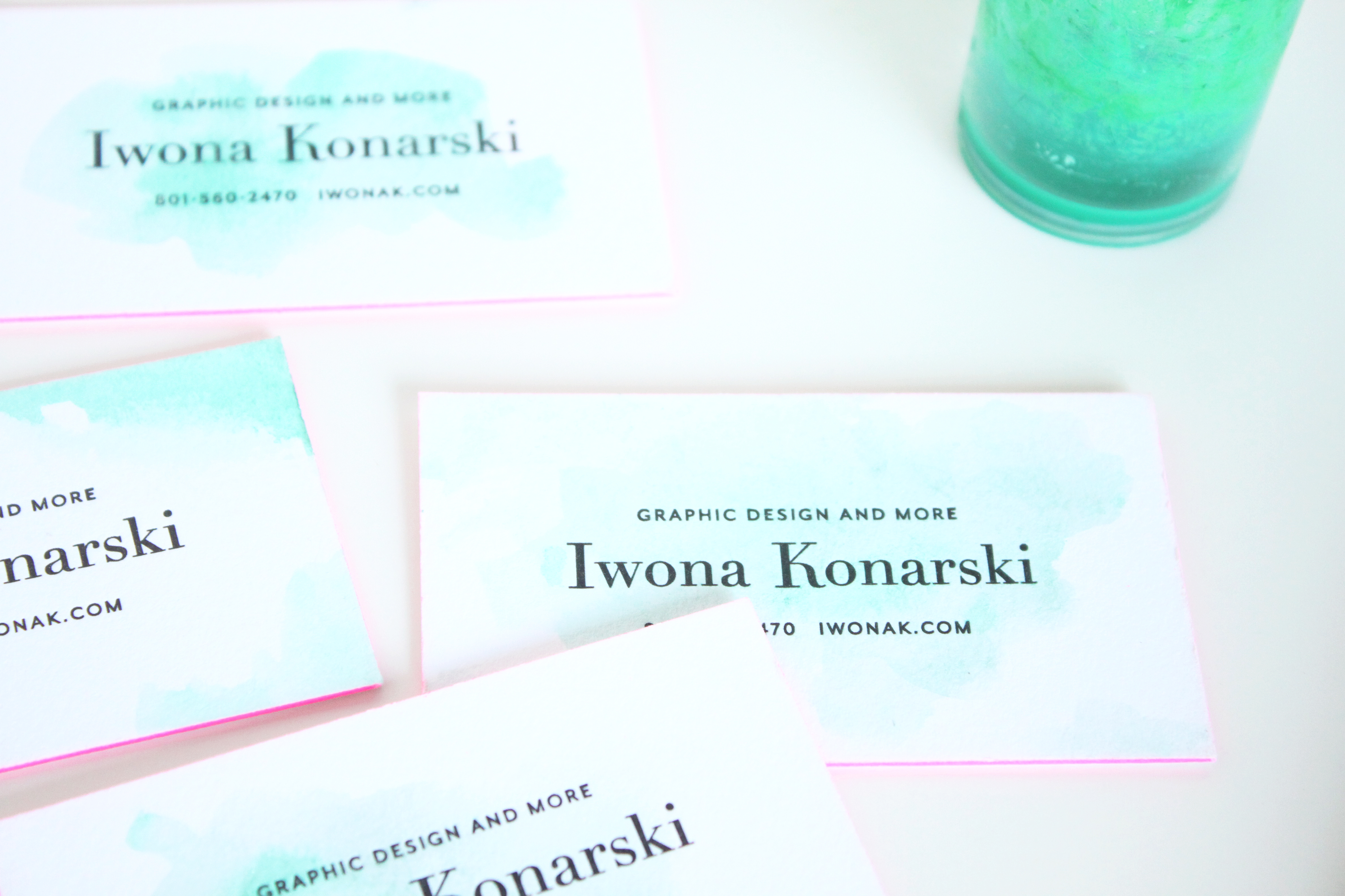
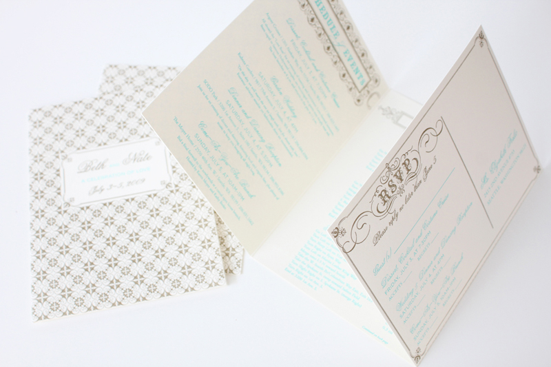
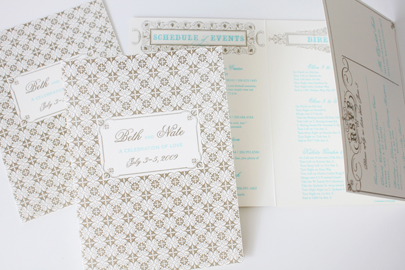
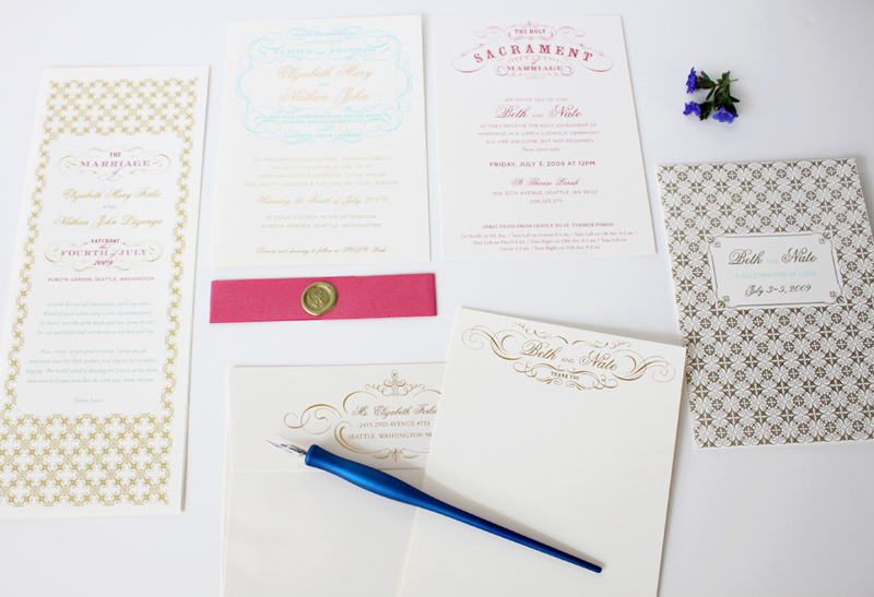
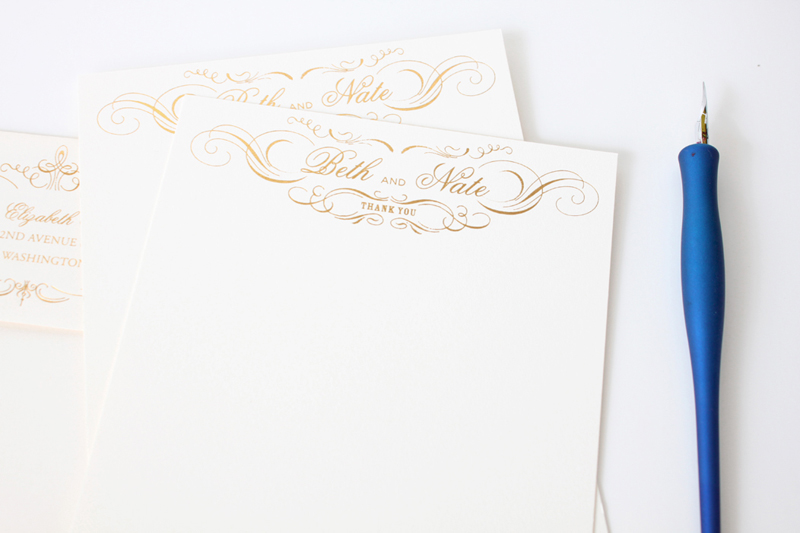
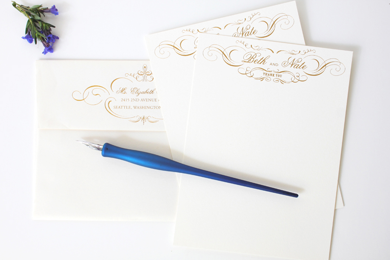
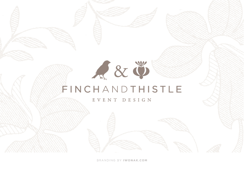
Over the past few months (ok, a year!) I’ve been working on a rebranding project for one of my favorite people – the uber talented Rachel Bowes of Finch & Thistle Event Design. Finch & Thistle Event Design provides event design, floral and event planning services for weddings and events throughout Washington State and across the country. With a strong portfolio of exquisitely designed and impeccably executed events, Rachel was seeking a brand re-haul and wanted a sophisticated, charming new identity that would grab the attention of brides-to-be and help her stand out in the crowd of wedding planners in the city. I had a wonderful time working with Rachel as we went in several different directions trying to create a brand that would represent her best. I’m very happy how it ended up. I took her already established logo (that I designed few years back), modified it a notch and then added new design details, both vintage and modern. The result is new identity and branding that is just as unique as she is – sophisticated and refined and true to Rachel’s own aesthetic.

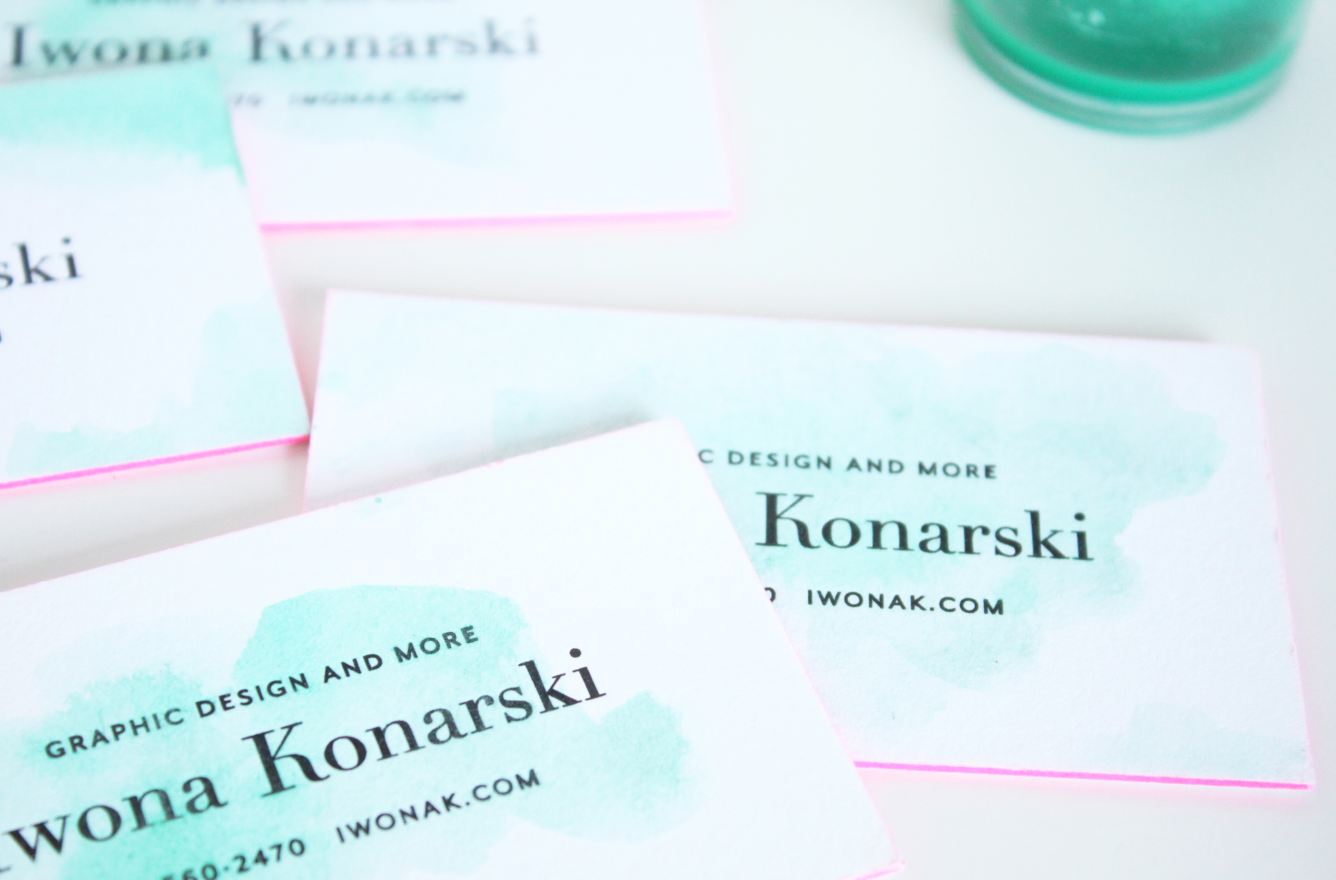
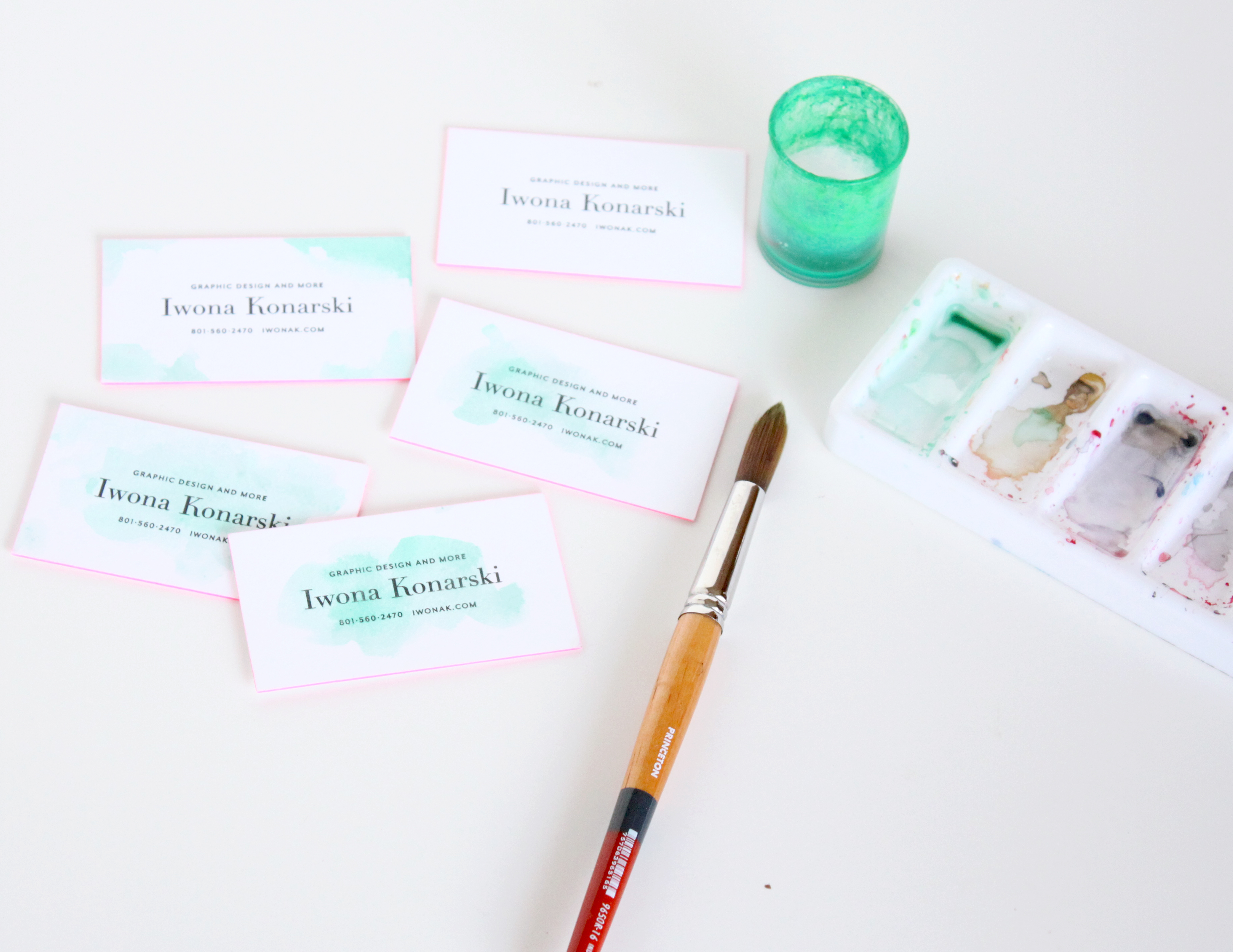
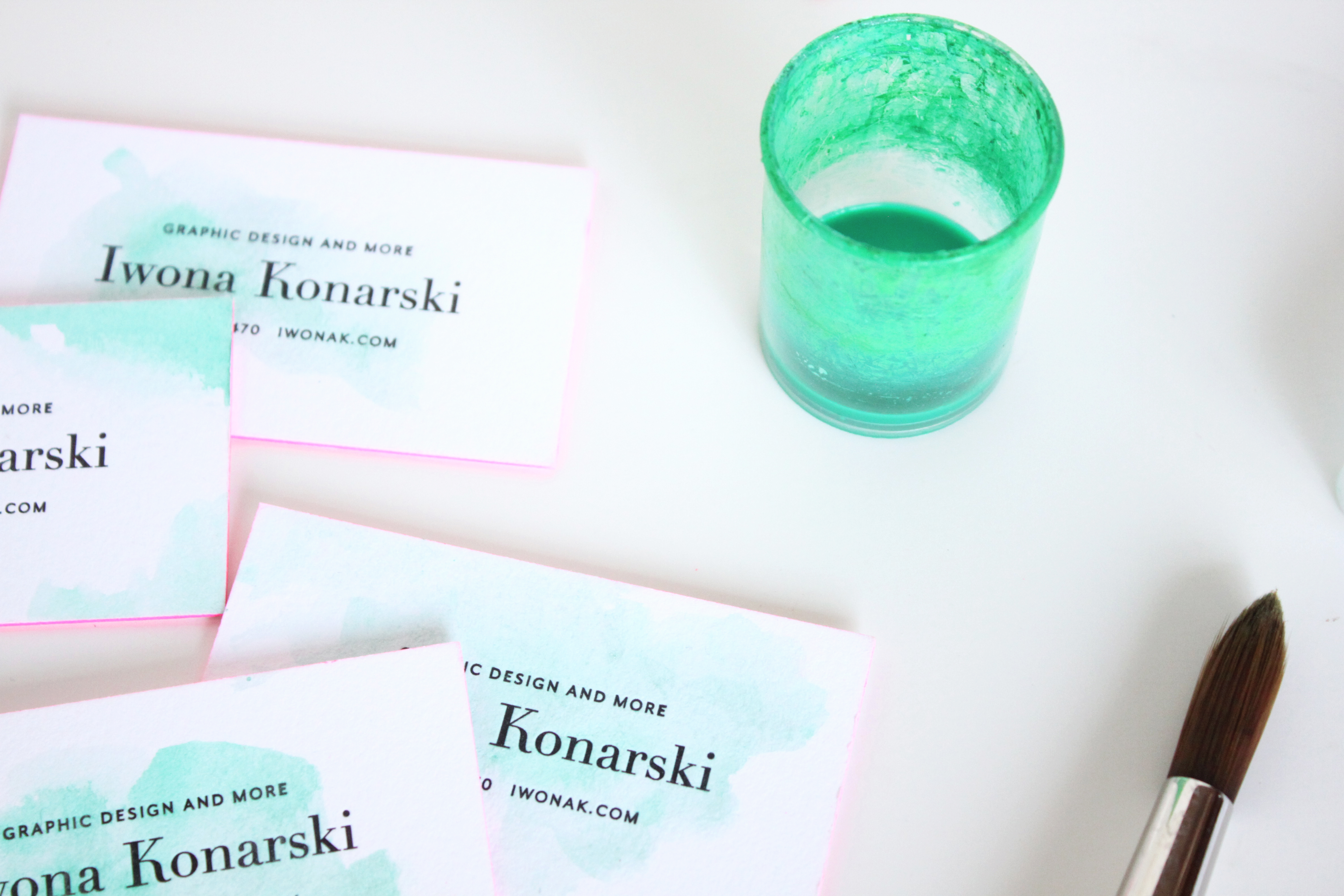
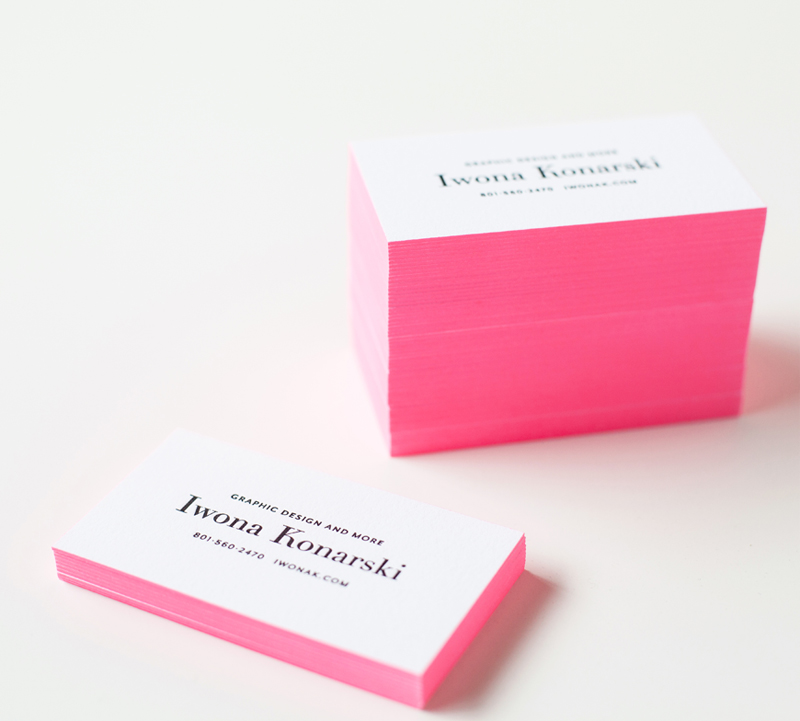
Working with Rachel is a blast! Cheers to her new look!! Please come back to see her new business cards. I’ll be posting pictures as soon as we get them back from the print shop. Think letterpress, foil, luxurious paper stock… In the meantime, take some time exploring her site and blog, there is so much beauty to see…

Finch & Thistle Event rebrand. By Iwona Konarski

I’m absolutely thrilled to share with you this special project of mine. Hello! Prints is an online stationery shop filled with beautiful and unique stationery designs. It desperately needed a brand refresh and I had a blast redesigning the site and rebranding it. You can see it in its entirety right here. For now, the designs are avaialable for purchase in Poland and Europe only but I plan to open an online store here, in the U.S. Every visit and purchase means so much to us – please take a peek!

HelloPrints.pl website and branding

HelloPrints.pl Website and Blog design

Ombre split ink letterpress invitations by iwonak.com |  #ombre #vellumenvelopes #letterpress #splitink #invitation #galainvitation #iwonak #seattledesigner #seattlestationery #seattleweddinginvitations #wedding #stationery #vellum

split-ink-letterpress-invitations-by-iwonak.com |  #ombre #letterpress #splitink #invitation #galainvitation #iwonak #seattledesigner #seattlestationery #seattleweddinginvitations #wedding #stationeryOmbre split ink letterpress invitations by iwonak.com |  #ombre #vellumenvelopes #letterpress #splitink #invitation #galainvitation #iwonak #seattledesigner #seattlestationery #seattleweddinginvitations #wedding #stationery #vellum

split ink letterpress invitations by iwonak.com |  #ombre #letterpress #splitink #invitation #galainvitation #iwonak #seattledesigner #seattlestationery #seattleweddinginvitations #wedding #stationery #vellumOmbre split ink letterpress invitations by iwonak.com |  #ombre #vellumenvelopes #letterpress #splitink #invitation #galainvitation #iwonak #seattledesigner #seattlestationery #seattleweddinginvitations #wedding #stationery #vellum #closeupOmbre split ink letterpress invitations by iwonak.com |  #ombre #savethedate #letterpress #splitink #invitation #galainvitation #iwonak #seattledesigner #seattlestationery #seattleweddinginvitations #wedding #stationery

Have you heard of split ink? I haven’t until a few months ago when I spotted some inspirations on Pinterest. Of course, I had to try it! Ombre has been such an influence in fashion I had to try it on paper. Perfect project came along and voila! The most awesome ombre gala invitations are here. They are slightly larger than standard invitation (A8) as I felt the floral illustrations and the amount of text needed some room to breath.

I designed the invitations to be printed with a split ink fountain using yellow and red inks which blended to a bright orange in the middle – check them out below, the results are stunning. To maximize the drama I  paired them with orange vellum envelopes and really love how they grab the the attention.

Hooray! I finally get to share newly completed project – Sarah’s new letterpress business cards. I just received my samples from the print shop and wow! They are striking. The cards feature one PMS color and are double-side printed on 600gsm Crane Lettra stock. Simple typography, unique logo and detailed yet elegant pattern allow these letterpress business cards to speak for themselves.

Simpatico-Letterpress-Business-Cards-branding-by-IwonaK.com