Letterpress + Turquoise Watercolor + pink edge business cards | Design by IwonaK.com

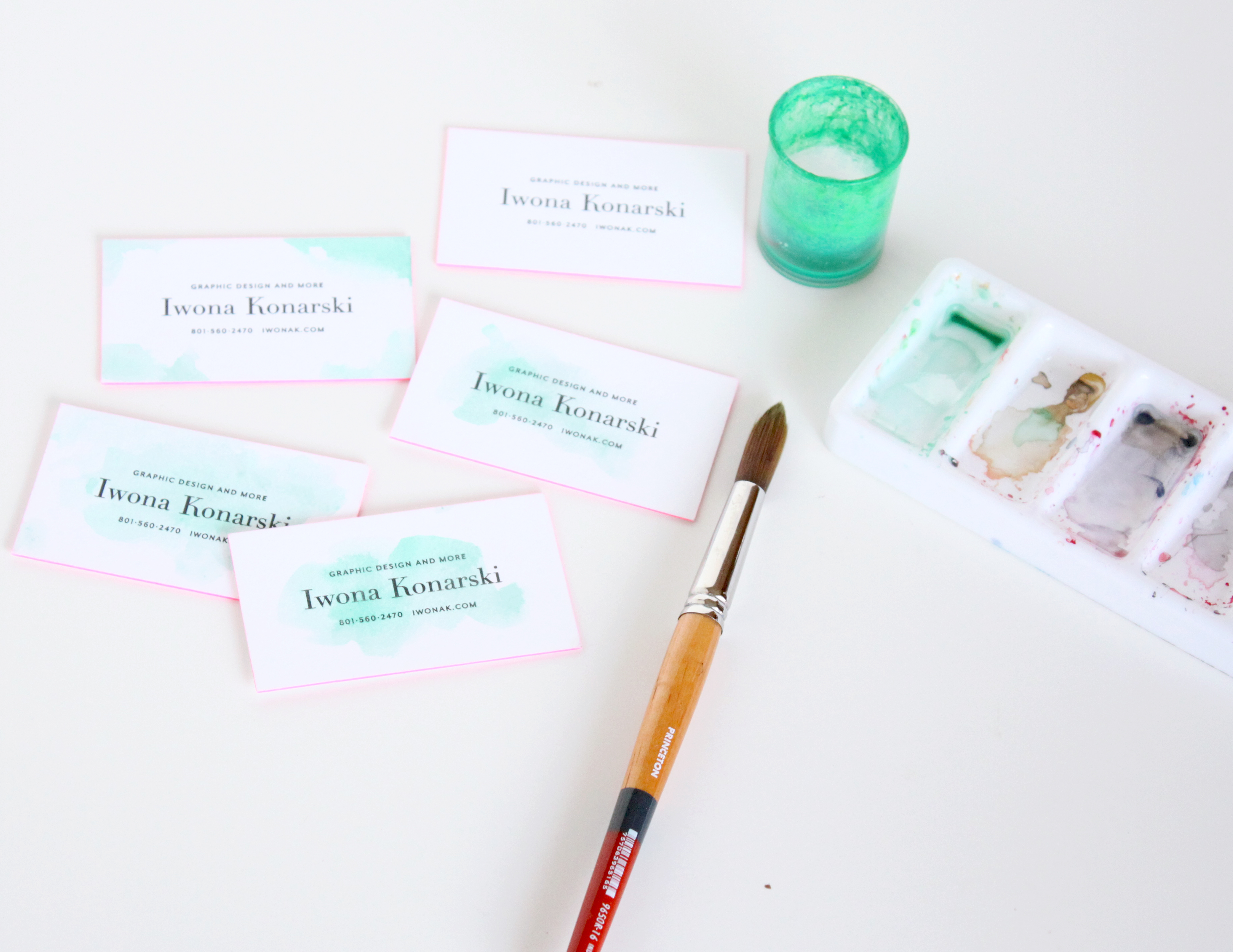
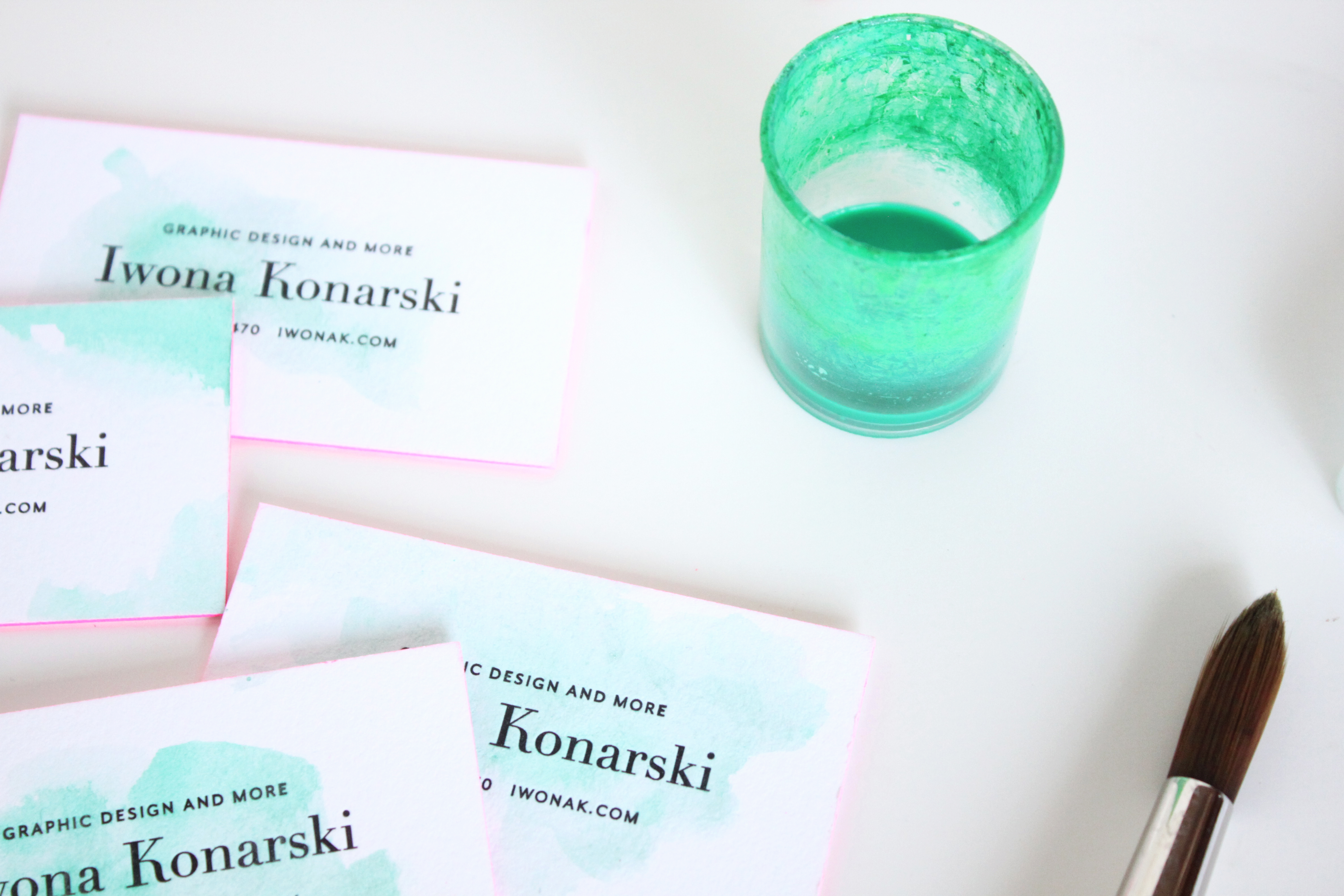
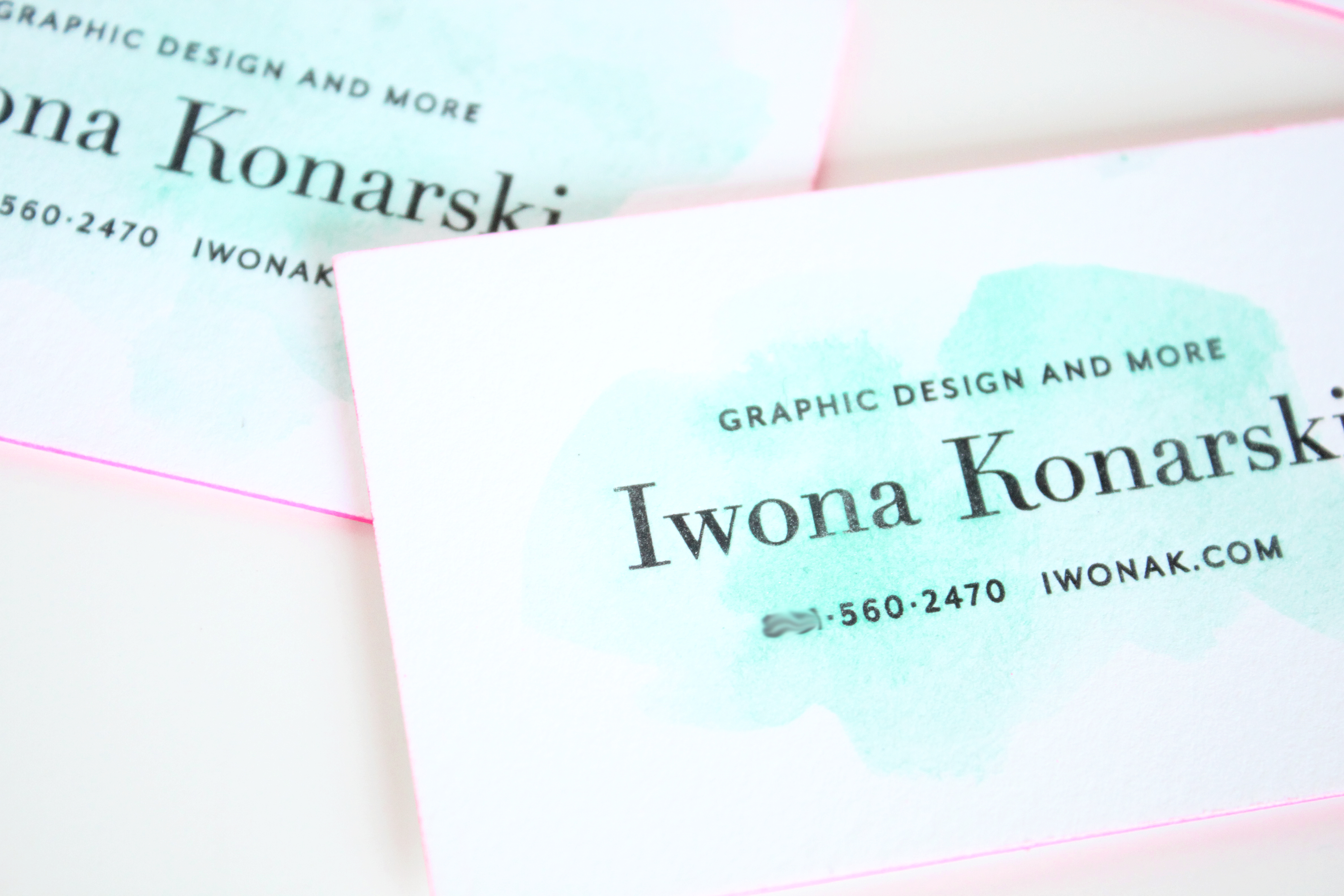
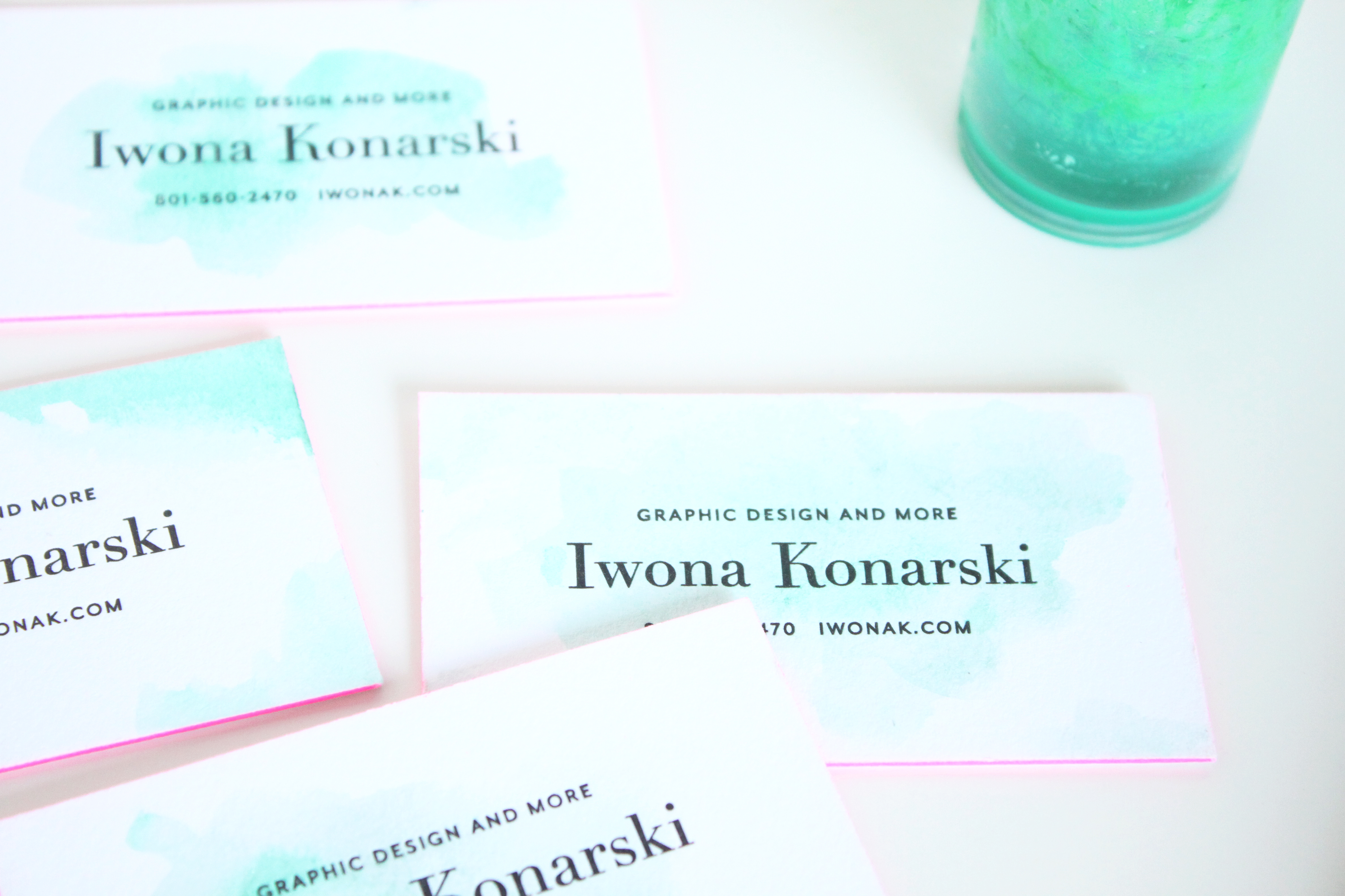
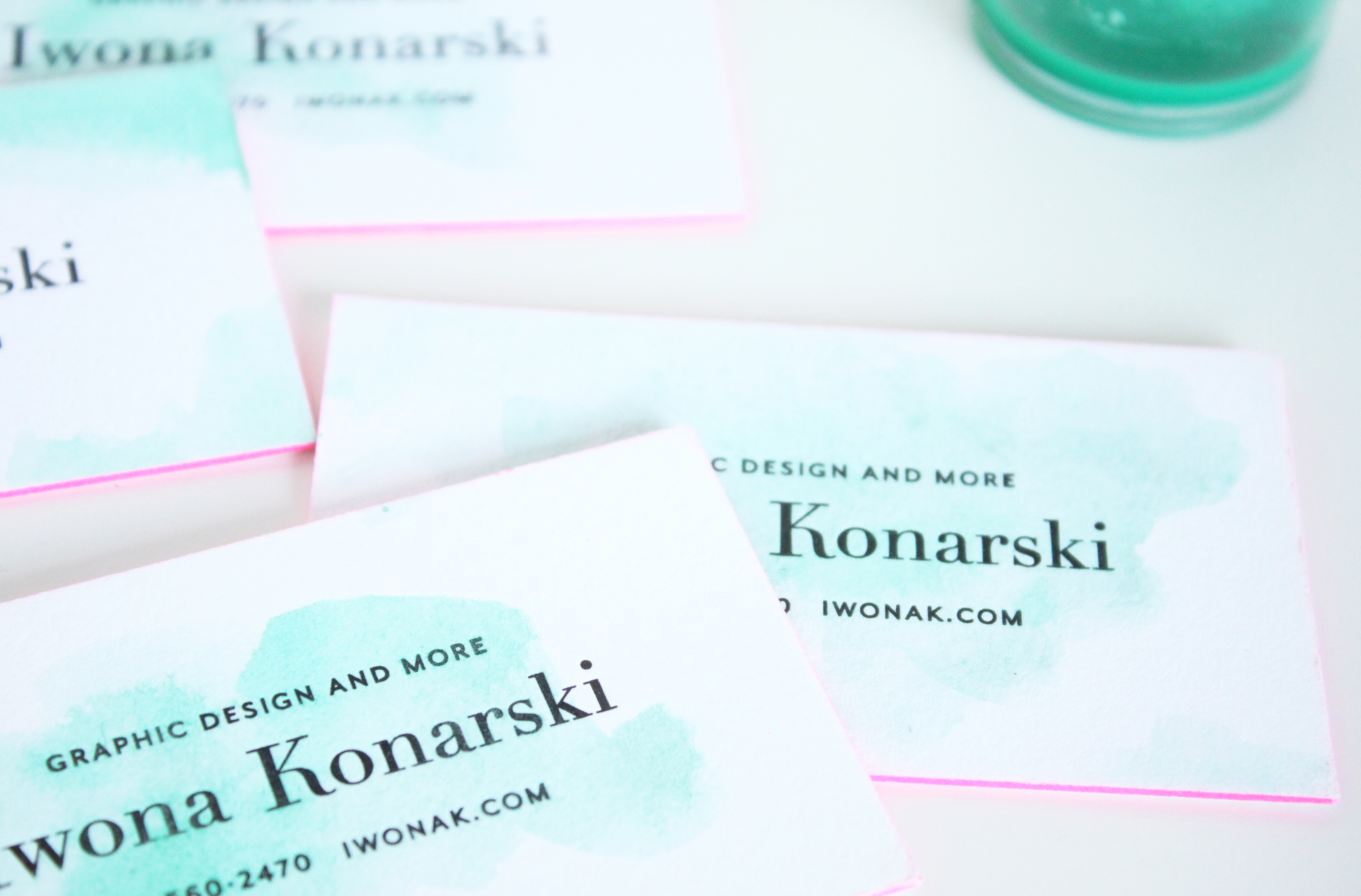
I’ve been loving my business cards since they day I got them, but once in a while I get the idea to “spice” them up somehow. I’ve wanted something simple, organic, something that wouldn’t overwhealm the classic design of my cards. So, yesterday while working with watercolors on the new wedding invitation, I’ve decided to carry on and add some colors to my cards. I went over each one with a touch of watercolor and I’m surprised how nicely letterpress paper takes watercolor. I love they way they’ve turned out, how each one is different and how the turquoise watercolor works with the letterpress and pink edges.

Letterpress + Watercolor + pink edge business cards | Design by IwonaK.comWatercolor and letterpress | business cards | Design by IwonaK.comWatercolor + pink edge letterpress business cards | Design by IwonaK.comLetterpress + Watercolor + pink edge business cards | Designed by IwonaK.com

Mood board | Wedding invitation | iwonak.com

This week has been really busy but so fun. I’m working on new wedding invitations design and I’m so excited about this new direction. Layers, textures, watercolor – can’t get any better than this. Here are few little snippets from the process.

Wedding mood board | Invitation design in progress | iwonak.comMood board | wedding collection | by iwonak.com

Kendal & Jim's wedding featured in Seattle Met Bride and Groom magazine. | Florals by Finch & Thistle Event Design | Photography by Catherine Abegg | Stationery by Iwona Konarski

Seattle themed wedding invitations | Finch and Thistle event design | Catherine Abegg photography | Iwona Konarski wedding invitations and collateral

So fun to see a Seattle themed wedding invitations I designed last summer for Kendal & Jim in the Seattle Met Bride and Groom magazine. I finally got my hands on the newest edition and voila, now I can proudly share it. The main invitation is letterpressed in navy and yellow ink on eco friendly paper. I love how it turned out and can’t wait to share more. You can view more beautiful images from this wedding here.


Floral and event design: Finch & Thistle Event Design  | Photography: Catherine Abegg

Letterpress Wedding Invitation in Silver Ink -| #letterpress #weddinginvitations #wedding #weddingstationery #stationery #silver #letterpresed #iwonak #print #weddingcollateral #iwonak.com


#tbt to my first wedding invitation. I’ve designed it and printed it for my friends who this year celebrated their 10th wedding anniversary. It was a fun but very time consuming project and I got to do it all manually, no computer involved. I worked with a vintage raised metal type that I set in the composing stick, setting letter by letter, line by line. It took me at least 3 attempts to find the type with complete alphabet that had all the letters I needed that weren’t damaged (“a’s” were always needed!) and yet I had to compromise on the ampersand that doesn’t match ;) I have to say I still like this invitation and it’s imperfections and how modern it looks given the traditional way of designing and printing it.

It has been Christmas in July and August in my design world lately. I have entered few designs for Minted’s That’s a Wrap! Personalizable Holiday Gift Wrap Challenge and two of my designs were picked out of 459 submissions. You can see both of them below. Both designs will be available in few color ways and with matching scalloped sticker and a gift tag. Stay tuned, I’ll let you know as soon as they’re available for purchase.

Overlapping | Personalized holiday gift wrapping paper by IwonaK for Minted  // #print #giftwrap #minted #iwonakforMinted #hohoho #giftwrapping #holidaygift #iwonak

Glitter and Dots Personalizable Wrapping Paper available at Minted  // Designed by IwonaK for Minted

Here’s a peak at a recently wrapped up wedding collateral. This custom map not only captured the spirit and look of the wedding but also introduced the guests to the location of the wedding ceremony and reception. It’s always such a great idea to show a smaller area, a close-up view of the location. I’ll be sharing more images from this fun wedding invitation suite in the next few months.

Custom wedding map and wedding stationery by IwonaK.com Custom wedding map by IwonaK.com

Ombre split ink letterpress invitations by iwonak.com |  #ombre #vellumenvelopes #letterpress #splitink #invitation #galainvitation #iwonak #seattledesigner #seattlestationery #seattleweddinginvitations #wedding #stationery #vellum

split-ink-letterpress-invitations-by-iwonak.com |  #ombre #letterpress #splitink #invitation #galainvitation #iwonak #seattledesigner #seattlestationery #seattleweddinginvitations #wedding #stationeryOmbre split ink letterpress invitations by iwonak.com |  #ombre #vellumenvelopes #letterpress #splitink #invitation #galainvitation #iwonak #seattledesigner #seattlestationery #seattleweddinginvitations #wedding #stationery #vellum

split ink letterpress invitations by iwonak.com |  #ombre #letterpress #splitink #invitation #galainvitation #iwonak #seattledesigner #seattlestationery #seattleweddinginvitations #wedding #stationery #vellumOmbre split ink letterpress invitations by iwonak.com |  #ombre #vellumenvelopes #letterpress #splitink #invitation #galainvitation #iwonak #seattledesigner #seattlestationery #seattleweddinginvitations #wedding #stationery #vellum #closeupOmbre split ink letterpress invitations by iwonak.com |  #ombre #savethedate #letterpress #splitink #invitation #galainvitation #iwonak #seattledesigner #seattlestationery #seattleweddinginvitations #wedding #stationery

Have you heard of split ink? I haven’t until a few months ago when I spotted some inspirations on Pinterest. Of course, I had to try it! Ombre has been such an influence in fashion I had to try it on paper. Perfect project came along and voila! The most awesome ombre gala invitations are here. They are slightly larger than standard invitation (A8) as I felt the floral illustrations and the amount of text needed some room to breath.

I designed the invitations to be printed with a split ink fountain using yellow and red inks which blended to a bright orange in the middle – check them out below, the results are stunning. To maximize the drama I  paired them with orange vellum envelopes and really love how they grab the the attention.