Tag Archives: art direction

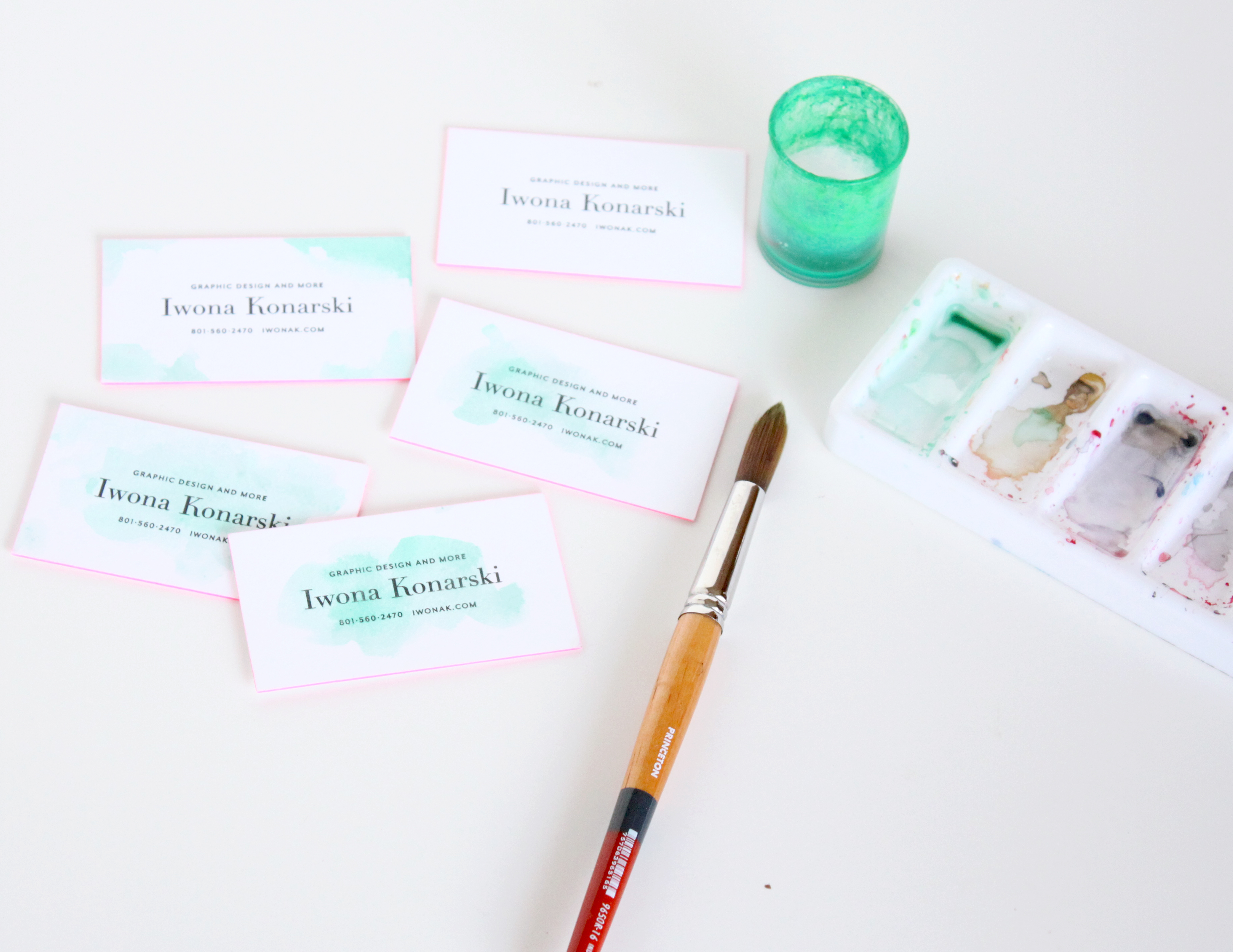
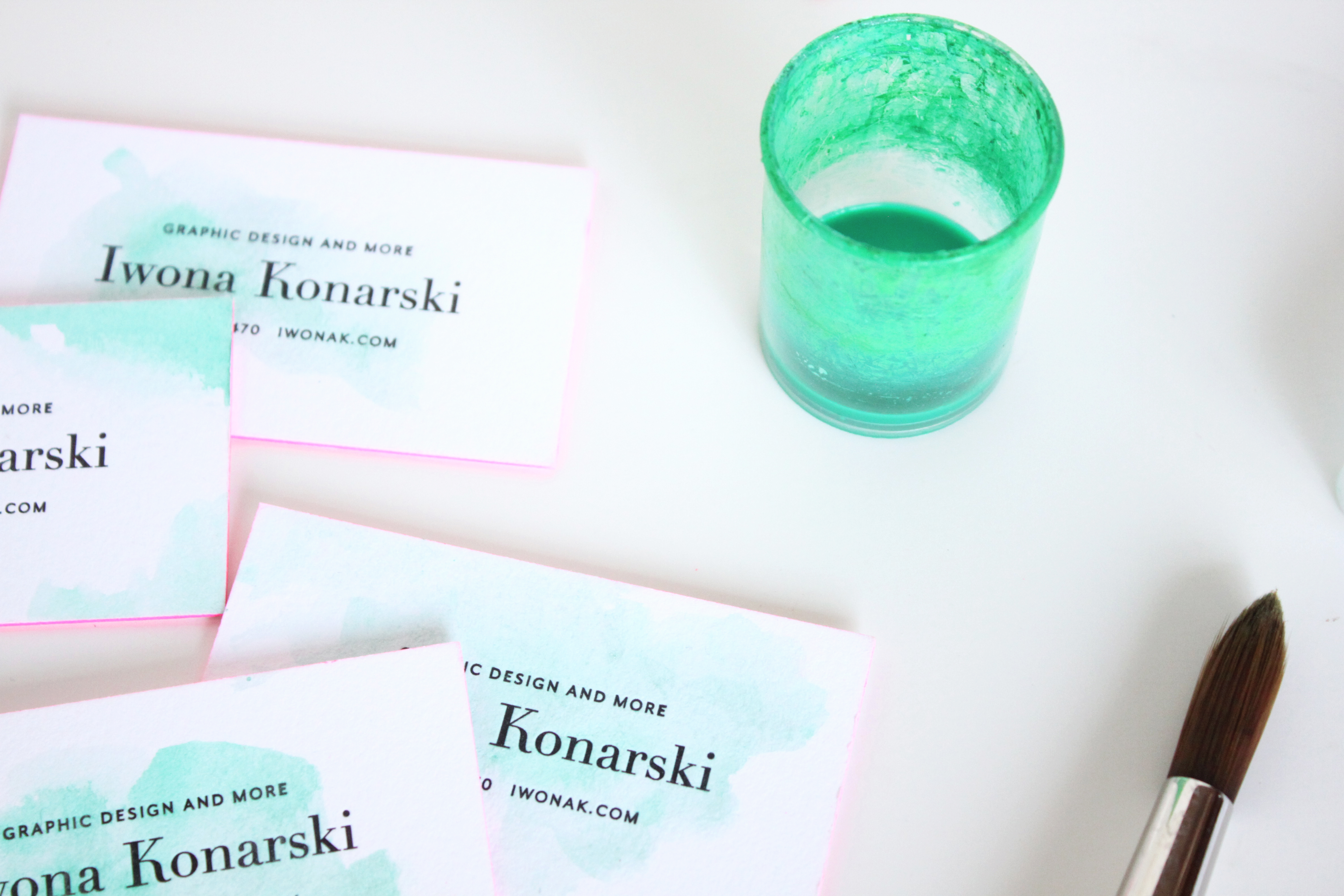
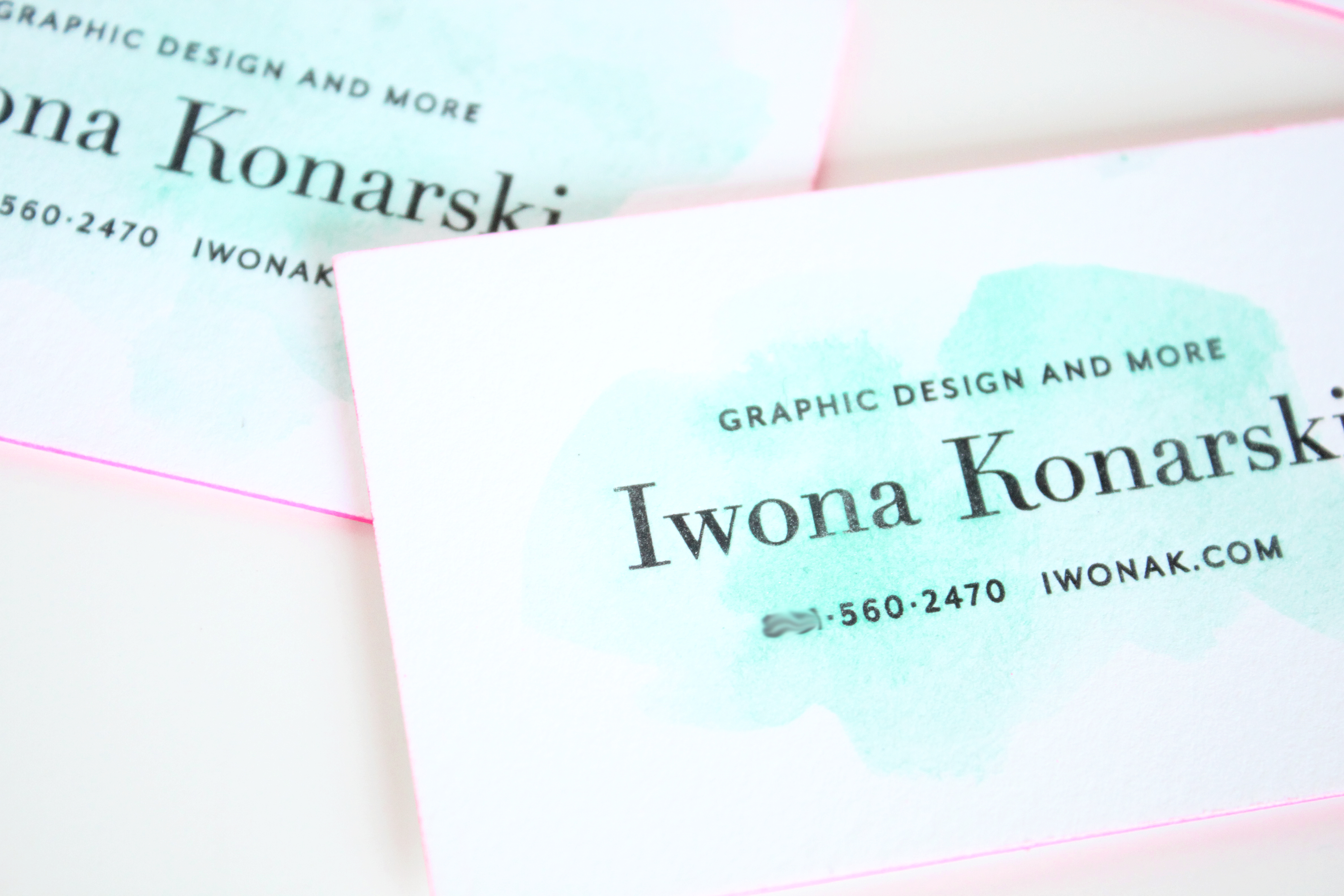
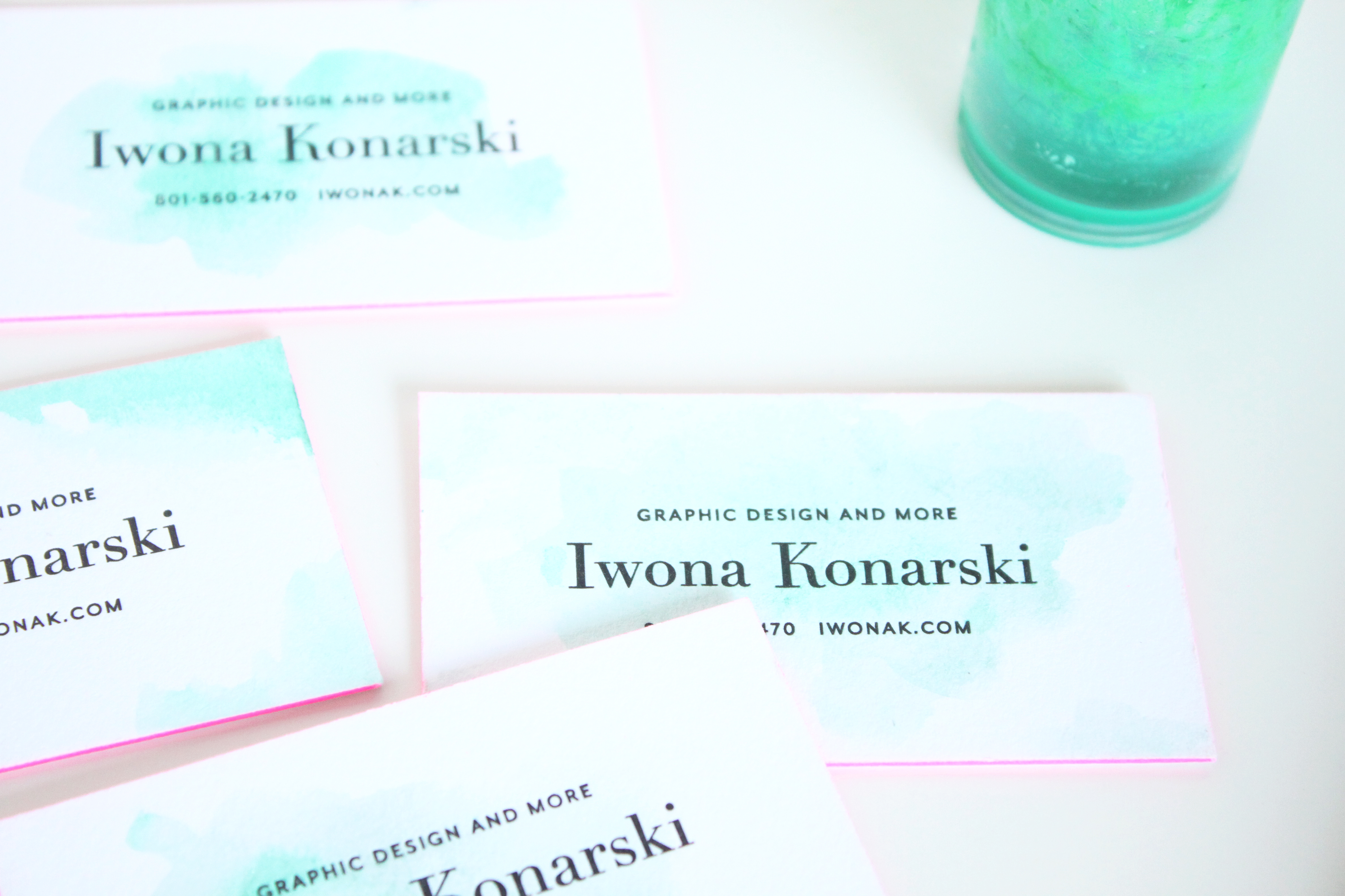
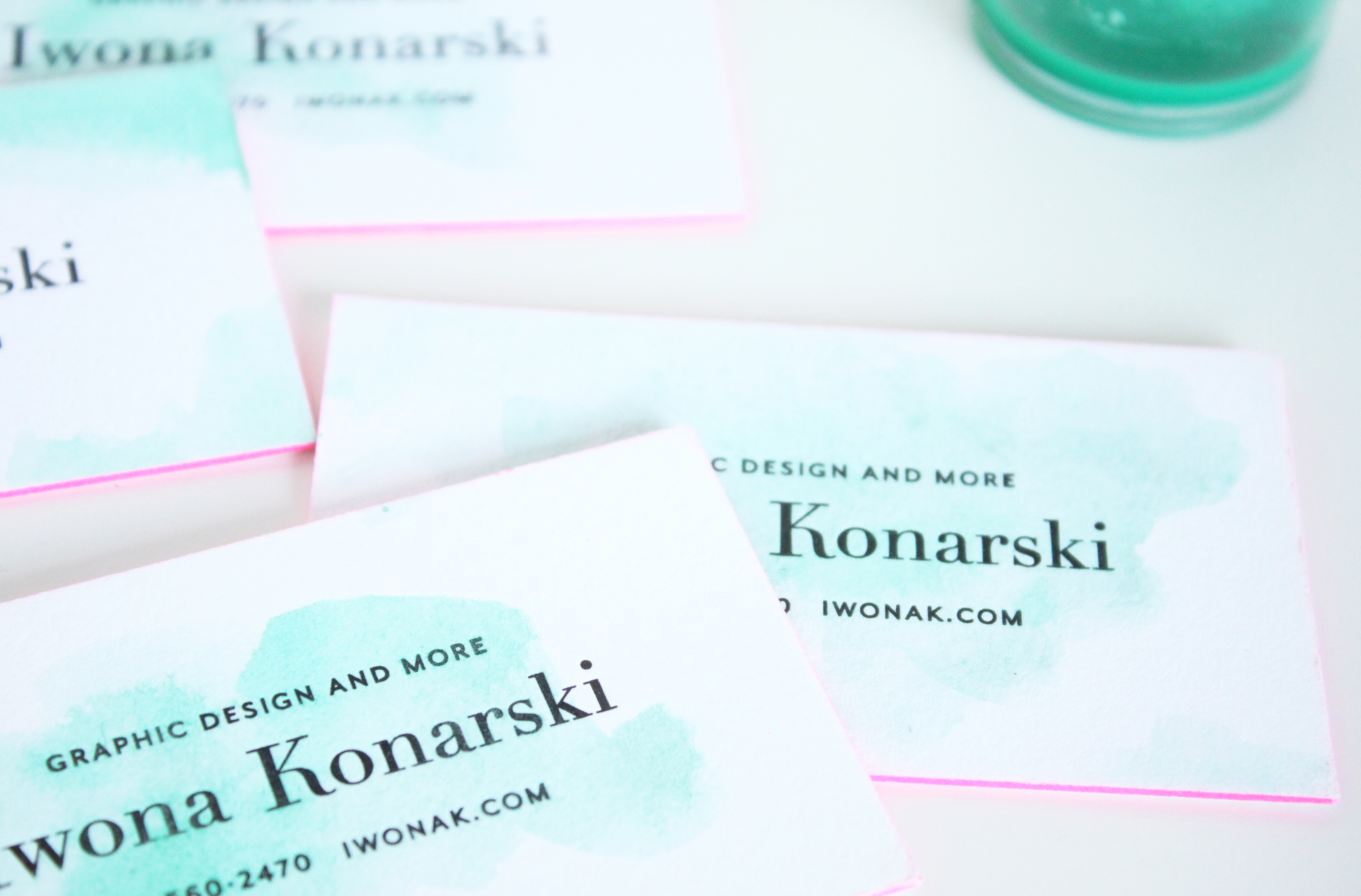
Letterpress + Turquoise Watercolor + pink edge business cards | Design by IwonaK.com

I’ve been loving my business cards since they day I got them, but once in a while I get the idea to “spice” them up somehow. I’ve wanted something simple, organic, something that wouldn’t overwhealm the classic design of my cards. So, yesterday while working with watercolors on the new wedding invitation, I’ve decided to carry on and add some colors to my cards. I went over each one with a touch of watercolor and I’m surprised how nicely letterpress paper takes watercolor. I love they way they’ve turned out, how each one is different and how the turquoise watercolor works with the letterpress and pink edges.

Letterpress + Watercolor + pink edge business cards | Design by IwonaK.comWatercolor and letterpress | business cards | Design by IwonaK.comWatercolor + pink edge letterpress business cards | Design by IwonaK.comLetterpress + Watercolor + pink edge business cards | Designed by IwonaK.com

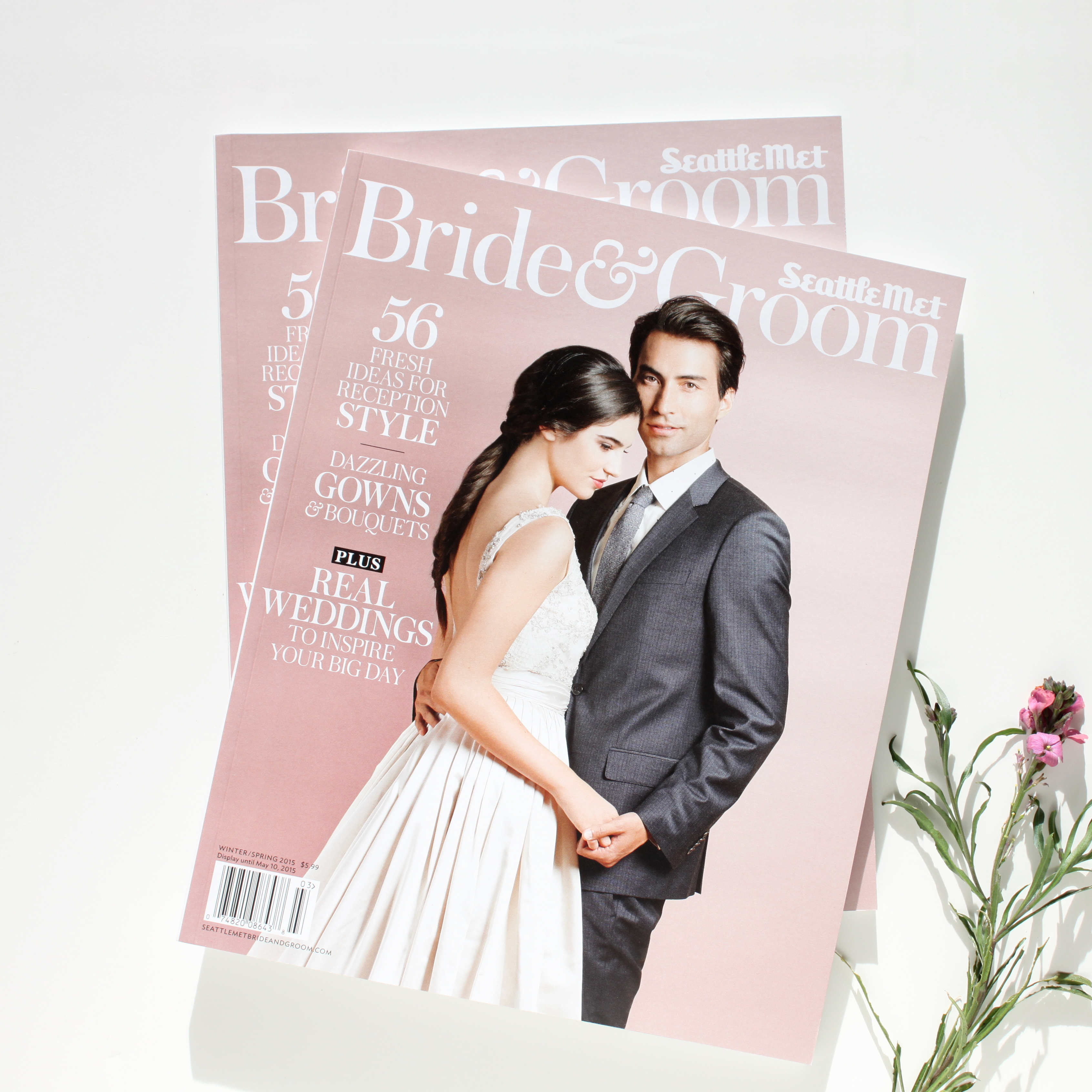
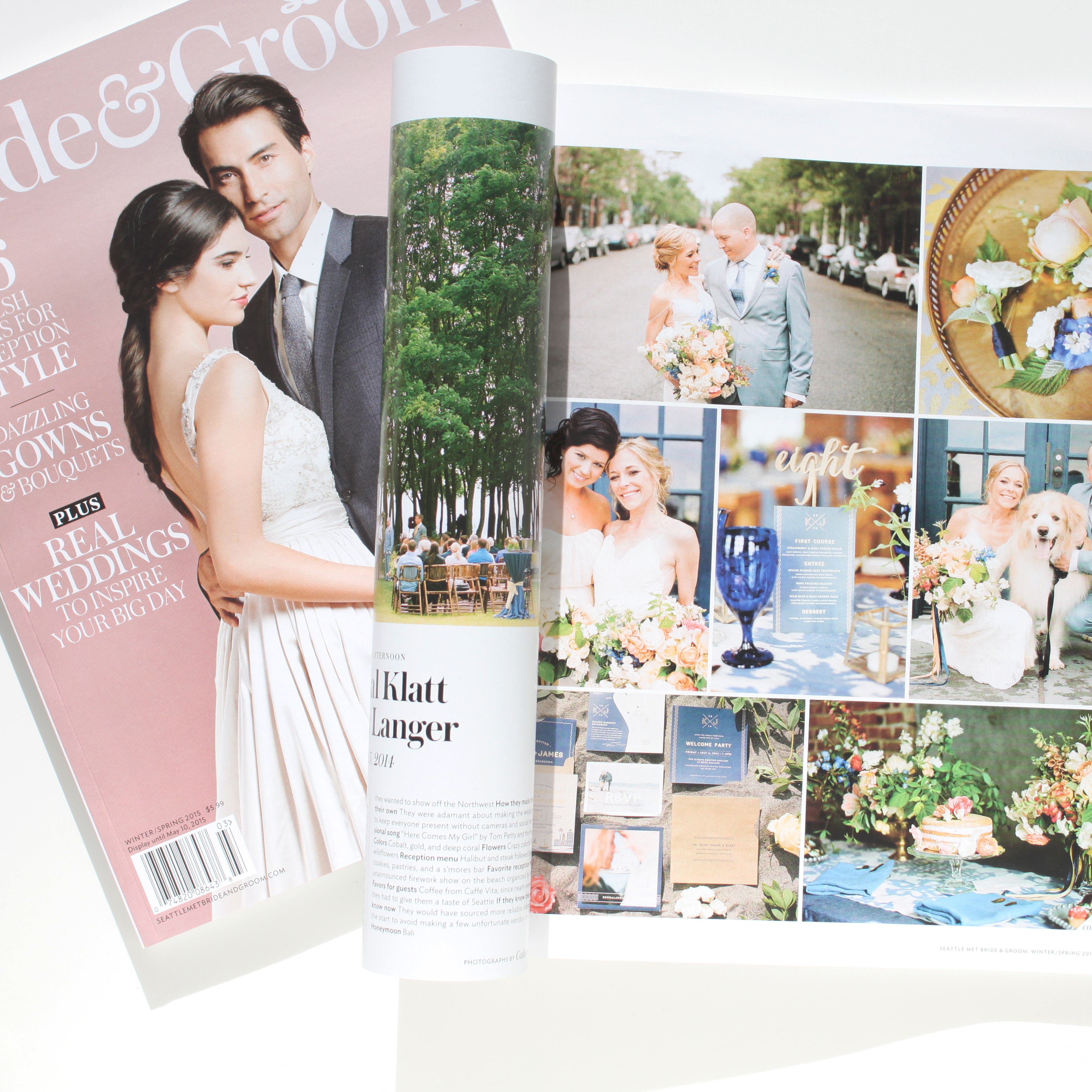
Kendal & Jim's wedding featured in Seattle Met Bride and Groom magazine. | Florals by Finch & Thistle Event Design | Photography by Catherine Abegg | Stationery by Iwona Konarski

Seattle themed wedding invitations | Finch and Thistle event design | Catherine Abegg photography | Iwona Konarski wedding invitations and collateral

So fun to see a Seattle themed wedding invitations I designed last summer for Kendal & Jim in the Seattle Met Bride and Groom magazine. I finally got my hands on the newest edition and voila, now I can proudly share it. The main invitation is letterpressed in navy and yellow ink on eco friendly paper. I love how it turned out and can’t wait to share more. You can view more beautiful images from this wedding here.


Floral and event design: Finch & Thistle Event Design  | Photography: Catherine Abegg

Exercise | Fitness | Fashion |  Mood Board |  by IwonaK.com

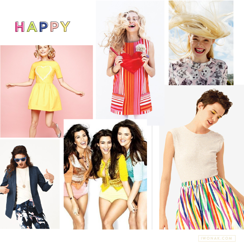
I’m really excited to show you the moodboards I’ve been working on with one of my sweet clients. While I absolutely love wall mounted inspiration boards, creating them digitally is so much easier and faster. I create digital mood boards for most projects. All my branding, collateral or wedding stationery project always, always start with a mood board. I love them. They help me define the visual direction of a brand, sort through my ideas and show clients my creative vision. They act as a guideline and they help with brand consistency.

A mood board is a combination of imagery, typography, colors and textures that define the style of the project and serve as a reference point. It is a tool for creatives and clients that conveys a design idea, moods, feelings and direction that are hard to communicate. For me, the mood boards are incredible tools in my work with clients. They help me think big and guide me along the way.  Check them out.


Sunnies | Fashion | Summer Fun | Mood Board by IwonaK.com

Happy | Color | Style | Mood Board by IwonaK.com

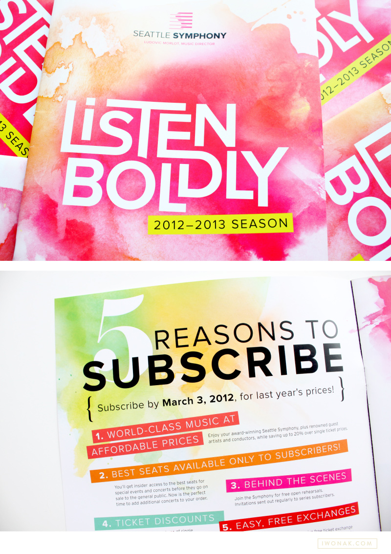
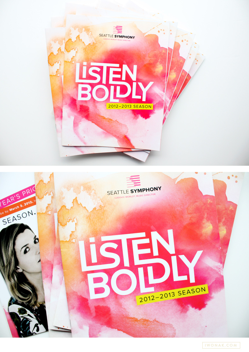
1213 Seattle Symphony brochure cover by Iwona Konarski

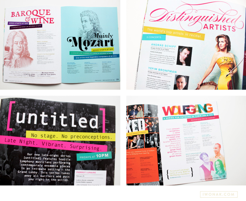
1213 Seattle Symphony brochure inside pages by Iwona Konarski

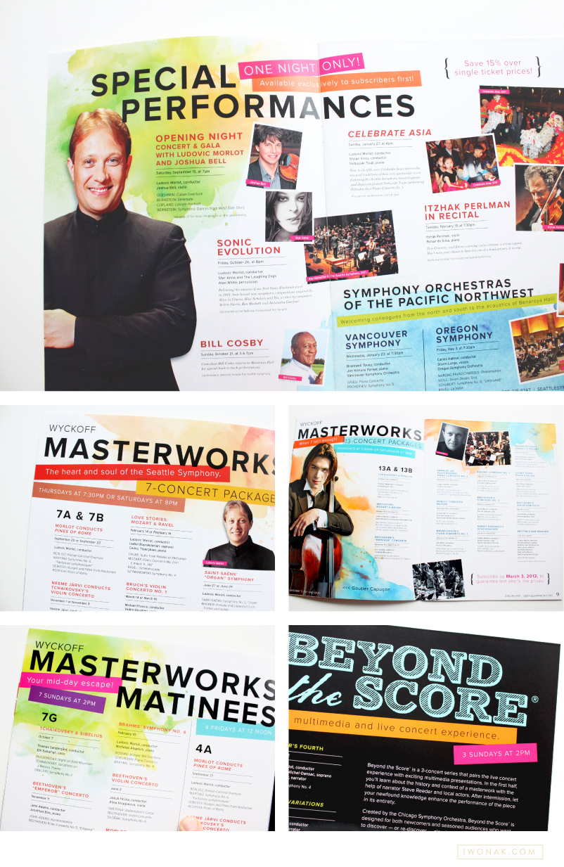
1213 Seattle Symphony brochure pages by Iwona Konarski

Today, I wanted to share with you a brochure I recently completed for the Seattle Symphony. You can see a sneak preview of it here. On the cover I featured the Symphony’s tagline – Listen Boldly – which was designed as a logo and paired with artsy watercolor. The mood for this season was joyful, romantic, welcoming with bold typography, bright color palette and large artist photos. Turns out, working with color makes me so excited! Working on something this cheery was definitely refreshing and it will be so much fun for the remaining of the season. I had lots of fun with watercolors and this whole do-it-yourself thing was a blast. This was a really fun project to work on and it might be my favorite design to date.

Simon Woods, Seattle Symphony Executive Director, calls this season “… a simply sensational season. … The programing is inspiring, innovative and stimulating, and with a big emphasis on informality and accessibility. … another exciting validation of the tremendous energy that we and so many others are experiencing under Ludovic Morlot’s leadership.” Looks like 2012-2013 season will be amazing! Please come to Benaroya Hall to listen to fantastic music and check my designs in person.

To see the whole brochure head over to issuu.
1213 Seattle Symphony Season Brochure Cover and Inside pages

I thought I’d pop in and share with you a sneak of this brochure! Just got it back from the printer and I’m thrilled to finally have it in my hands. It’s so bright and colorful and sooo different than anything I have done in the past. It’s been my life for the last few months – in the making since September! I promise to take more photos and published them here soon. See ya!

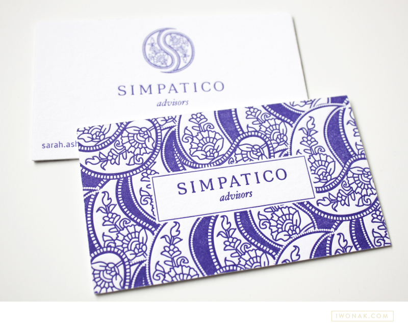
Hooray! I finally get to share newly completed project – Sarah’s new letterpress business cards. I just received my samples from the print shop and wow! They are striking. The cards feature one PMS color and are double-side printed on 600gsm Crane Lettra stock. Simple typography, unique logo and detailed yet elegant pattern allow these letterpress business cards to speak for themselves.

Simpatico-Letterpress-Business-Cards-branding-by-IwonaK.com

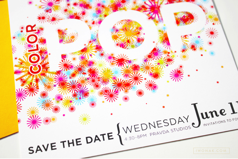
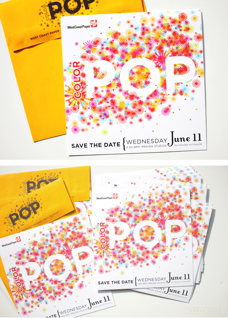
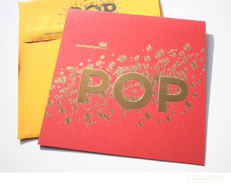
Corporate event invitations | Designed by Iwona Konarski #invitation #design #stationery #details #color #event #iwonak.com

Corporate event invitations | Designed by Iwona Konarski #invitation #design #stationery #details #color #event #iwonak.comGold foil corporate event invitations | Designed by Iwona Konarski #gold #foil #invitation #design #stationery #details #event #iwonak.com

Few months ago, I completed this fun save the date and invitation for West Coast Paper Company. I kept the save the date fun, bright and full of color. I am the most excited about the gold foil on red paper, which was also embossed. I had fun blingin this one out a bit – foil is my latest obsession and I’ll be sure to print foil again.