Tag Archives: seattle graphic designer

Exercise | Fitness | Fashion |  Mood Board |  by IwonaK.com

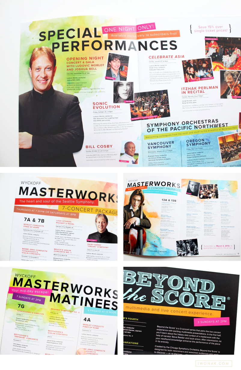
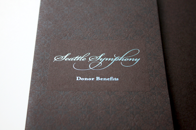
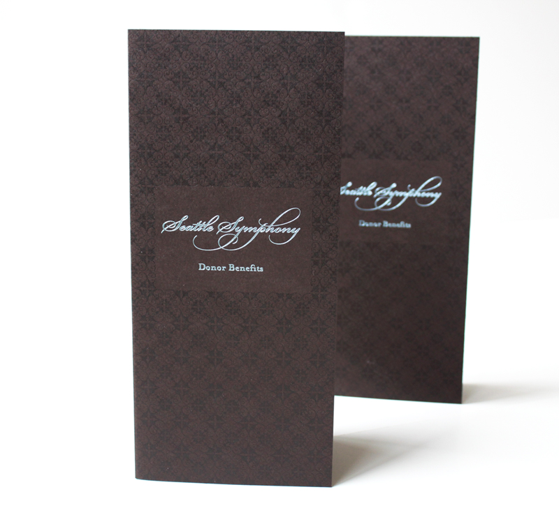
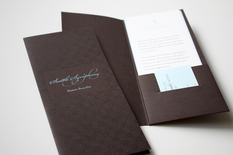
I’m really excited to show you the moodboards I’ve been working on with one of my sweet clients. While I absolutely love wall mounted inspiration boards, creating them digitally is so much easier and faster. I create digital mood boards for most projects. All my branding, collateral or wedding stationery project always, always start with a mood board. I love them. They help me define the visual direction of a brand, sort through my ideas and show clients my creative vision. They act as a guideline and they help with brand consistency.

A mood board is a combination of imagery, typography, colors and textures that define the style of the project and serve as a reference point. It is a tool for creatives and clients that conveys a design idea, moods, feelings and direction that are hard to communicate. For me, the mood boards are incredible tools in my work with clients. They help me think big and guide me along the way.  Check them out.


Sunnies | Fashion | Summer Fun | Mood Board by IwonaK.com

Happy | Color | Style | Mood Board by IwonaK.com

Our Holiday Cards 2013 watercolor calligraphy

Our Holiday Cards 2013 envelope calligraphy


Our Holiday Cards 2013 watercolor calligraphy closeup

Time to send out our holiday cards! Our holiday cards arrived from the print shop today and I couldn’t be more excited! I have already addressed all the envelopes and all I have to do now is write few wishes on the back side, seal the envelopes and make a trip to the post office. For the record, this has never happened before. I am usually so late that our cards arrive between Christmas and New Year.

This year, I kept the design simple with few favorite pictures our family (pup included) and my watercolor calligraphy. I also hand addressed all envelopes, practicing my calligraphy. The biggest challenge was the sparkly paper which makes the ink bleed with too much pressure. But they turned out pretty enough to send.

Happy 2013

I am more than ready to say goodbye to 2012 and hello to 2013! It has been a very, very busy year and I’m looking forward to 2013. I plan to relax, work less (is it even possible?!) and just have fun. Wishing you a very Happy New Year. May 2013 be filled with love, joy and happiness.

Cheers to 2013!

Every year Pantone selects an outstanding color of the year. This year, the color of the year for 2013 is Emerald. A color that Pantone describes as: “Most often associated with brilliant, precious gemstones, the perception of Emerald is sophisticated and luxurious. Since antiquity, this luminous, magnificent hue has been the color of beauty and new life in many cultures and religions. Also the color of growth, renewal and prosperity, no other color conveys regeneration more than green. For centuries, many countries have chosen green to represent healing and unity.”

Even though it is the color of my eyes, it is not my favorite color… Maybe because our first house was covered in emerald green carpet and it was just too much? After looking at all the beautiful inspirations, I have to say that I’m beginning to like it. I could definitely see myself wear it as a pop of color.

Color-of-the-year-emerald-green

Credits: NAILS: Visit harpersbazaar.com  //  THE CUFF  Charlene K Emerald Agate Cuff, $172; # //  THE HEEL  Patrizia Pepe Metallic Pumps, $383; forzieri.com  //  THE SATCHEL  Jil Sander New Malavoglia Bag, $1,760; net-a-porter.com  //  THE BRACELET  Vita Fede Mini Titan Stone Bracelet $375.00; shopbop.com  // THE NAIL POLISH: Essie’s Going Incognito $8.50; nordstrom.com  // THE iPHONE CASE amazon.com 


1213 Seattle Symphony brochure cover by Iwona Konarski

1213 Seattle Symphony brochure inside pages by Iwona Konarski

1213 Seattle Symphony brochure pages by Iwona Konarski

Today, I wanted to share with you a brochure I recently completed for the Seattle Symphony. You can see a sneak preview of it here. On the cover I featured the Symphony’s tagline – Listen Boldly – which was designed as a logo and paired with artsy watercolor. The mood for this season was joyful, romantic, welcoming with bold typography, bright color palette and large artist photos. Turns out, working with color makes me so excited! Working on something this cheery was definitely refreshing and it will be so much fun for the remaining of the season. I had lots of fun with watercolors and this whole do-it-yourself thing was a blast. This was a really fun project to work on and it might be my favorite design to date.

Simon Woods, Seattle Symphony Executive Director, calls this season “… a simply sensational season. … The programing is inspiring, innovative and stimulating, and with a big emphasis on informality and accessibility. … another exciting validation of the tremendous energy that we and so many others are experiencing under Ludovic Morlot’s leadership.” Looks like 2012-2013 season will be amazing! Please come to Benaroya Hall to listen to fantastic music and check my designs in person.

To see the whole brochure head over to issuu.

Benefits folder letterpress printed in clear ink and blue foil  |  Design and art direction by Iwona Konarski @iwonak.com | #branding #collateral #print #layout #letterpress #foil #iwonak.comBenefits folder letterpress printed in clear ink and blue foil  |  Design and art direction by Iwona Konarski @iwonak.com | #branding #collateral #print #layout #letterpress #foil #iwonak.comBenefits folder letterpress printed in clear ink and blue foil  |  Design and art direction by Iwona Konarski @iwonak.com | #branding #collateral #print #layout #letterpress #foil #iwonak.com

I simply can’t resist the charm of a letterpressed collateral. These folders are part of Seattle Symphony’s Donor Benefits Collateral and are designed to hold multiple sheets of paper, the quantity depends on the membership level. Each folder is letterpress printed with a beautiful blind (no ink) impression for the pattern design and blue foil stamped for the logo.

It’s printed on Cambric Beckett stock in mahogany, which I really like for the touch of tooth to the finish and how it takes a beautiful, crisp impression. The inside pages were offset printed in custom brown and blue ink on Strathmore paper stock.