Tag Archives: blind letterpress

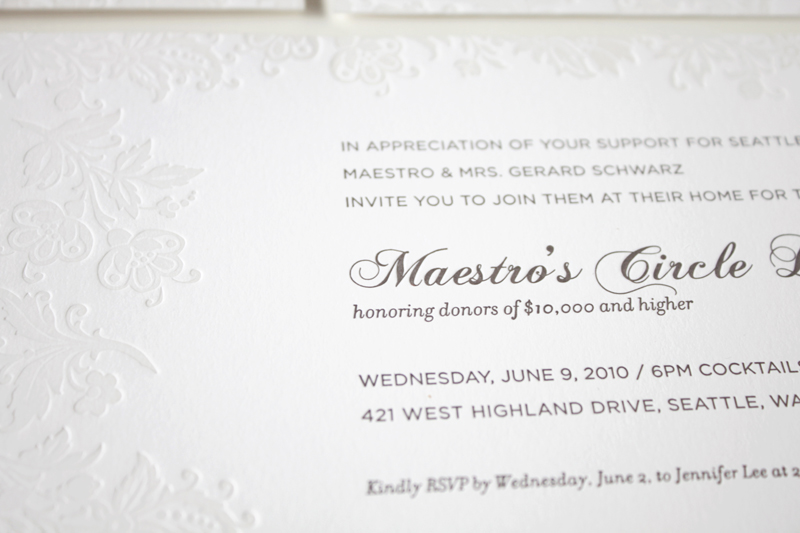
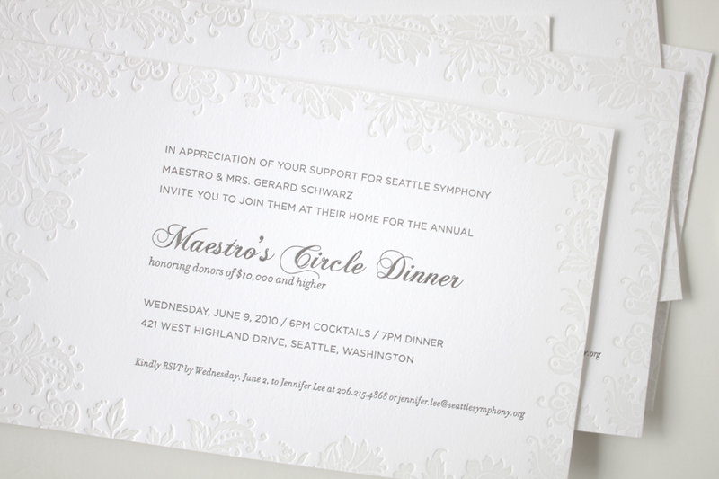
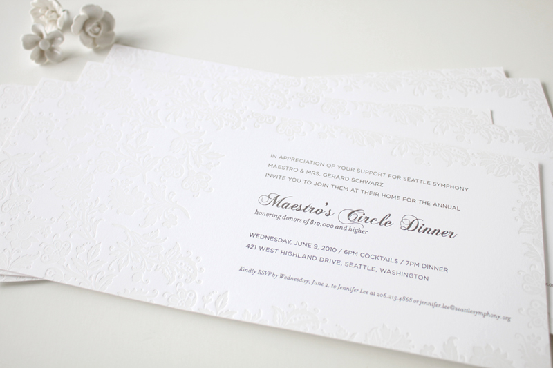
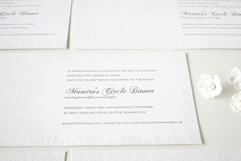
2 color #letterpress event invitation |  Designed by Iwona Konarski |  #invitation #letterpress #blindletterpress #eventstationery #stationery #branding #iwonak.com 2 color #letterpress event invitation |  Designed by Iwona Konarski |  #invitation #letterpress #blindletterpress #eventstationery #stationery #branding #iwonak.com blind #letterpress + warm grey pantone  |  event invitation designed by Iwona Konarski |  #invitation #letterpress #blindletterpress #eventstationery #stationery #branding #iwonak.com blind #letterpress + warm grey pantone  |  event invitation designed by Iwona Konarski |  #invitation #letterpress #blindletterpress #eventstationery #stationery #branding #iwonak.com

After spending the long weekend enjoy the sun, I thought I should get around to sharing this beautiful invitation. I designed it for the Symphony’s Maestro Circle Dinner – an annual affair that takes place at Maestro Schwarz’s house. Designing stationery for so many events is a perfect opportunity for me to try some printing that I haven’t done before, so this time I went with the combination of blind letterpress and warm grey ink on crisp white, heavy card stock. The blind letterpress is very beautiful but I wished I used pearl foil instead. It would give it a bit more shine and grandeur. I’ll definitely try it next time. And so far, this is my favorite invitation to date. Pretty, isn’t it?

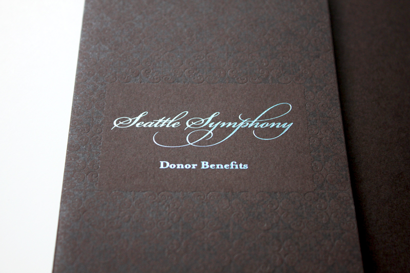
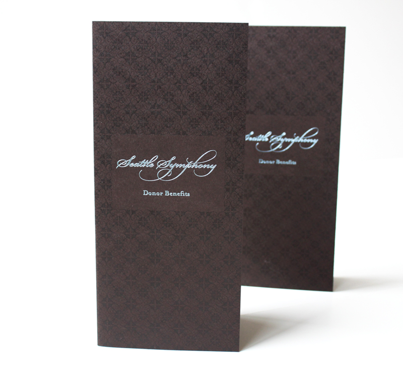
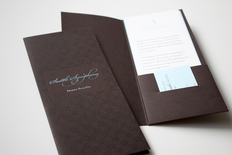
Benefits folder letterpress printed in clear ink and blue foil  |  Design and art direction by Iwona Konarski @iwonak.com | #branding #collateral #print #layout #letterpress #foil #iwonak.comBenefits folder letterpress printed in clear ink and blue foil  |  Design and art direction by Iwona Konarski @iwonak.com | #branding #collateral #print #layout #letterpress #foil #iwonak.comBenefits folder letterpress printed in clear ink and blue foil  |  Design and art direction by Iwona Konarski @iwonak.com | #branding #collateral #print #layout #letterpress #foil #iwonak.com

I simply can’t resist the charm of a letterpressed collateral. These folders are part of Seattle Symphony’s Donor Benefits Collateral and are designed to hold multiple sheets of paper, the quantity depends on the membership level. Each folder is letterpress printed with a beautiful blind (no ink) impression for the pattern design and blue foil stamped for the logo.

It’s printed on Cambric Beckett stock in mahogany, which I really like for the touch of tooth to the finish and how it takes a beautiful, crisp impression. The inside pages were offset printed in custom brown and blue ink on Strathmore paper stock.