
Tag Archives: iwonak.com
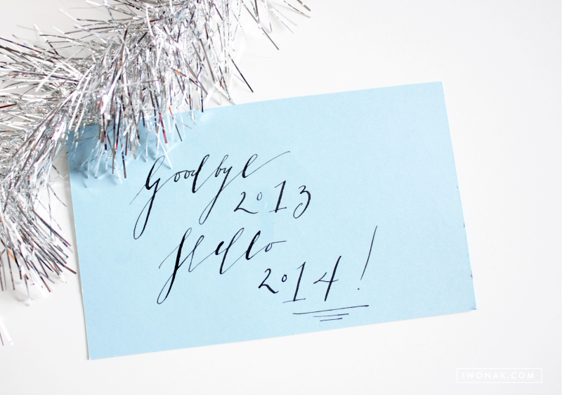
Happy 2014, everyone! What has happened to 2013? How did it go by so quickly? It was a total blur, yet it was a great year. For me, it was the year of change. I’ve quit my job and enjoyed spending more time with my precious little family. I am still working out my resolutions for this year but I know for sure the top priority is to focus on my family. I also want to get my life organized, get rid of clutter, exercise and eat better, spend less time in front of computer, and just start fresh. I am ready to take on the new year. And this year I will follow my dreams.
Cheers to 2014!
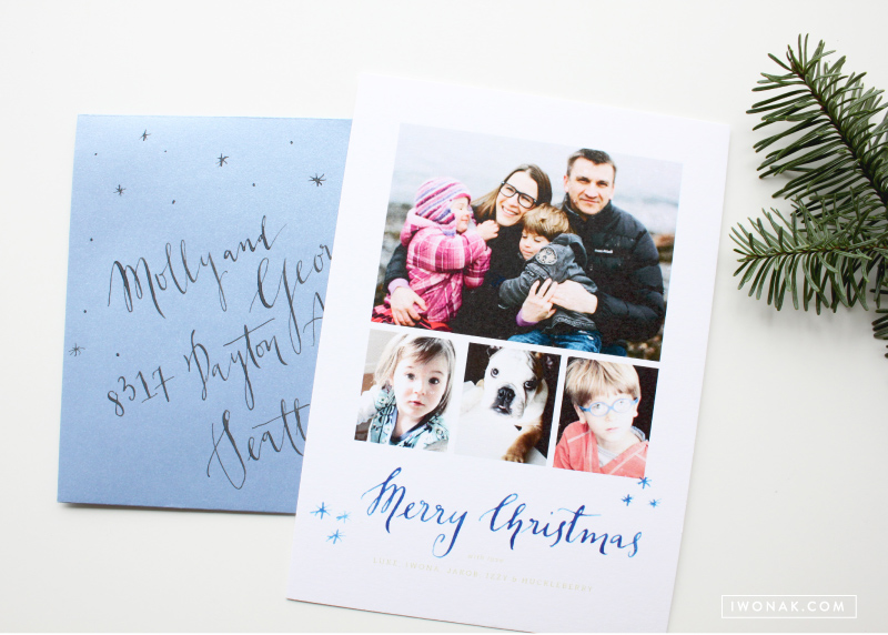
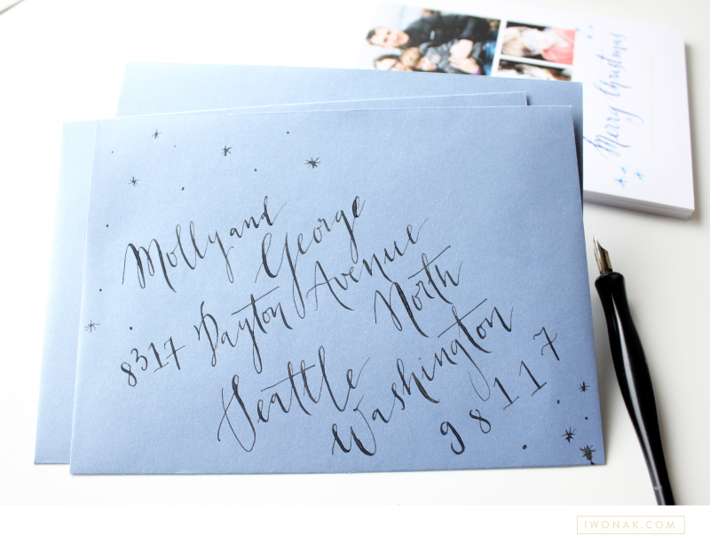
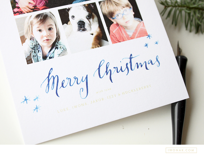
Time to send out our holiday cards! Our holiday cards arrived from the print shop today and I couldn’t be more excited! I have already addressed all the envelopes and all I have to do now is write few wishes on the back side, seal the envelopes and make a trip to the post office. For the record, this has never happened before. I am usually so late that our cards arrive between Christmas and New Year.
This year, I kept the design simple with few favorite pictures our family (pup included) and my watercolor calligraphy. I also hand addressed all envelopes, practicing my calligraphy. The biggest challenge was the sparkly paper which makes the ink bleed with too much pressure. But they turned out pretty enough to send.
A sneak peak at what I’m working on today… I promise more details soon.
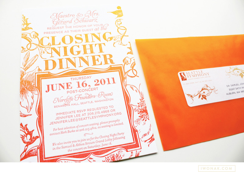
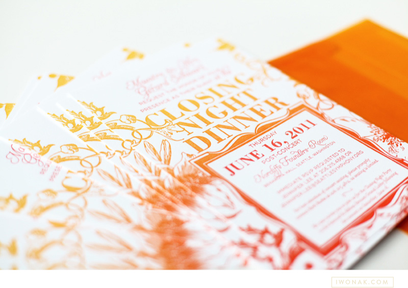
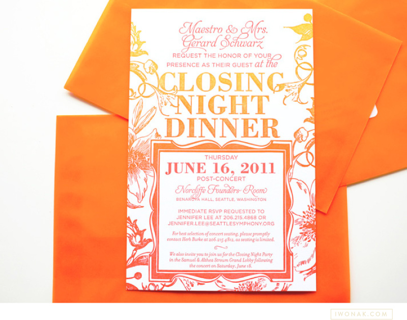
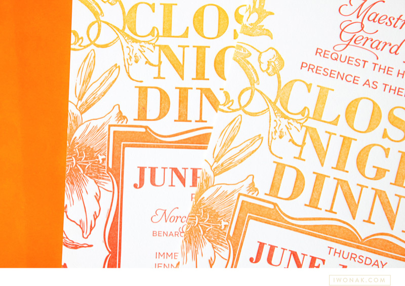
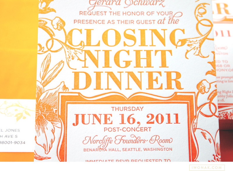
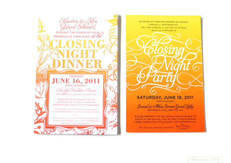
Have you heard of split ink? I haven’t until a few months ago when I spotted some inspirations on Pinterest. Of course, I had to try it! Ombre has been such an influence in fashion I had to try it on paper. Perfect project came along and voila! The most awesome ombre gala invitations are here. They are slightly larger than standard invitation (A8) as I felt the floral illustrations and the amount of text needed some room to breath.
I designed the invitations to be printed with a split ink fountain using yellow and red inks which blended to a bright orange in the middle – check them out below, the results are stunning. To maximize the drama I paired them with orange vellum envelopes and really love how they grab the the attention.
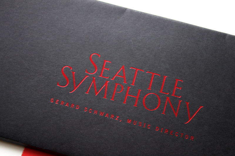
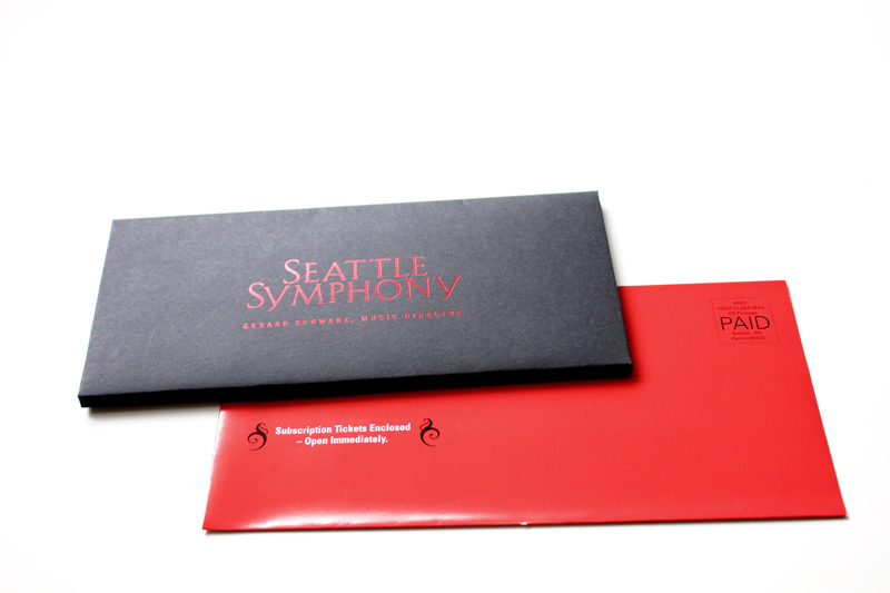
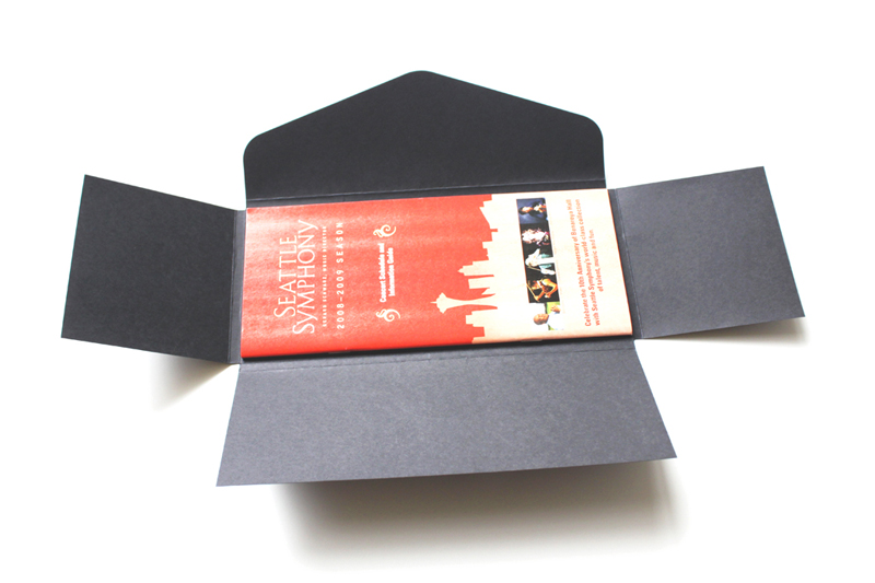
I thought I’ll share with you this project that I completed this summer. It’s too pretty not to share. It is a packaging for our season tickets. I’m absolutely in love with the shiny red foil on the cover – it is so pretty and so classic… I know foil stamping hasn’t been used much lately, but I really hope it will return. It’s so amazing, isn’t it?
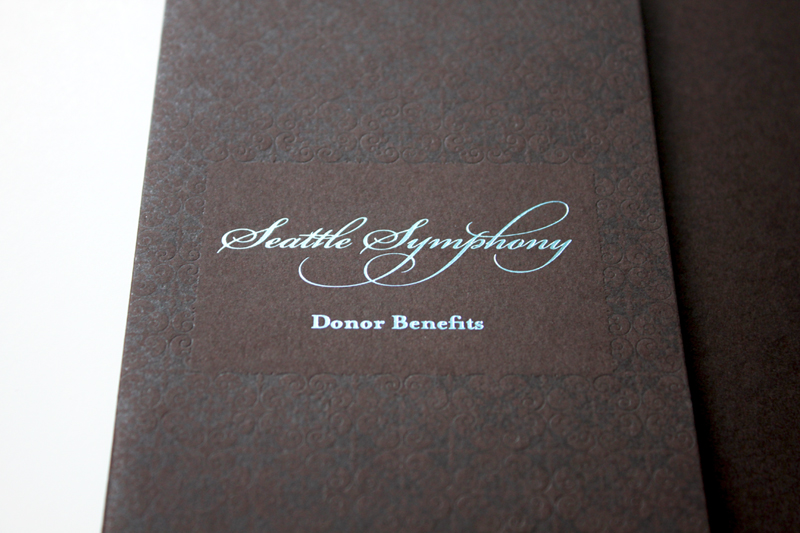
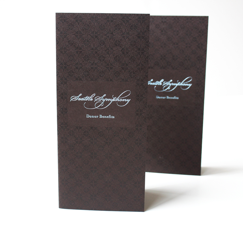
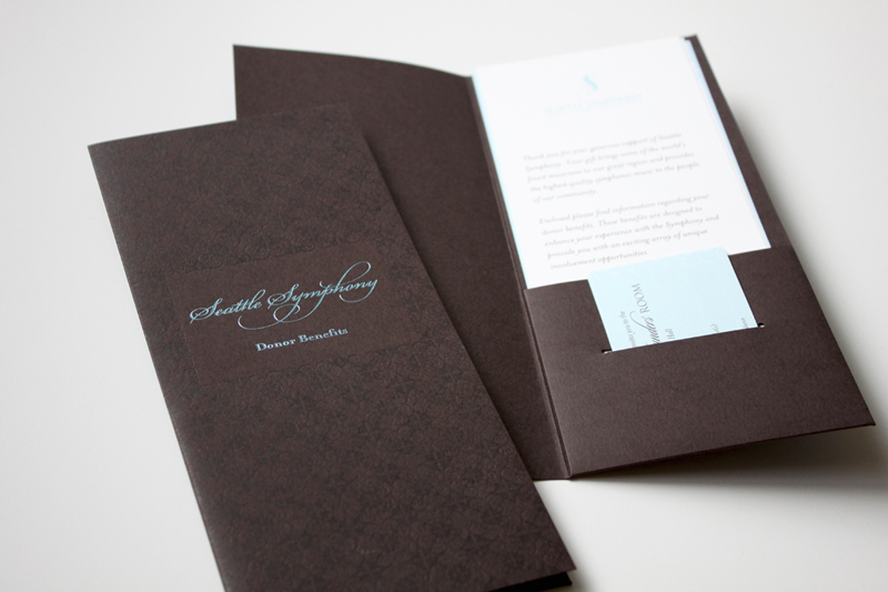
I simply can’t resist the charm of a letterpressed collateral. These folders are part of Seattle Symphony’s Donor Benefits Collateral and are designed to hold multiple sheets of paper, the quantity depends on the membership level. Each folder is letterpress printed with a beautiful blind (no ink) impression for the pattern design and blue foil stamped for the logo.
It’s printed on Cambric Beckett stock in mahogany, which I really like for the touch of tooth to the finish and how it takes a beautiful, crisp impression. The inside pages were offset printed in custom brown and blue ink on Strathmore paper stock.