Erin & Ryan’s wedding invitations just arrived from the shop! Here’s a quick photo from the studio today.More to come soon….
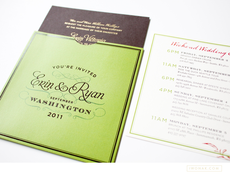
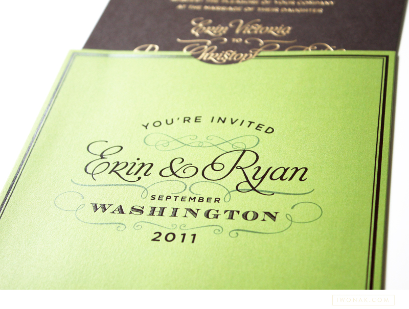
Erin & Ryan’s wedding invitations just arrived from the shop! Here’s a quick photo from the studio today.More to come soon….


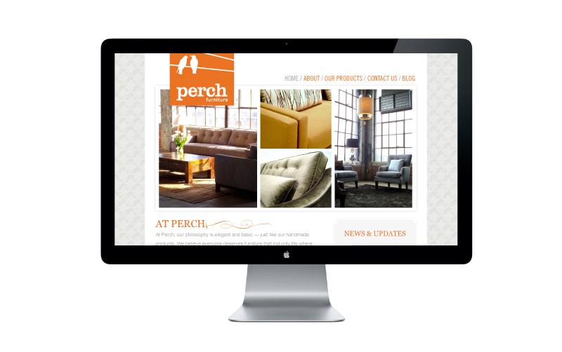
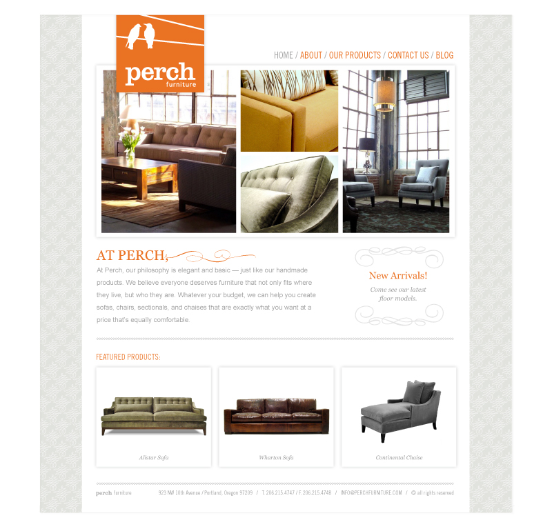
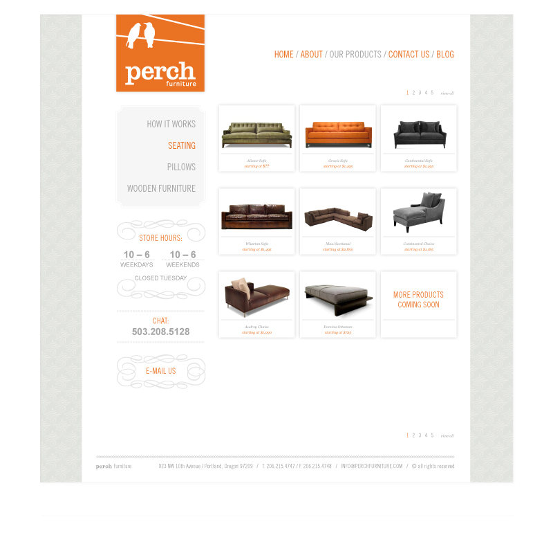
I’m excited to share with you a recent project that I’ve been working on for the past few months! I worked closely with Perch Furniture owner Willi Galloway on a design of her website. Perch Furniture is a custom sofa studio located in Portland, Oregon. Willi Galloway and her team is dedicated to helping customers create custom furniture (sofas and chairs) that fits their lifestyle and most importantly suits any budget. Almost everything in their store is custom. Made-to-order and built in the United States. I designed their website to showcase a sample selection of their offerings. I started with an existing logo and color palette and designed her website with a clean and functional layout.
I take on a limited number of web design projects each year. If you are interested in working with me please inquire about my schedule and pricing.
Hello everyone! Today I wanted to share with you my work for a magical inspiration shoot for Nonpareil magazine – a beautiful online publication that focuses on stylish, DIY projects and inspiration for weddings. Kathleen of Twig and Thistle created a mood board used as inspiration and picked Rachel of Finch and Thistle Events to select designers, photographers and stylists to bring the whole wedding theme to life. The “From Farm to Table” concept began with french country inspired details paired with pops of natural green and coral tones along with rustic wood and burlap surfaces. And the final results were unbelievably beautiful.
I was able to pull together a lovely decor pieces for this shoot. I created personalized napkin wrappers that also served as table cards, thank you labels for the wedding gifts and “Mr. and Mrs.” table runner template (spray painted by Rachel.) I can’t thank Rachel enough for asking me to contribute and a big thanks to the team that made this a reality!
Below are some shots from the article. To see even more details and download the table runner template be sure to check out the seventh issue of Nonpareil.
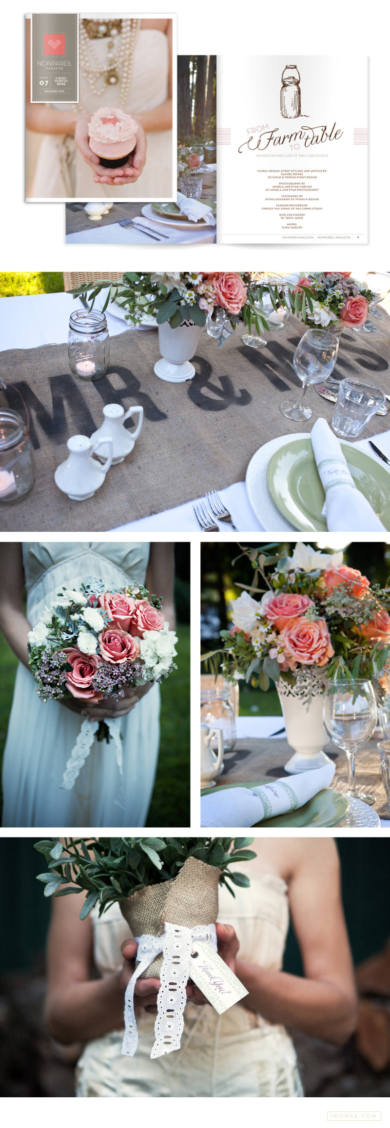
The amazing crew that put it all together: The floral and event styling by Rachel Bowes of Fitch & Thistle Event Design / Photography by Angel and Evan Carlyle of Angela & Evan Photography / Stationery by Iwona Konarski of IwonaK.com / Fashion and wardrobe provided by Chrissy Wai-Ching of Wai-Ching Studio / Hair and make up by Teryl Hawk / The georgeous model was Kara Saidler.
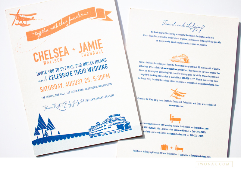
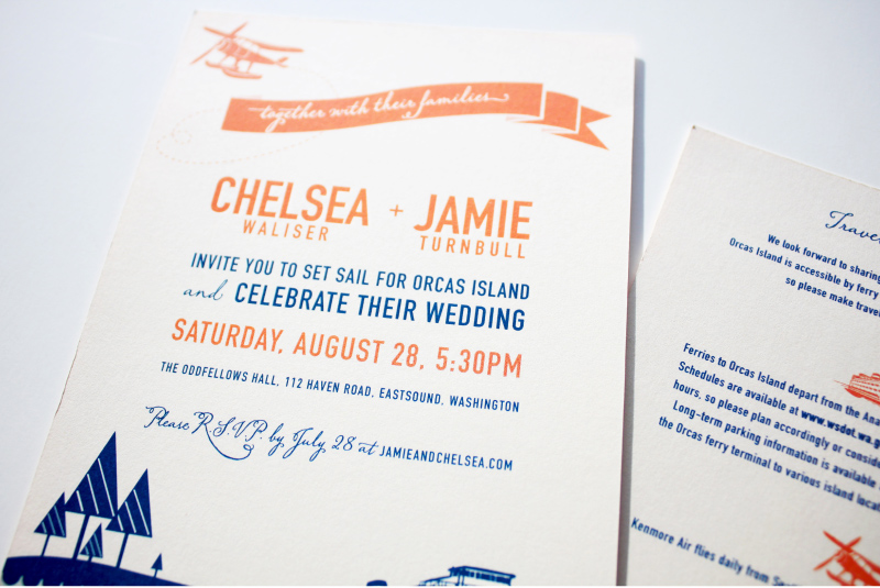
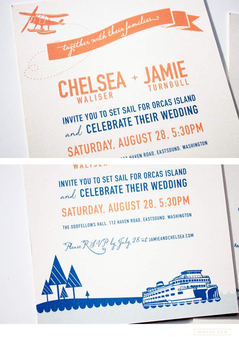
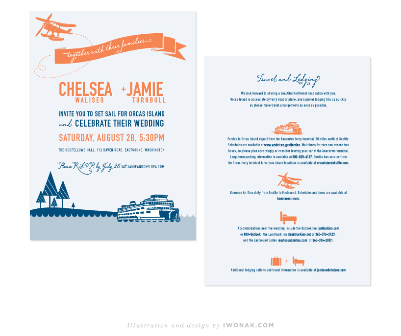
I’m a bit behind posting here but today I wanted to share the wonderful invitations for the wedding of Chelsea & Jamie. I was excited to be able to design their invitation suite, and I’m very happy with how they turned out. When Chelsea approached me about designing their invites she had a couple of basic ideas already in mind. She wanted to keep it simple, she wanted her colours to be orange and blue and she wanted to incorporate ferry boats and waves into the design. I took an illustrated approach and created this colorful nautical wedding invitation that’s a bit modern and fun with a fresh summer vibe. Because their budget was small, I had the invitations printed digitally on a heavy off–white stock.
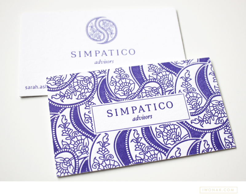
Hooray! I finally get to share newly completed project – Sarah’s new letterpress business cards. I just received my samples from the print shop and wow! They are striking. The cards feature one PMS color and are double-side printed on 600gsm Crane Lettra stock. Simple typography, unique logo and detailed yet elegant pattern allow these letterpress business cards to speak for themselves.
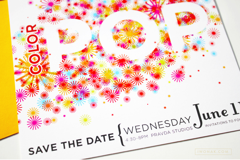
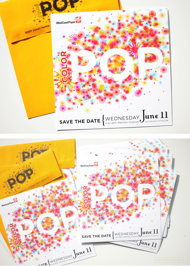
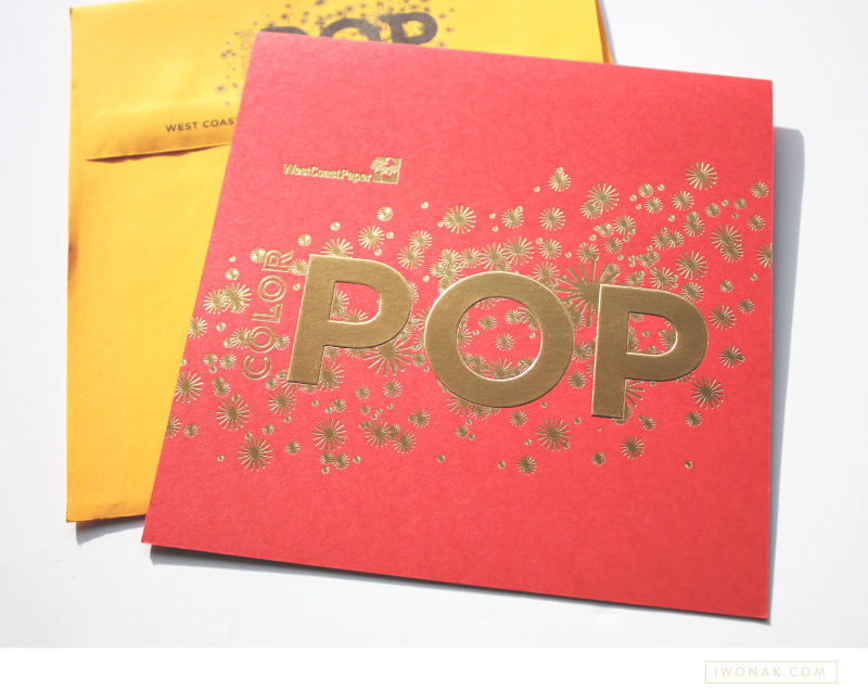
Few months ago, I completed this fun save the date and invitation for West Coast Paper Company. I kept the save the date fun, bright and full of color. I am the most excited about the gold foil on red paper, which was also embossed. I had fun blingin this one out a bit – foil is my latest obsession and I’ll be sure to print foil again.
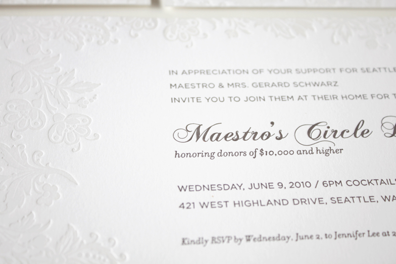
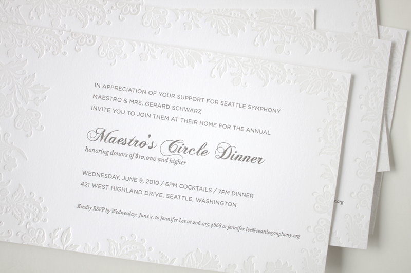
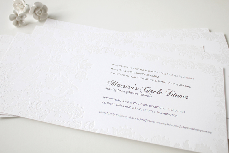
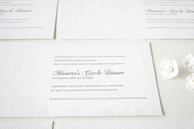
After spending the long weekend enjoy the sun, I thought I should get around to sharing this beautiful invitation. I designed it for the Symphony’s Maestro Circle Dinner – an annual affair that takes place at Maestro Schwarz’s house. Designing stationery for so many events is a perfect opportunity for me to try some printing that I haven’t done before, so this time I went with the combination of blind letterpress and warm grey ink on crisp white, heavy card stock. The blind letterpress is very beautiful but I wished I used pearl foil instead. It would give it a bit more shine and grandeur. I’ll definitely try it next time. And so far, this is my favorite invitation to date. Pretty, isn’t it?
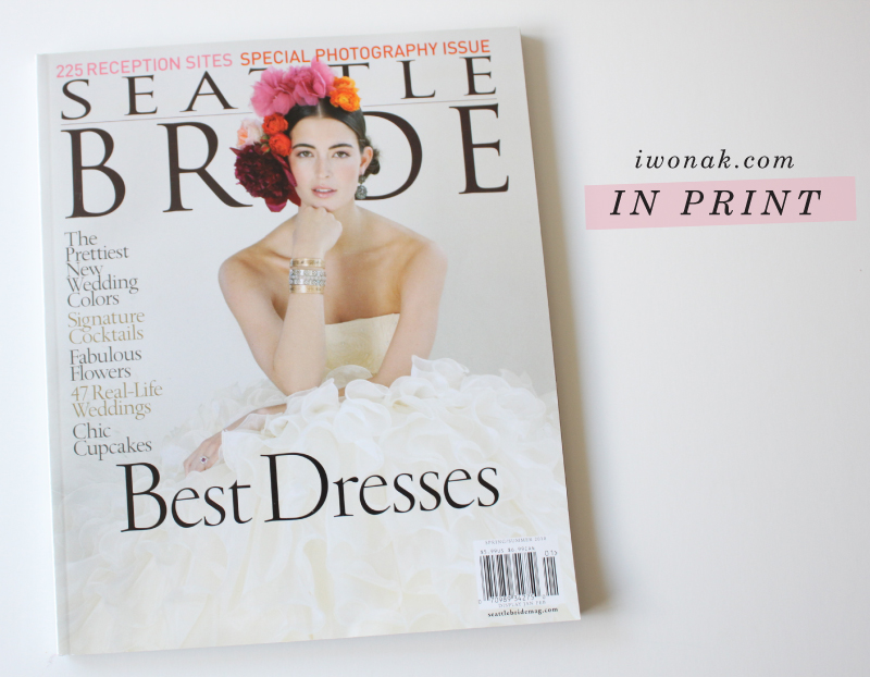
I’m so excited to finally share this wedding I designed that’s in the pages the Spring/Summer issue of Seattle Bride! Last year I had the honor of designing save the dates cards, invitations and programs for my dear friend Beth and her husband Nate. Unfortunately, only Save the Dates made it into the magazine. Designing them was a bit of a challenge, because the wedding was so far away and we hadn’t really envisioned what the invitation suite would look like yet. All we knew the rest of the wedding stationery had to be letterpress. Soon, I’ll post the rest of the suite but for now you can read more about the wedding here.
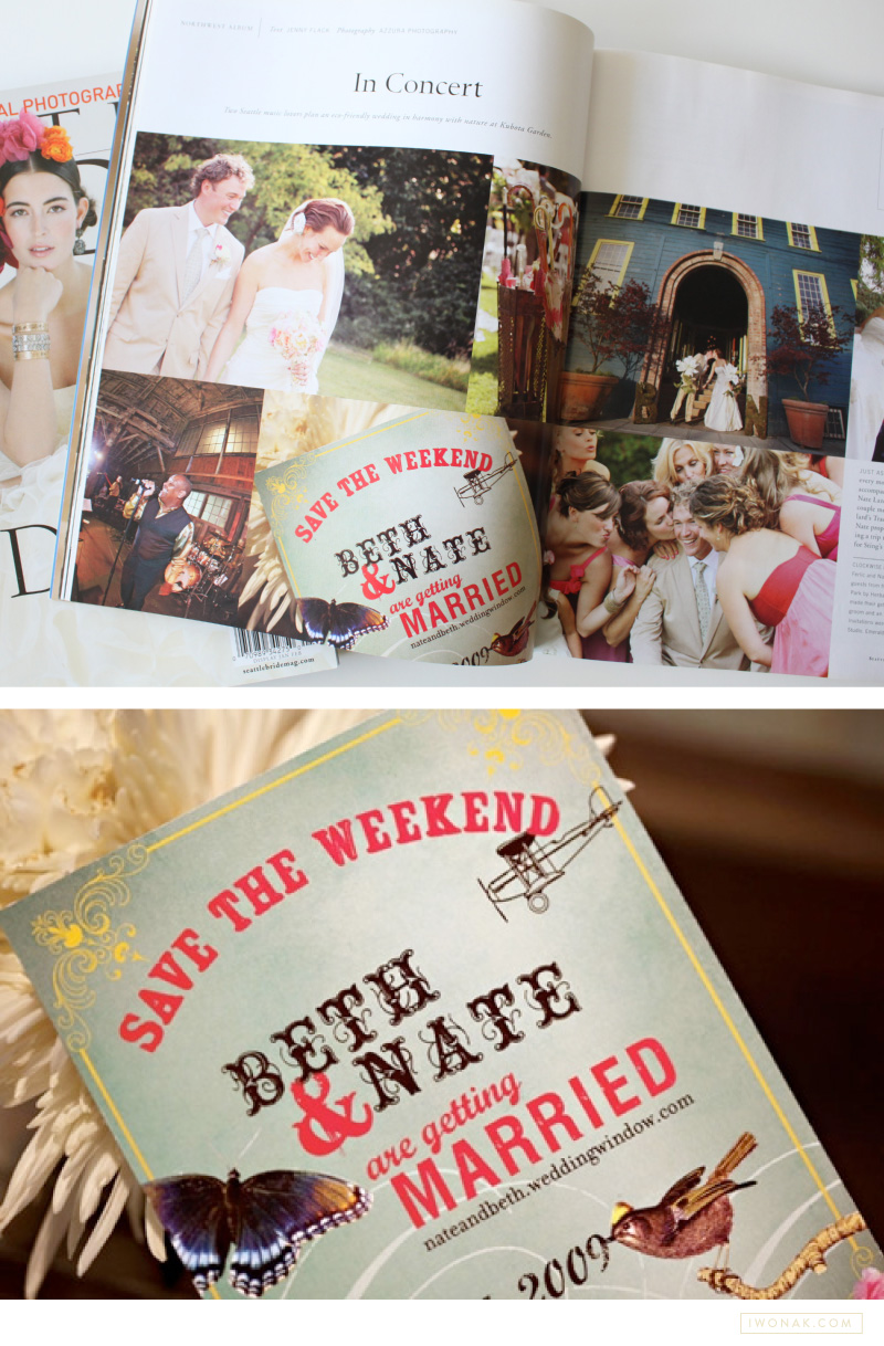
Photos: two top by Iwona Konarski // Last photo: Azzura Photography
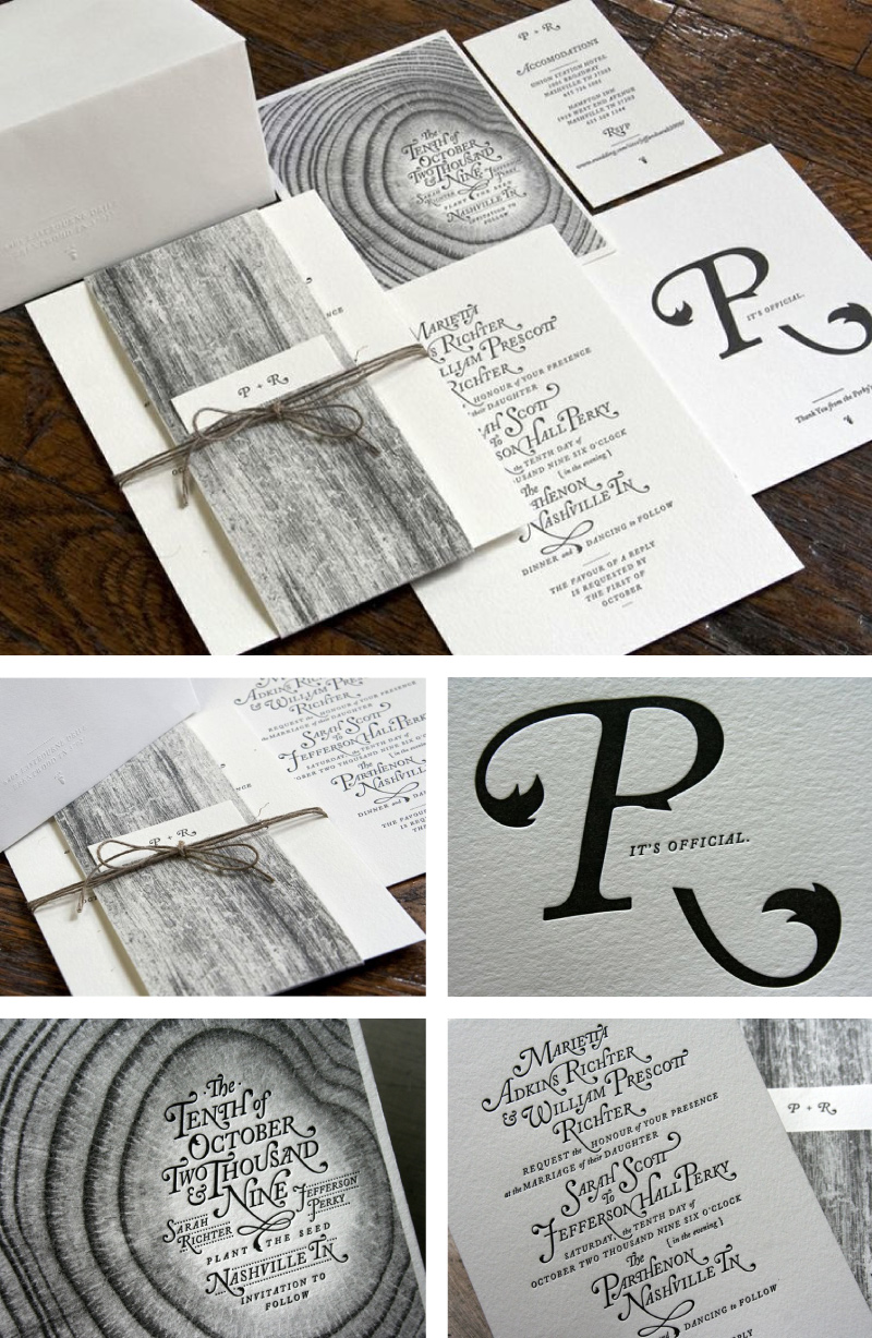
I’ve been admiring those beautiful invitations from Nashville-based creative studio, Perky Bros. The groom, Jefferson Perky of Perky Bros., designed these whimsical, yet elegant invitation set complete with custom lettering (aren’t the beautiful swashes of the Adobe Caslon Italic amazing) and natural wood elements and had them letterpressed by Studio On Fire. I love the cool monochromatic color palette and the whimsical, sophisticated yet organic feel of those invitations. Just gorgeous!
To find out more about the printing process and see behind the scene visit Studio on Fire blog. To check Perky Bros portfolio visit their website.
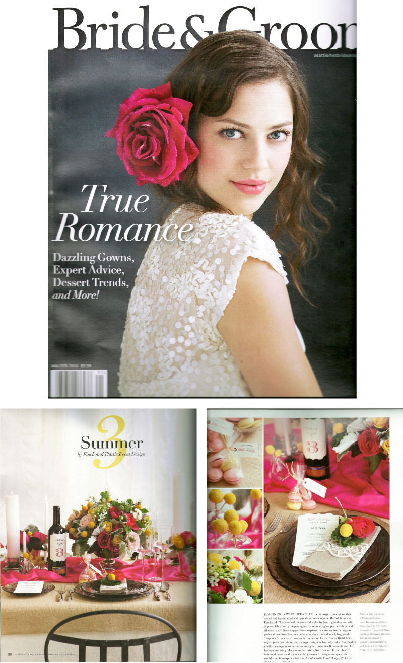
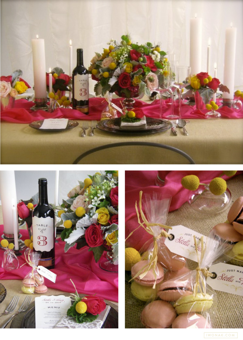
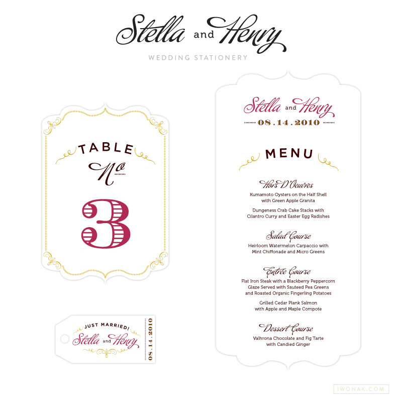
Back in early September, I was six months pregnant and brainstorming stationery ideas for a photoshoot for Seattle Metropolitan Bride & Groom with my friend Rachel from Finch & Thistle Events. I thought I have at least 3 weeks to execute some amazing ideas. But, oh well, best laid plans… Things didn’t go as well as I had hoped for. Mid September plans changed radically, and after my routine morning ultrasound I was “wheeled” to the hospital from my doctors office and told that as of today I’m starting my maternity leave. Yes, I was put on the hospital bedrest at 28 weeks! Not fun at all… Of course, I had silly, unrealistic expectations and really hoped I can work up until the due date… carrying twins! Just writing this make me laugh.
To maintain my sanity, I’ve decided to keep working on fun projects and this one was definitely the one. Rachel visited me often at the hospital and in between Terbutaline shots (to calm my contractions) and multiple doctor visits throught a day, I was able to finish this amazing stationery by early October, just in time for the shoot.
The Winter/Spring 2010 issue of Seattle Metropolitan Bride & Groom is on the newsstands now (has been since December) and I’m really excited to finally share with you this project. Thank you Rachel Bowes for inviting me to be part of this amazing collaboration. You can view behind-the-scenes on Rachel’s blog.
