Tag Archives: business cards

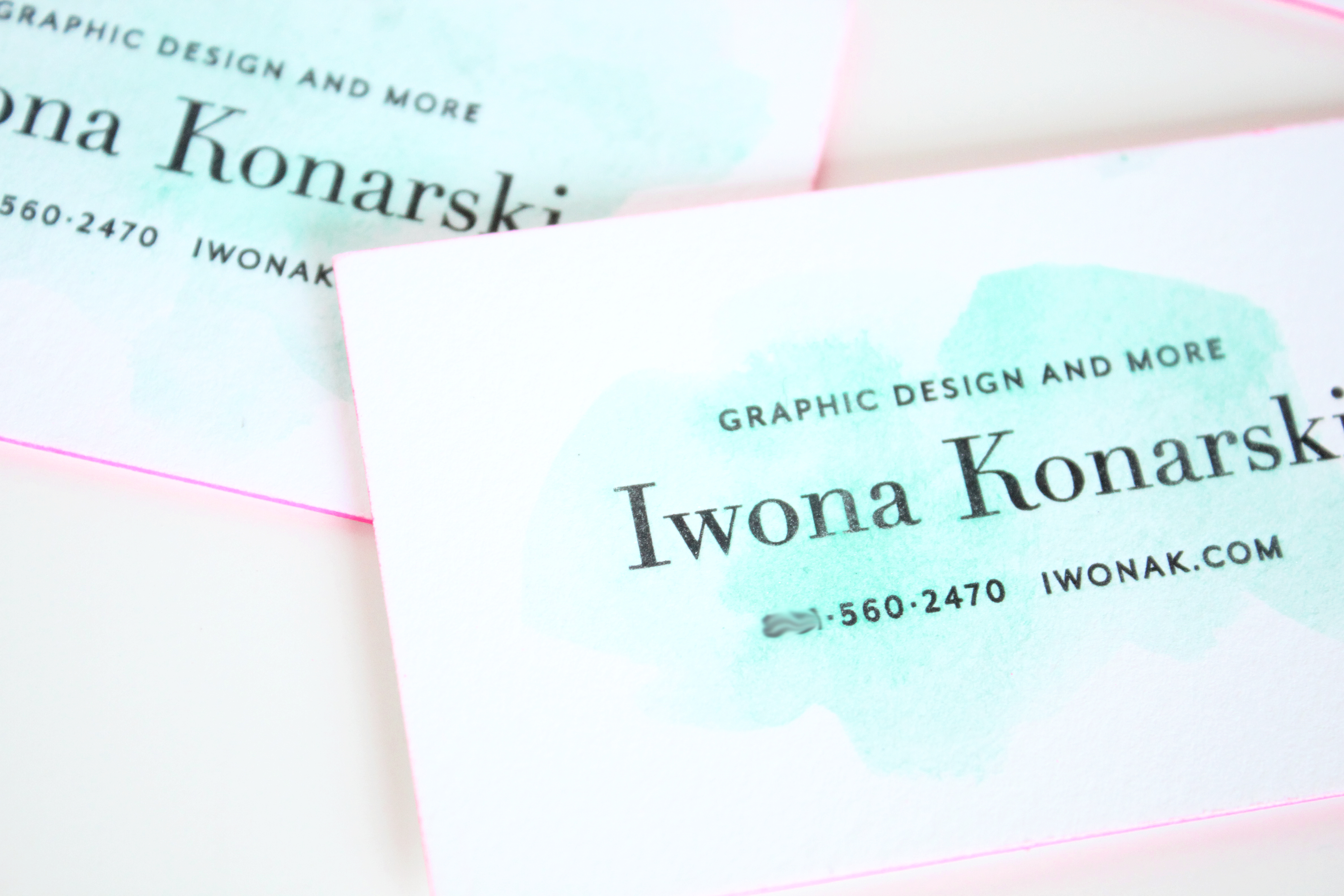
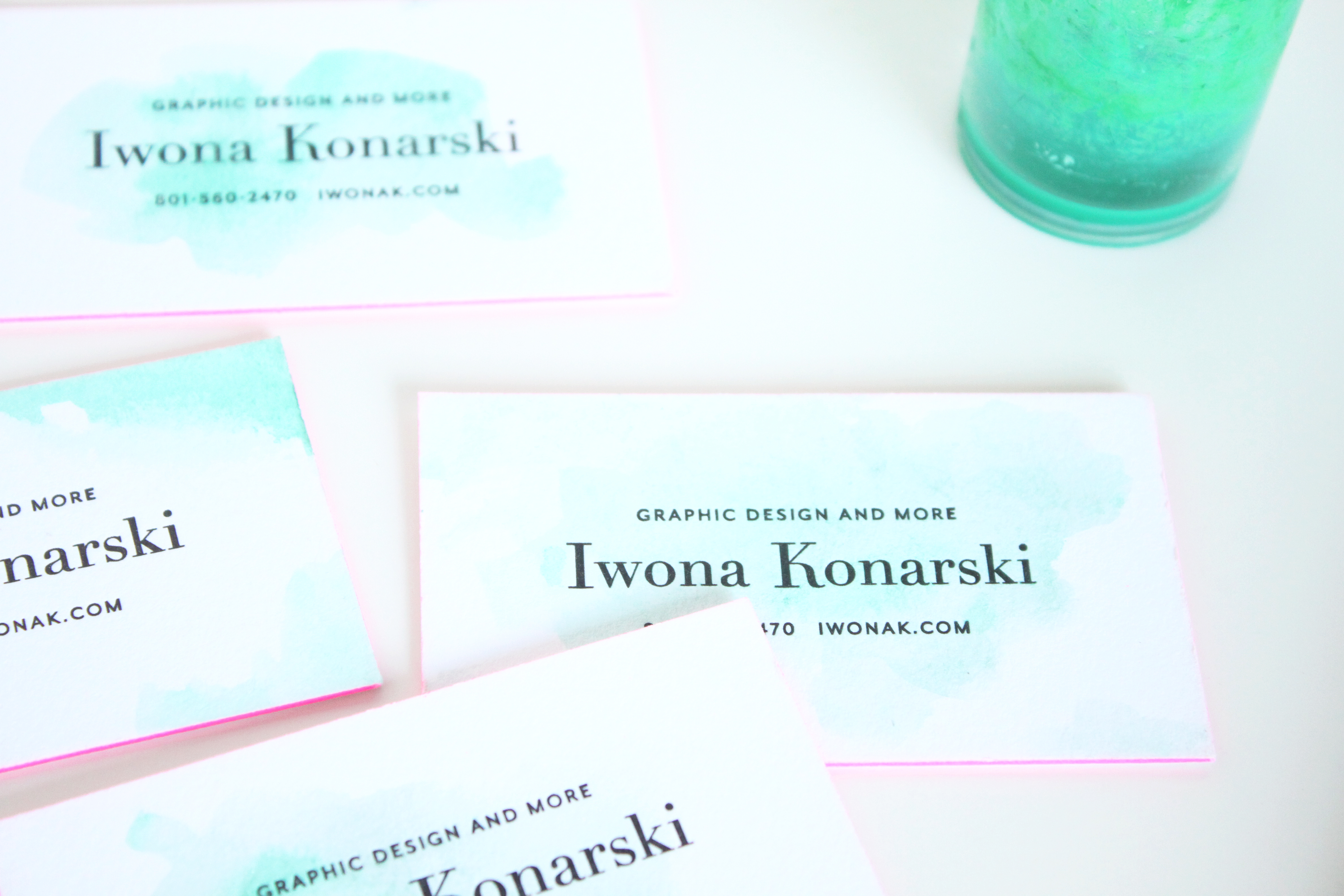
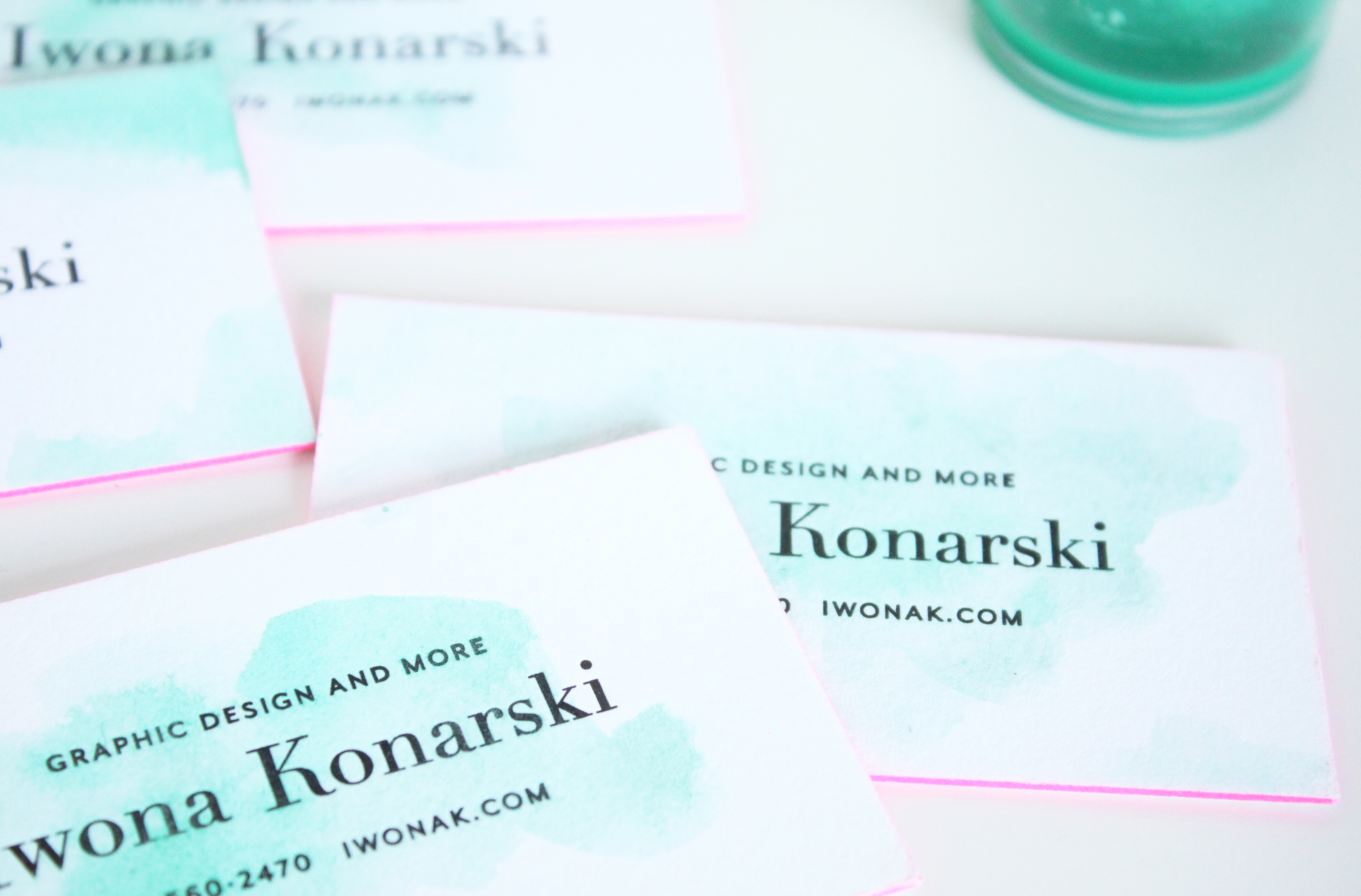
Letterpress + Turquoise Watercolor + pink edge business cards | Design by IwonaK.com

I’ve been loving my business cards since they day I got them, but once in a while I get the idea to “spice” them up somehow. I’ve wanted something simple, organic, something that wouldn’t overwhealm the classic design of my cards. So, yesterday while working with watercolors on the new wedding invitation, I’ve decided to carry on and add some colors to my cards. I went over each one with a touch of watercolor and I’m surprised how nicely letterpress paper takes watercolor. I love they way they’ve turned out, how each one is different and how the turquoise watercolor works with the letterpress and pink edges.
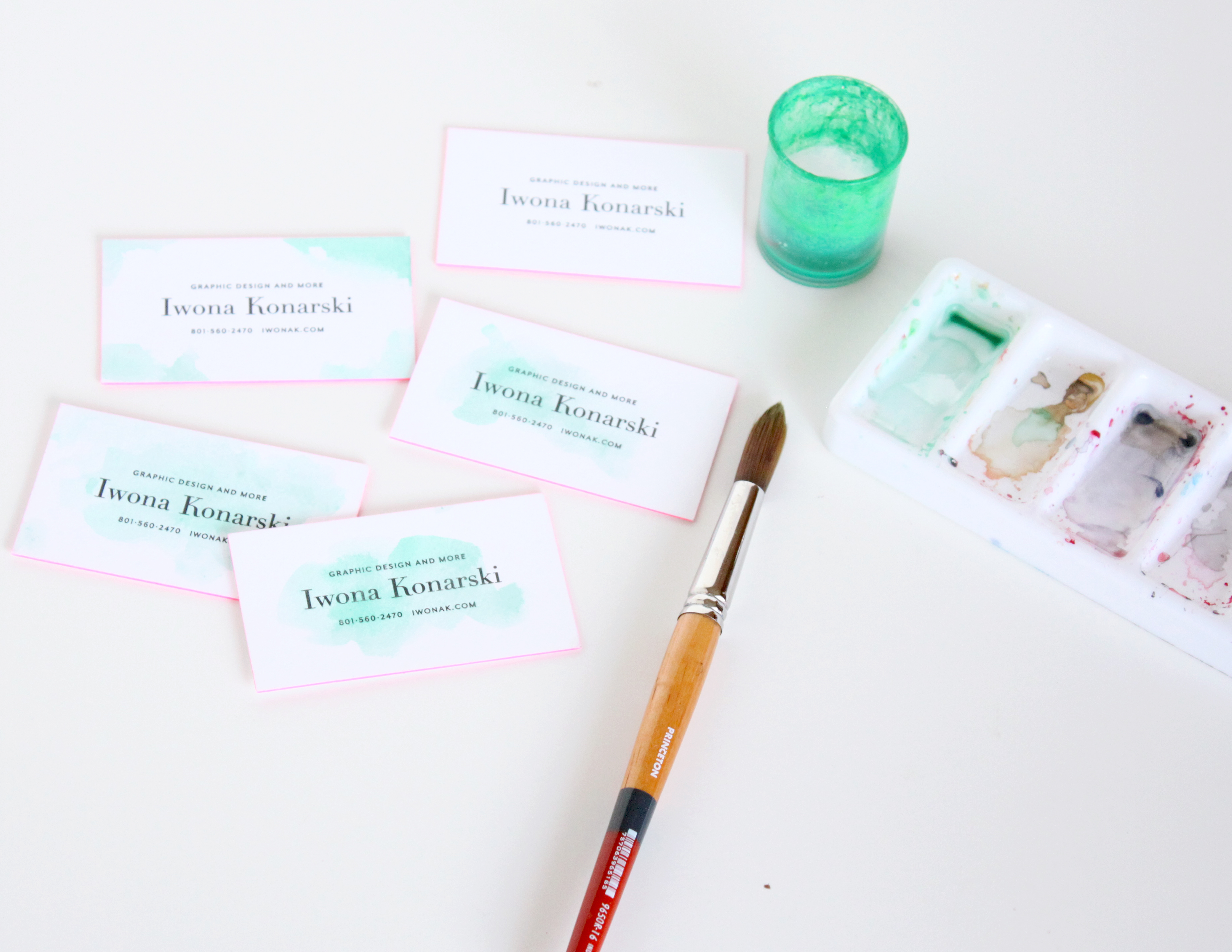
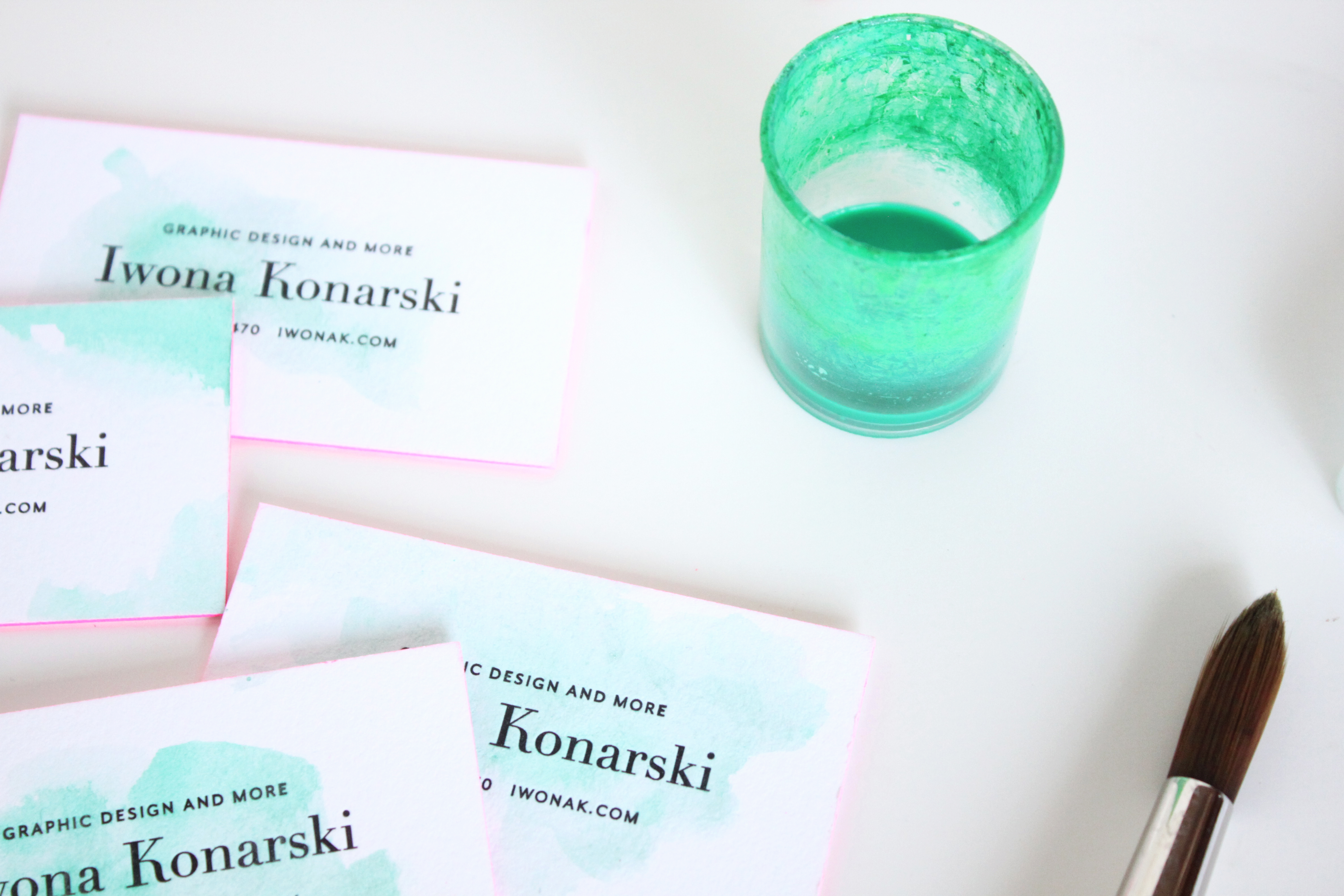
Letterpress + Watercolor + pink edge business cards | Design by IwonaK.comWatercolor and letterpress | business cards | Design by IwonaK.comWatercolor + pink edge letterpress business cards | Design by IwonaK.comLetterpress + Watercolor + pink edge business cards | Designed by IwonaK.com

Iwona K com Business Cards

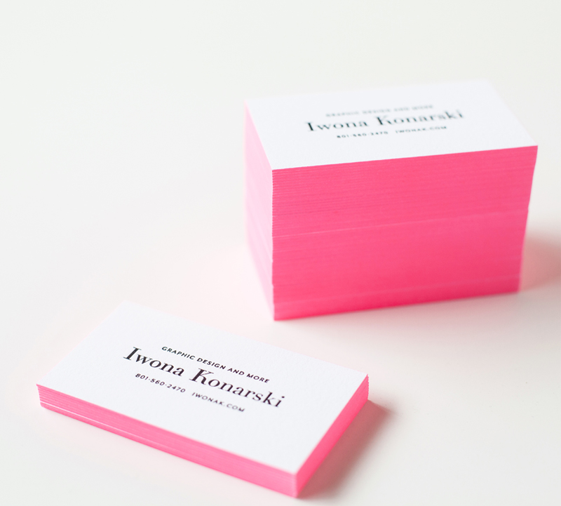
Wooohoo! My new letterpress business cards are finally here! And I absolutely love them! However, I have to
admit, designing them hasn’t been easy. As most designers can attest branding yourself is difficult. I love minimal
and clean design so I knew from the start that my logo and branding would have to reflect that. Keeping the design simple proofed to be difficult. I wanted to keep my branding in black & white but feared it’ll be dull and ordinary.

After a month trying to figure out what I want my brand to look like, and what I want my clients to feel about me and my work, I’ve got up the nerve to narrow down the design and sent my business cards off to be printed.
I knew my business cards would be letterpress and I wanted them to stand out and leave an impression. So I went with black letterpress text and added a bit of a wow factor by painting the edges in bright pink. I love how they turned out! They’re elegant yet cheerful and definitely eye-catching! I’m thrilled to have them in-hands, and I love seeing people stroke them….

Photography: Rachel Nickel

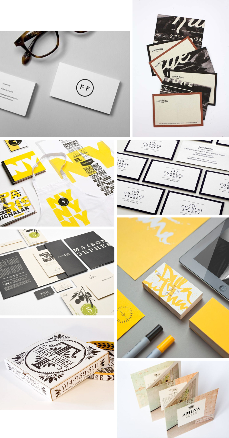
As you know I’m in the process of rebranding and redesigning my website and blog. This means that it’s absolutely necessary to reshoot my portfolio pieces. This time around I’m going for a modern yet sophisticated style, with clean, simple and direct shots. I’ve been looking for inspirations on how to style my portfolio and as always
Pinterest doesn’t disappoint. Below are just a few of my faves.

And, now on to choosing which projects to include… I’ll share more about the project as I go further into the rebranding process.

Portfolio Styling Inspiration

Credits: From left to right: 1. Pinned from Donhkoland / 2. Ashton Ridge Lodge – Kristen West Design / 3. lg2 boutique’s branding for the 2011 edition ofLa Vittoria / 4. 150 CHARLES STREET – JesseReedFromOhio / 5. Maison Orphée branding by lg2boutique.com / 6. Dylan Culhane Collateral by Ben Johnston. / 7. Branding and packaging for Tarry Market by Memo via The Dieline. / 8. Pinned from DesignInspiration.net


Hooray! I finally get to share Rachel’s new business cards! Rachel has been my best friend and client and just recently she came to me wanting to totally rebrand her event design and floral business, Finch And Thistle. I talked about her Her new business cards are modern yet sophisticated and classic. I couldn’t be happier with the way they turned out!