Nautical wedding invitations in blue and orange color palette | Illustration and design by Iwona Konarski #wedding #invitation #design #stationery #details #nautical #iwonak.comNautical wedding invitations in blue and orange color palette | Illustration and design by Iwona Konarski #wedding #invitation #design #stationery #details #nautical #iwonak.com

Nautical wedding invitations in blue and orange color palette | Illustration and design by Iwona Konarski #wedding #invitation #design #stationery #details #nautical #iwonak.comNautical wedding invitations in blue and orange color palette | Illustration and design by Iwona Konarski #wedding #invitation #design #stationery #details #nautical #iwonak.com #seattle #stationeere

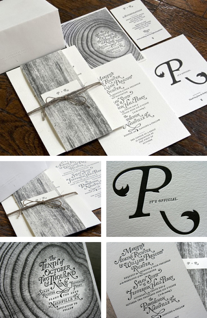
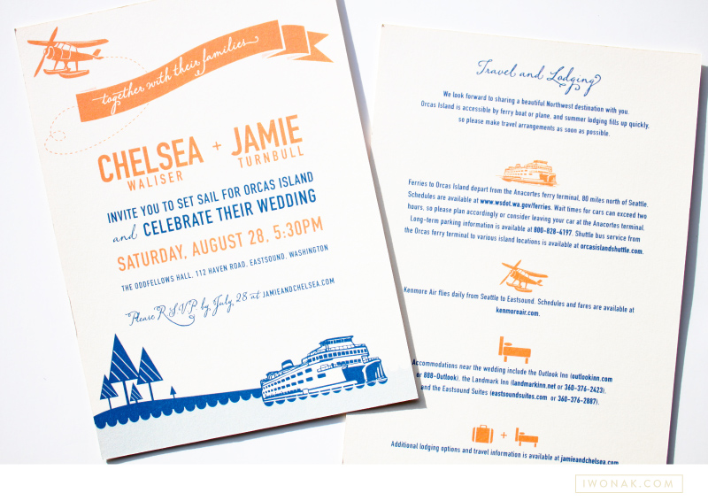
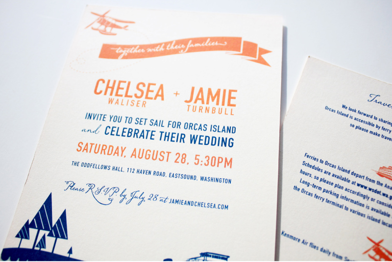
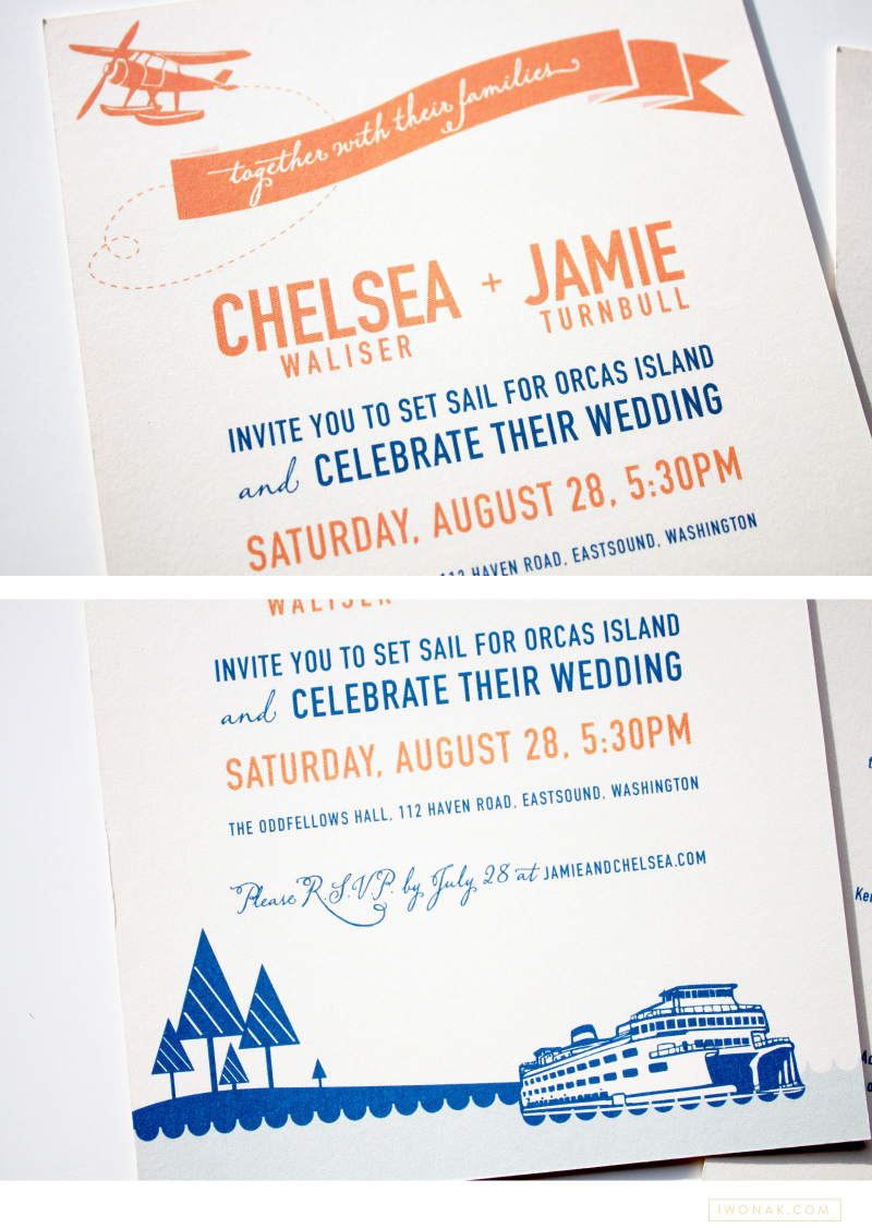
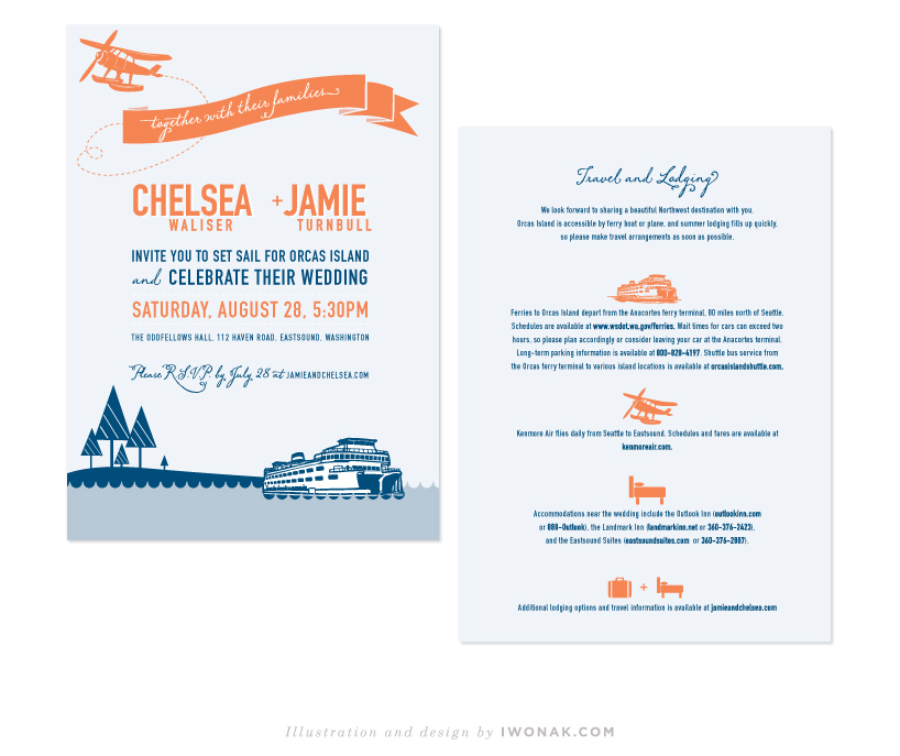
I’m a bit behind posting here but today I wanted to share the wonderful invitations for the wedding of Chelsea & Jamie. I was excited to be able to design their invitation suite, and I’m very happy with how they turned out. When Chelsea approached me about designing their invites she had a couple of basic ideas already in mind. She wanted to keep it simple, she wanted her colours to be orange and blue and she wanted to incorporate ferry boats and waves into the design. I took an illustrated approach and created this colorful nautical wedding invitation that’s a bit modern and fun with a fresh summer vibe. Because their budget was small, I had the invitations printed digitally on a heavy off–white stock.

Hooray! I finally get to share newly completed project – Sarah’s new letterpress business cards. I just received my samples from the print shop and wow! They are striking. The cards feature one PMS color and are double-side printed on 600gsm Crane Lettra stock. Simple typography, unique logo and detailed yet elegant pattern allow these letterpress business cards to speak for themselves.

Simpatico-Letterpress-Business-Cards-branding-by-IwonaK.com

Corporate event invitations | Designed by Iwona Konarski #invitation #design #stationery #details #color #event #iwonak.com

Corporate event invitations | Designed by Iwona Konarski #invitation #design #stationery #details #color #event #iwonak.comGold foil corporate event invitations | Designed by Iwona Konarski #gold #foil #invitation #design #stationery #details #event #iwonak.com

Few months ago, I completed this fun save the date and invitation for West Coast Paper Company. I kept the save the date fun, bright and full of color. I am the most excited about the gold foil on red paper, which was also embossed. I had fun blingin this one out a bit – foil is my latest obsession and I’ll be sure to print foil again.

Letterpress wedding invitations from Perky Bros

I’ve been admiring those beautiful invitations from Nashville-based creative studio, Perky Bros. The groom, Jefferson Perky of Perky Bros., designed these whimsical, yet elegant invitation set complete with custom lettering (aren’t the beautiful swashes of the Adobe Caslon Italic amazing) and natural wood elements and had them letterpressed by Studio On Fire. I love the cool monochromatic color palette and the whimsical, sophisticated yet organic feel of those invitations. Just gorgeous!

To find out more about the printing process and see behind the scene visit Studio on Fire blog. To check Perky Bros portfolio visit their website.

Amazing red foil on Black paper  |  www.iwonak.comRed  foil on black  |  beautiful season ticket packets for Seattle Symphony  |   www.iwonak.comRed shiny foil on black paper |  beautiful season ticket packets for Seattle Symphony  |   www.iwonak.com


I thought I’ll share with you this project that I completed this summer. It’s too pretty not to share. It is a packaging for our season tickets. I’m absolutely in love with the shiny red foil on the cover – it is so pretty and so classic… I know foil stamping hasn’t been used much lately, but I really hope it will return. It’s so amazing, isn’t it?

Benefits folder letterpress printed in clear ink and blue foil  |  Design and art direction by Iwona Konarski @iwonak.com | #branding #collateral #print #layout #letterpress #foil #iwonak.comBenefits folder letterpress printed in clear ink and blue foil  |  Design and art direction by Iwona Konarski @iwonak.com | #branding #collateral #print #layout #letterpress #foil #iwonak.comBenefits folder letterpress printed in clear ink and blue foil  |  Design and art direction by Iwona Konarski @iwonak.com | #branding #collateral #print #layout #letterpress #foil #iwonak.com

I simply can’t resist the charm of a letterpressed collateral. These folders are part of Seattle Symphony’s Donor Benefits Collateral and are designed to hold multiple sheets of paper, the quantity depends on the membership level. Each folder is letterpress printed with a beautiful blind (no ink) impression for the pattern design and blue foil stamped for the logo.

It’s printed on Cambric Beckett stock in mahogany, which I really like for the touch of tooth to the finish and how it takes a beautiful, crisp impression. The inside pages were offset printed in custom brown and blue ink on Strathmore paper stock.

Gold foil on brown paper |  Event invitations by Iwona Konarski | iwonak.com Gold foil on brown paper |  Event invitations by Iwona Konarski | iwonak.com


Gold. Shiny foil. Brown paper stock. Chartreuse envelopes with letterpress return address. Check! Check and check! I’m very excited to have my latest project printed. I was really worried about the fine lines in the floral art but it all turned out perfect. Yay! Now, back to another design… stay tuned. Lot’s of events happening at the Symphony this spring and summer.