Corporate event invitations | Designed by Iwona Konarski #invitation #design #stationery #details #color #event #iwonak.com

Corporate event invitations | Designed by Iwona Konarski #invitation #design #stationery #details #color #event #iwonak.comGold foil corporate event invitations | Designed by Iwona Konarski #gold #foil #invitation #design #stationery #details #event #iwonak.com

Few months ago, I completed this fun save the date and invitation for West Coast Paper Company. I kept the save the date fun, bright and full of color. I am the most excited about the gold foil on red paper, which was also embossed. I had fun blingin this one out a bit – foil is my latest obsession and I’ll be sure to print foil again.

2 color #letterpress event invitation |  Designed by Iwona Konarski |  #invitation #letterpress #blindletterpress #eventstationery #stationery #branding #iwonak.com 2 color #letterpress event invitation |  Designed by Iwona Konarski |  #invitation #letterpress #blindletterpress #eventstationery #stationery #branding #iwonak.com blind #letterpress + warm grey pantone  |  event invitation designed by Iwona Konarski |  #invitation #letterpress #blindletterpress #eventstationery #stationery #branding #iwonak.com blind #letterpress + warm grey pantone  |  event invitation designed by Iwona Konarski |  #invitation #letterpress #blindletterpress #eventstationery #stationery #branding #iwonak.com

After spending the long weekend enjoy the sun, I thought I should get around to sharing this beautiful invitation. I designed it for the Symphony’s Maestro Circle Dinner – an annual affair that takes place at Maestro Schwarz’s house. Designing stationery for so many events is a perfect opportunity for me to try some printing that I haven’t done before, so this time I went with the combination of blind letterpress and warm grey ink on crisp white, heavy card stock. The blind letterpress is very beautiful but I wished I used pearl foil instead. It would give it a bit more shine and grandeur. I’ll definitely try it next time. And so far, this is my favorite invitation to date. Pretty, isn’t it?

IwonaKinSeattleBride2010_savethedate

I’m so excited to finally share this wedding I designed that’s in the pages the Spring/Summer issue of Seattle Bride! Last year I had the honor of designing save the dates cards, invitations and programs for my dear friend Beth and her husband Nate. Unfortunately, only Save the Dates made it into the magazine. Designing them was a bit of a challenge, because the wedding was so far away and we hadn’t really envisioned what the invitation suite would look like yet. All we knew the rest of the wedding stationery had to be letterpress. Soon, I’ll post the rest of the suite but for now you can read more about the wedding here.


IwonaKinSeattleBride2010_SeattleWeddingInvitations

Photos: two top by Iwona Konarski // Last photo: Azzura Photography

Amazing red foil on Black paper  |  www.iwonak.comRed  foil on black  |  beautiful season ticket packets for Seattle Symphony  |   www.iwonak.comRed shiny foil on black paper |  beautiful season ticket packets for Seattle Symphony  |   www.iwonak.com


I thought I’ll share with you this project that I completed this summer. It’s too pretty not to share. It is a packaging for our season tickets. I’m absolutely in love with the shiny red foil on the cover – it is so pretty and so classic… I know foil stamping hasn’t been used much lately, but I really hope it will return. It’s so amazing, isn’t it?

OurHolidayCards_IwonaKonarski

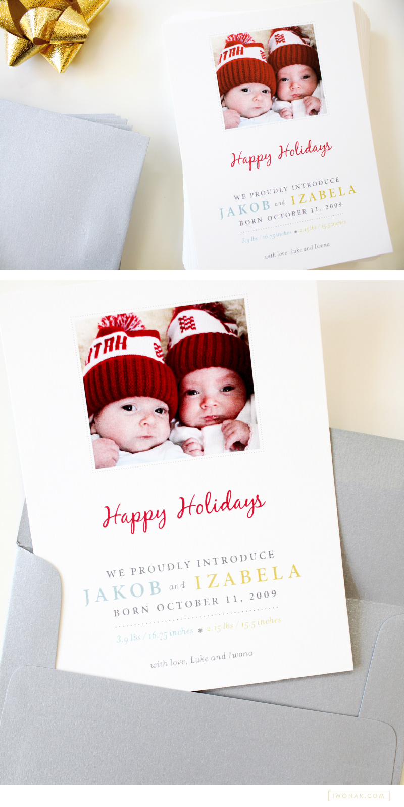
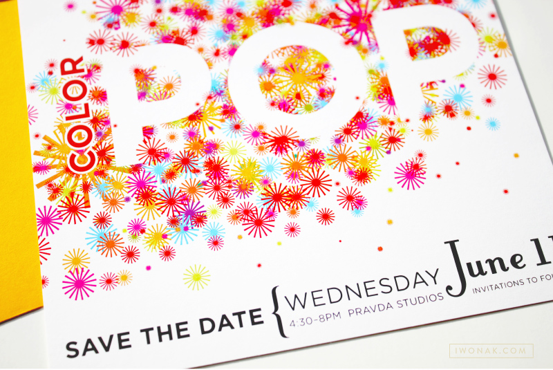
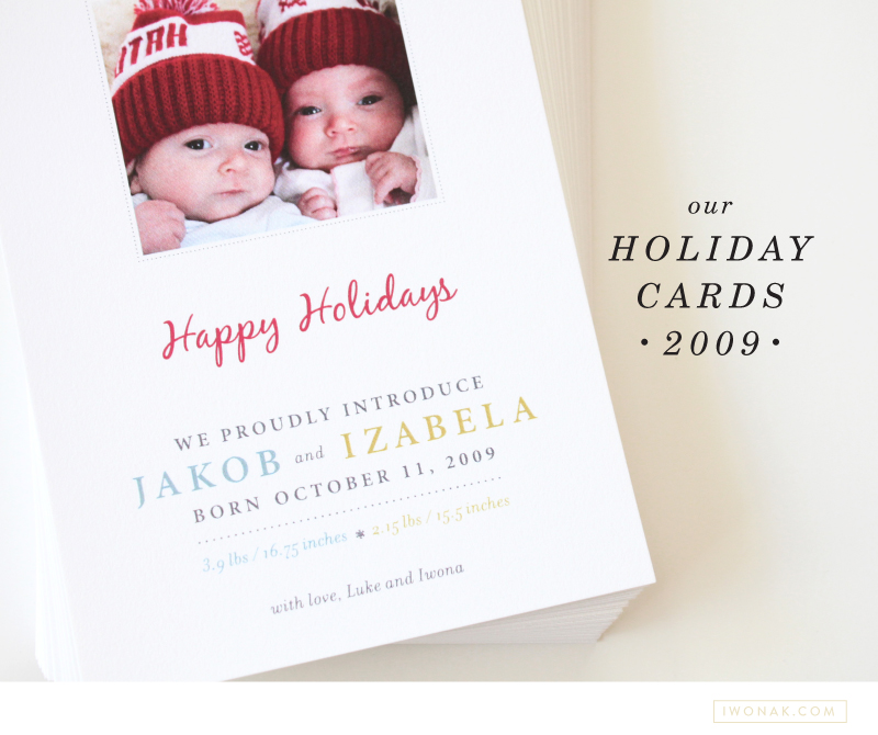
Each year I plan to have my Christmas cards designed and printed early. And then life happens and they are always sent late. I am a graphic designer and design should be easy, yet it is always so much work. I usually have a hard time settling on the right design (let’s not even mention picking photos) and then, well the addressing of all those envelopes takes forever too. This year the biggest challenge was not designing but taking the photos of our little ones. We finally brought them home a day before Thanksgiving and life has been a whirlwind since. Due to their fragile conditions and our crazy and unpredictable schedule, we were unable to have a photographer to come to our house to take our family pictures. I was left with the job of capturing our precious babies. And it was a challenge. Babies tend to fuss and stretch out and don’t like being confined. After taking hundreds of photos we finally chose one that had both of them looking into the camera.


This year’s card was extra special because it was also Jakob and Izzy’s birth announcement! Originally I wanted to send out two separate cards, but there is no way I could have made that happen. This year our card will double as a Christmas card and baby announcement. And I am totally ok with that. Why not to celebrate the season as well as our bundles of joy. I am so happy with the way those cards turned out! Merry Christmas!

OurHolidayCardsBirthAnnouncements_IwonaKonarski

Benefits folder letterpress printed in clear ink and blue foil  |  Design and art direction by Iwona Konarski @iwonak.com | #branding #collateral #print #layout #letterpress #foil #iwonak.comBenefits folder letterpress printed in clear ink and blue foil  |  Design and art direction by Iwona Konarski @iwonak.com | #branding #collateral #print #layout #letterpress #foil #iwonak.comBenefits folder letterpress printed in clear ink and blue foil  |  Design and art direction by Iwona Konarski @iwonak.com | #branding #collateral #print #layout #letterpress #foil #iwonak.com

I simply can’t resist the charm of a letterpressed collateral. These folders are part of Seattle Symphony’s Donor Benefits Collateral and are designed to hold multiple sheets of paper, the quantity depends on the membership level. Each folder is letterpress printed with a beautiful blind (no ink) impression for the pattern design and blue foil stamped for the logo.

It’s printed on Cambric Beckett stock in mahogany, which I really like for the touch of tooth to the finish and how it takes a beautiful, crisp impression. The inside pages were offset printed in custom brown and blue ink on Strathmore paper stock.

Gold foil on brown paper |  Event invitations by Iwona Konarski | iwonak.com Gold foil on brown paper |  Event invitations by Iwona Konarski | iwonak.com


Gold. Shiny foil. Brown paper stock. Chartreuse envelopes with letterpress return address. Check! Check and check! I’m very excited to have my latest project printed. I was really worried about the fine lines in the floral art but it all turned out perfect. Yay! Now, back to another design… stay tuned. Lot’s of events happening at the Symphony this spring and summer.