I’m absolutely thrilled to share with you this special project of mine. Hello! Prints is an online stationery shop filled with beautiful and unique stationery designs. It desperately needed a brand refresh and I had a blast redesigning the site and rebranding it. You can see it in its entirety right here. For now, the designs are avaialable for purchase in Poland and Europe only but I plan to open an online store here, in the U.S. Every visit and purchase means so much to us – please take a peek!

HelloPrints.pl website and branding

HelloPrints.pl Website and Blog design

1213 Seattle Symphony brochure cover by Iwona Konarski

1213 Seattle Symphony brochure inside pages by Iwona Konarski

1213 Seattle Symphony brochure pages by Iwona Konarski

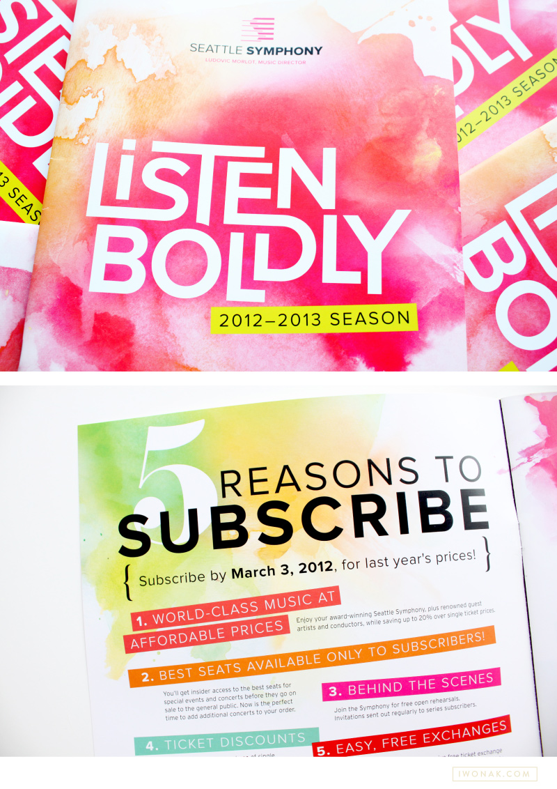
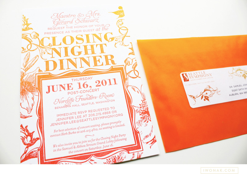
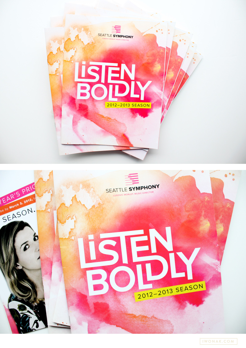
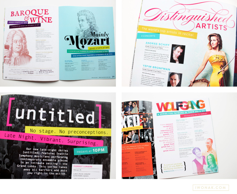
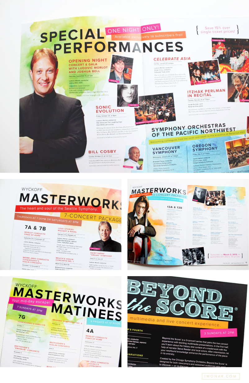
Today, I wanted to share with you a brochure I recently completed for the Seattle Symphony. You can see a sneak preview of it here. On the cover I featured the Symphony’s tagline – Listen Boldly – which was designed as a logo and paired with artsy watercolor. The mood for this season was joyful, romantic, welcoming with bold typography, bright color palette and large artist photos. Turns out, working with color makes me so excited! Working on something this cheery was definitely refreshing and it will be so much fun for the remaining of the season. I had lots of fun with watercolors and this whole do-it-yourself thing was a blast. This was a really fun project to work on and it might be my favorite design to date.

Simon Woods, Seattle Symphony Executive Director, calls this season “… a simply sensational season. … The programing is inspiring, innovative and stimulating, and with a big emphasis on informality and accessibility. … another exciting validation of the tremendous energy that we and so many others are experiencing under Ludovic Morlot’s leadership.” Looks like 2012-2013 season will be amazing! Please come to Benaroya Hall to listen to fantastic music and check my designs in person.

To see the whole brochure head over to issuu.

1213 Seattle Symphony Season Brochure Cover and Inside pages

I thought I’d pop in and share with you a sneak of this brochure! Just got it back from the printer and I’m thrilled to finally have it in my hands. It’s so bright and colorful and sooo different than anything I have done in the past. It’s been my life for the last few months – in the making since September! I promise to take more photos and published them here soon. See ya!

Take a look at a new project I just wrapped up! This custom website was designed for clients that wanted to showcase their beautiful home located in Tacoma, Washington. This custom built in 2009 home is an entirely green, fully self-sustaining habitat and is currently for sale. Check it out!

The website reflects the aesthetics of their home, it is clean, simple and easy to navigate. The contact form makes it easy for visitors to get in touch and there is plenty of beautiful images in the gallery.

Verdant-Home-Website-Design-iwonak.comVerdant-Home-Web-Design-iwonak.comVerdant-Home-Website-Design

Art Direction and Design: Iwona Konarski  //  Photography: Angela & Evan Photography  //  Visit website: verdanthometacoma.com

Ombre split ink letterpress invitations by iwonak.com |  #ombre #vellumenvelopes #letterpress #splitink #invitation #galainvitation #iwonak #seattledesigner #seattlestationery #seattleweddinginvitations #wedding #stationery #vellum

split-ink-letterpress-invitations-by-iwonak.com |  #ombre #letterpress #splitink #invitation #galainvitation #iwonak #seattledesigner #seattlestationery #seattleweddinginvitations #wedding #stationeryOmbre split ink letterpress invitations by iwonak.com |  #ombre #vellumenvelopes #letterpress #splitink #invitation #galainvitation #iwonak #seattledesigner #seattlestationery #seattleweddinginvitations #wedding #stationery #vellum

split ink letterpress invitations by iwonak.com |  #ombre #letterpress #splitink #invitation #galainvitation #iwonak #seattledesigner #seattlestationery #seattleweddinginvitations #wedding #stationery #vellumOmbre split ink letterpress invitations by iwonak.com |  #ombre #vellumenvelopes #letterpress #splitink #invitation #galainvitation #iwonak #seattledesigner #seattlestationery #seattleweddinginvitations #wedding #stationery #vellum #closeupOmbre split ink letterpress invitations by iwonak.com |  #ombre #savethedate #letterpress #splitink #invitation #galainvitation #iwonak #seattledesigner #seattlestationery #seattleweddinginvitations #wedding #stationery

Have you heard of split ink? I haven’t until a few months ago when I spotted some inspirations on Pinterest. Of course, I had to try it! Ombre has been such an influence in fashion I had to try it on paper. Perfect project came along and voila! The most awesome ombre gala invitations are here. They are slightly larger than standard invitation (A8) as I felt the floral illustrations and the amount of text needed some room to breath.

I designed the invitations to be printed with a split ink fountain using yellow and red inks which blended to a bright orange in the middle – check them out below, the results are stunning. To maximize the drama I  paired them with orange vellum envelopes and really love how they grab the the attention.

I’m excited to share with you a recent project that I’ve been working on for the past few months! I worked closely with Perch Furniture owner Willi Galloway on a design of her website. Perch Furniture is a custom sofa studio located in Portland, Oregon. Willi Galloway and her team is dedicated to helping customers create custom furniture (sofas and chairs) that fits their lifestyle and most importantly suits any budget. Almost everything in their store is custom. Made-to-order and built in the United States. I designed their website to showcase a sample selection of their offerings. I started with an existing logo and color palette and designed her website with a clean and functional layout.

I take on a limited number of web design projects each year. If you are interested in working with me please inquire about my schedule and pricing.

Perch Furniture Website by Iwona Konarski

Perch Furniture Website home

Perch Furniture Website product

Nautical wedding invitations in blue and orange color palette | Illustration and design by Iwona Konarski #wedding #invitation #design #stationery #details #nautical #iwonak.comNautical wedding invitations in blue and orange color palette | Illustration and design by Iwona Konarski #wedding #invitation #design #stationery #details #nautical #iwonak.com

Nautical wedding invitations in blue and orange color palette | Illustration and design by Iwona Konarski #wedding #invitation #design #stationery #details #nautical #iwonak.comNautical wedding invitations in blue and orange color palette | Illustration and design by Iwona Konarski #wedding #invitation #design #stationery #details #nautical #iwonak.com #seattle #stationeere

I’m a bit behind posting here but today I wanted to share the wonderful invitations for the wedding of Chelsea & Jamie. I was excited to be able to design their invitation suite, and I’m very happy with how they turned out. When Chelsea approached me about designing their invites she had a couple of basic ideas already in mind. She wanted to keep it simple, she wanted her colours to be orange and blue and she wanted to incorporate ferry boats and waves into the design. I took an illustrated approach and created this colorful nautical wedding invitation that’s a bit modern and fun with a fresh summer vibe. Because their budget was small, I had the invitations printed digitally on a heavy off–white stock.

Hooray! I finally get to share newly completed project – Sarah’s new letterpress business cards. I just received my samples from the print shop and wow! They are striking. The cards feature one PMS color and are double-side printed on 600gsm Crane Lettra stock. Simple typography, unique logo and detailed yet elegant pattern allow these letterpress business cards to speak for themselves.

Simpatico-Letterpress-Business-Cards-branding-by-IwonaK.com