Tag Archives: iwona konarski

1213 Seattle Symphony Season Brochure Cover and Inside pages

I thought I’d pop in and share with you a sneak of this brochure! Just got it back from the printer and I’m thrilled to finally have it in my hands. It’s so bright and colorful and sooo different than anything I have done in the past. It’s been my life for the last few months – in the making since September! I promise to take more photos and published them here soon. See ya!

BohoShootOnStyleMePretty_stationeryByIwonaK

Hello friends! Check out this beautiful post featuring my ombré wedding stationery on Style Me Pretty.
I am honored to be featured on Style Me Pretty blog along with some of my favorite Seattle vendors. This shoot was designed and styled by the amazingly talented Rachel of Finch and Thistle Events and documented impeccably by Angela and Evan of Angela & Evan Photography.

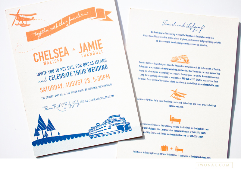
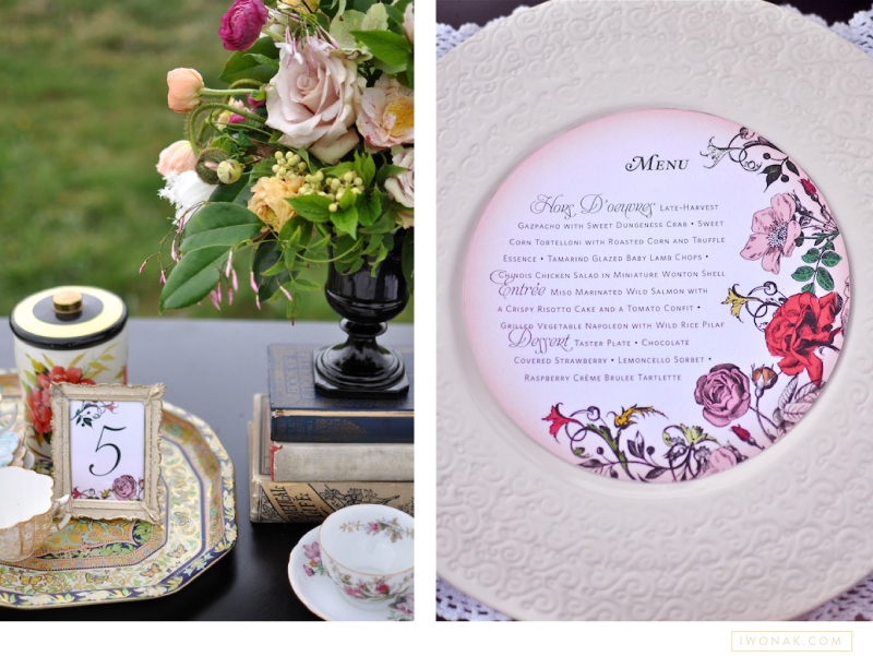
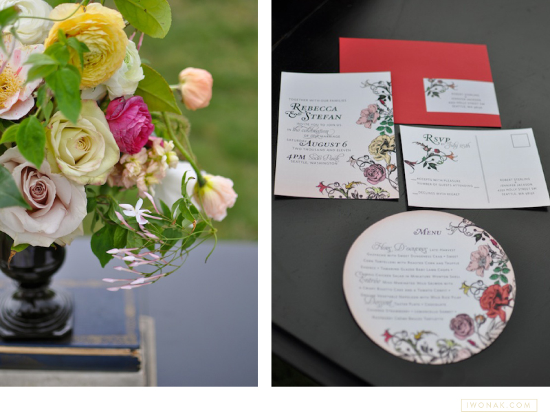
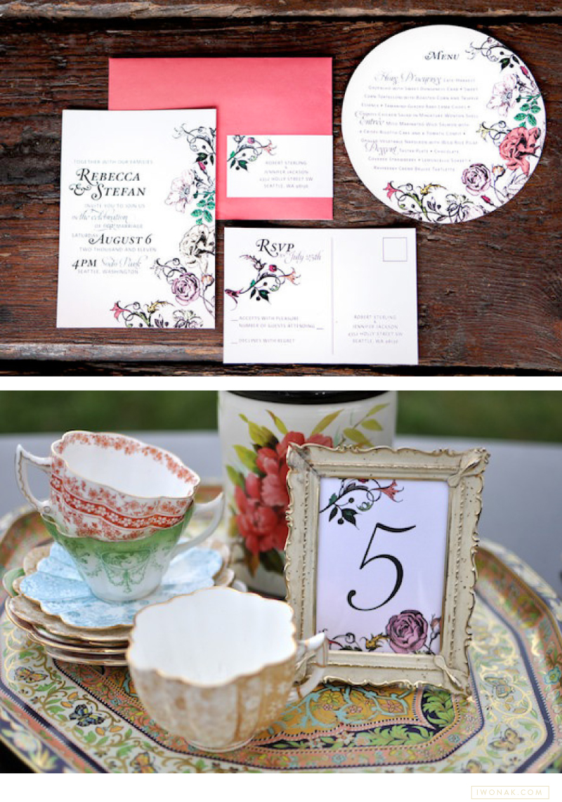
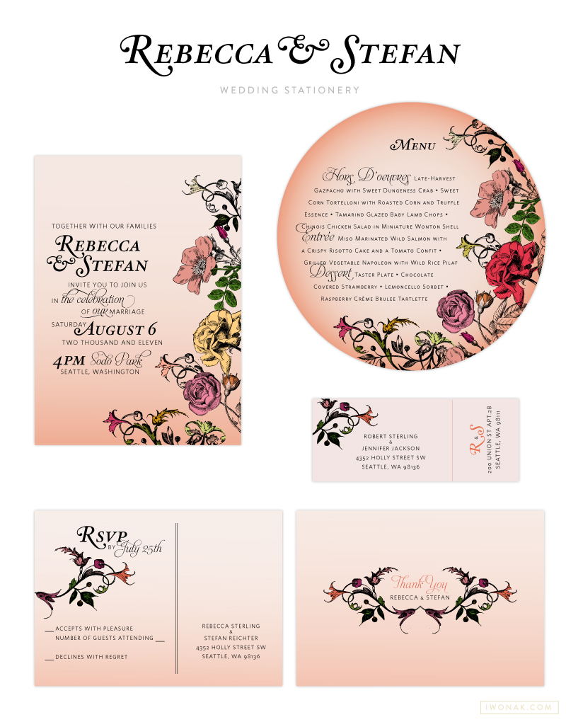
For this shoot, I drew inspiration from a muted summer color palette with pops of reds. The subtle pink ombré effect with a gorgeous floral vine pattern was applied to all wedding stationery including invitations, rsvp and thank you cards, mailing labels and table signs. The round menu cards were designed to fit on each plate perfectly.  The ombré was also picked up in the purple skirt of Chelsea’s beautiful one-shouldered Wai-Ching gown that she accented in a modern fashion with several diamond necklaces layered for effect.

See the full post with lots of other beautiful details here.

StyleMePretty_stationeryByIwonaKBohoShootOnStyleMePretty_paperGoodsByIwonaK


Here is the entire paper suite for the shoot… Let’s chat if you’re looking for custom invitation suite for your own wedding or event!


BohoWeddingStationeryByIwonaK


Design, Stylist, and Floral Design: Rachel Bowes of Finch & Thistle Event Design / Photography: Angela and Evan Photography / Stationery: Iwona Konarski / Cake: Baked / Custom Pillows: Plum Cushion / Dresses: Wai Ching Studio + KT Jean Couture Design / Make-up + Hair: Teryl Hawk / Hair Piece: BloomGirl / Models: Caleb + Chelsea of TCM / Jewelry: Alvin Goldfarb Jeweler / Venue: Wine and Roses Estate

Ombre split ink letterpress invitations by iwonak.com |  #ombre #vellumenvelopes #letterpress #splitink #invitation #galainvitation #iwonak #seattledesigner #seattlestationery #seattleweddinginvitations #wedding #stationery #vellum

split-ink-letterpress-invitations-by-iwonak.com |  #ombre #letterpress #splitink #invitation #galainvitation #iwonak #seattledesigner #seattlestationery #seattleweddinginvitations #wedding #stationeryOmbre split ink letterpress invitations by iwonak.com |  #ombre #vellumenvelopes #letterpress #splitink #invitation #galainvitation #iwonak #seattledesigner #seattlestationery #seattleweddinginvitations #wedding #stationery #vellum

split ink letterpress invitations by iwonak.com |  #ombre #letterpress #splitink #invitation #galainvitation #iwonak #seattledesigner #seattlestationery #seattleweddinginvitations #wedding #stationery #vellumOmbre split ink letterpress invitations by iwonak.com |  #ombre #vellumenvelopes #letterpress #splitink #invitation #galainvitation #iwonak #seattledesigner #seattlestationery #seattleweddinginvitations #wedding #stationery #vellum #closeupOmbre split ink letterpress invitations by iwonak.com |  #ombre #savethedate #letterpress #splitink #invitation #galainvitation #iwonak #seattledesigner #seattlestationery #seattleweddinginvitations #wedding #stationery

Have you heard of split ink? I haven’t until a few months ago when I spotted some inspirations on Pinterest. Of course, I had to try it! Ombre has been such an influence in fashion I had to try it on paper. Perfect project came along and voila! The most awesome ombre gala invitations are here. They are slightly larger than standard invitation (A8) as I felt the floral illustrations and the amount of text needed some room to breath.

I designed the invitations to be printed with a split ink fountain using yellow and red inks which blended to a bright orange in the middle – check them out below, the results are stunning. To maximize the drama I  paired them with orange vellum envelopes and really love how they grab the the attention.

Nautical wedding invitations in blue and orange color palette | Illustration and design by Iwona Konarski #wedding #invitation #design #stationery #details #nautical #iwonak.comNautical wedding invitations in blue and orange color palette | Illustration and design by Iwona Konarski #wedding #invitation #design #stationery #details #nautical #iwonak.com

Nautical wedding invitations in blue and orange color palette | Illustration and design by Iwona Konarski #wedding #invitation #design #stationery #details #nautical #iwonak.comNautical wedding invitations in blue and orange color palette | Illustration and design by Iwona Konarski #wedding #invitation #design #stationery #details #nautical #iwonak.com #seattle #stationeere

I’m a bit behind posting here but today I wanted to share the wonderful invitations for the wedding of Chelsea & Jamie. I was excited to be able to design their invitation suite, and I’m very happy with how they turned out. When Chelsea approached me about designing their invites she had a couple of basic ideas already in mind. She wanted to keep it simple, she wanted her colours to be orange and blue and she wanted to incorporate ferry boats and waves into the design. I took an illustrated approach and created this colorful nautical wedding invitation that’s a bit modern and fun with a fresh summer vibe. Because their budget was small, I had the invitations printed digitally on a heavy off–white stock.

2 color #letterpress event invitation |  Designed by Iwona Konarski |  #invitation #letterpress #blindletterpress #eventstationery #stationery #branding #iwonak.com 2 color #letterpress event invitation |  Designed by Iwona Konarski |  #invitation #letterpress #blindletterpress #eventstationery #stationery #branding #iwonak.com blind #letterpress + warm grey pantone  |  event invitation designed by Iwona Konarski |  #invitation #letterpress #blindletterpress #eventstationery #stationery #branding #iwonak.com blind #letterpress + warm grey pantone  |  event invitation designed by Iwona Konarski |  #invitation #letterpress #blindletterpress #eventstationery #stationery #branding #iwonak.com

After spending the long weekend enjoy the sun, I thought I should get around to sharing this beautiful invitation. I designed it for the Symphony’s Maestro Circle Dinner – an annual affair that takes place at Maestro Schwarz’s house. Designing stationery for so many events is a perfect opportunity for me to try some printing that I haven’t done before, so this time I went with the combination of blind letterpress and warm grey ink on crisp white, heavy card stock. The blind letterpress is very beautiful but I wished I used pearl foil instead. It would give it a bit more shine and grandeur. I’ll definitely try it next time. And so far, this is my favorite invitation to date. Pretty, isn’t it?

Benefits folder letterpress printed in clear ink and blue foil  |  Design and art direction by Iwona Konarski @iwonak.com | #branding #collateral #print #layout #letterpress #foil #iwonak.comBenefits folder letterpress printed in clear ink and blue foil  |  Design and art direction by Iwona Konarski @iwonak.com | #branding #collateral #print #layout #letterpress #foil #iwonak.comBenefits folder letterpress printed in clear ink and blue foil  |  Design and art direction by Iwona Konarski @iwonak.com | #branding #collateral #print #layout #letterpress #foil #iwonak.com

I simply can’t resist the charm of a letterpressed collateral. These folders are part of Seattle Symphony’s Donor Benefits Collateral and are designed to hold multiple sheets of paper, the quantity depends on the membership level. Each folder is letterpress printed with a beautiful blind (no ink) impression for the pattern design and blue foil stamped for the logo.

It’s printed on Cambric Beckett stock in mahogany, which I really like for the touch of tooth to the finish and how it takes a beautiful, crisp impression. The inside pages were offset printed in custom brown and blue ink on Strathmore paper stock.

Gold foil on brown paper |  Event invitations by Iwona Konarski | iwonak.com Gold foil on brown paper |  Event invitations by Iwona Konarski | iwonak.com


Gold. Shiny foil. Brown paper stock. Chartreuse envelopes with letterpress return address. Check! Check and check! I’m very excited to have my latest project printed. I was really worried about the fine lines in the floral art but it all turned out perfect. Yay! Now, back to another design… stay tuned. Lot’s of events happening at the Symphony this spring and summer.