All posts by iwonak

About iwonak

Lorem ipsum dolor sit amet, consectetur adipiscing elit. Nulla commodo enim consectetur, aliquet lorem vel, hendrerit purus. Proin laoreet faucibus massa, nec porta libero tempor sed. Suspendisse facilisis tempor nulla nec vestibulum. Sed turpis dui, fringilla quis cursus sed, euismod vitae ante

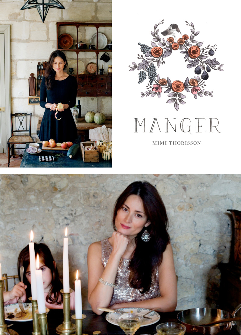
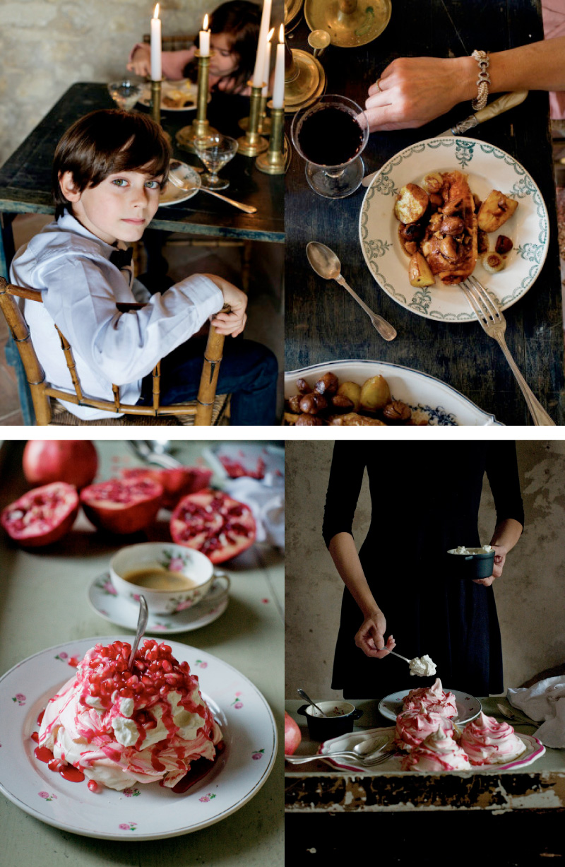
Few months ago I happened upon Mimi Thorisson’s amazing food blog called Manger and have been sucked into her beautiful life ever since. Mimi, her husband Oddur, their four kids and 19 dogs live in a picturesque country estate in Médoc, France. I couldn’t help but fell in love with the photographs of her exquisitely beautiful dishes set against carerra and antique china, her darling children and cute little dogs. Her blog is one of my favorite food blogs. Recently she revealed her new logo and updated her blog. And I absolutely love it! The new logo is so beautiful. Inspired by a beautiful ceiling wreath from a nearby château in ruins discovered by Mimi. It features lovely florals and the profile of her beloved fox terrier. And no wonder I fell in love with it. The new logo and icons were illustrated by the wonderfully talented Anna Bond from Rifle Paper Co! I’ve been a fan of Anna’s work for ages. Isn’t this lovely?
 

MimiThorisson MimiThorissonsblogManger

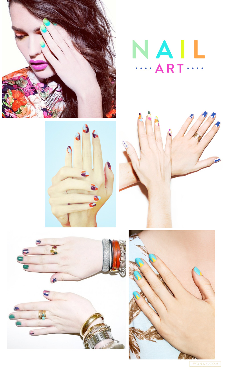
Nail art seems to be a huge trend these days and I’m so inspired by it. I don’t often paint my nails as my lifestyle doesn’t allow it (too busy with my twins) but if I could I would totally rock some of the amazing creations you see just about everywhere.

Queen of nails, Madeline Poole, is definitely my favorite to watch. This celebrity manicurist and nail art
trendsetter is one of the most notable rising stars in the industry. Her colorful designs are jaw-dropping and
you can spother work in various commercials, videos, and editorials. Search for her tutorials, you will not be
disappointed. Her blog is a feast for all nail art lovers, and you can check out her editorial looks at mpnails.com.

NailArtAndMadelinePoole

Happy 2013

I am more than ready to say goodbye to 2012 and hello to 2013! It has been a very, very busy year and I’m looking forward to 2013. I plan to relax, work less (is it even possible?!) and just have fun. Wishing you a very Happy New Year. May 2013 be filled with love, joy and happiness.

Cheers to 2013!

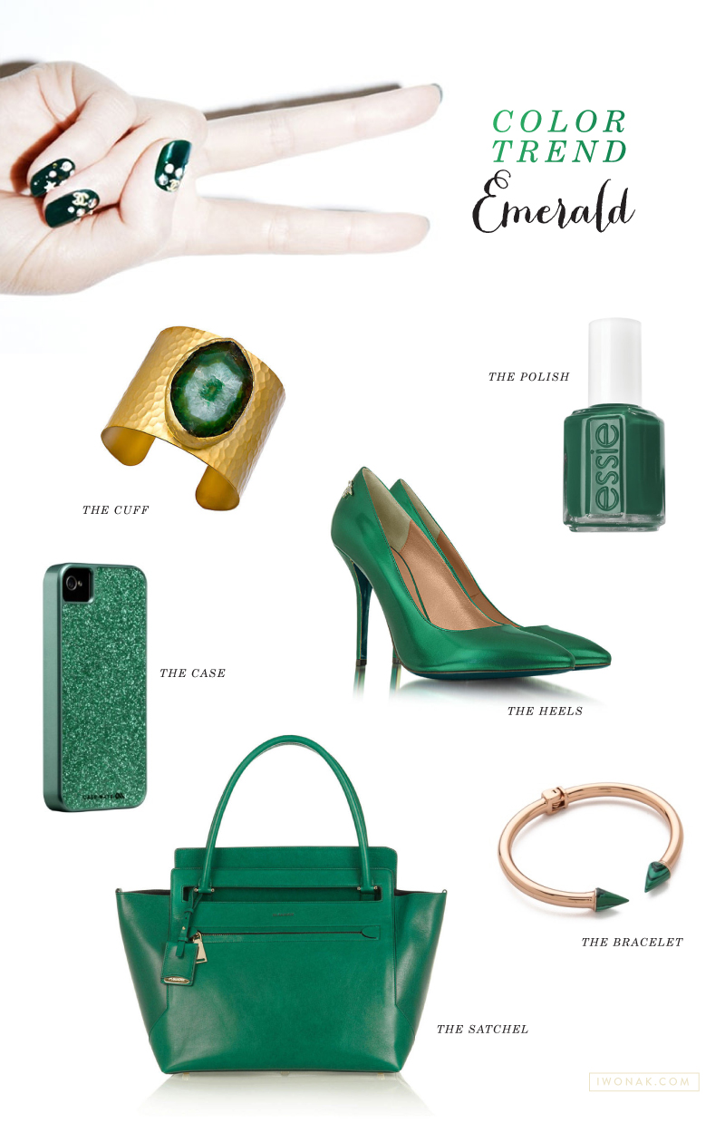
Every year Pantone selects an outstanding color of the year. This year, the color of the year for 2013 is Emerald. A color that Pantone describes as: “Most often associated with brilliant, precious gemstones, the perception of Emerald is sophisticated and luxurious. Since antiquity, this luminous, magnificent hue has been the color of beauty and new life in many cultures and religions. Also the color of growth, renewal and prosperity, no other color conveys regeneration more than green. For centuries, many countries have chosen green to represent healing and unity.”

Even though it is the color of my eyes, it is not my favorite color… Maybe because our first house was covered in emerald green carpet and it was just too much? After looking at all the beautiful inspirations, I have to say that I’m beginning to like it. I could definitely see myself wear it as a pop of color.

Color-of-the-year-emerald-green

Credits: NAILS: Visit harpersbazaar.com  //  THE CUFF  Charlene K Emerald Agate Cuff, $172; # //  THE HEEL  Patrizia Pepe Metallic Pumps, $383; forzieri.com  //  THE SATCHEL  Jil Sander New Malavoglia Bag, $1,760; net-a-porter.com  //  THE BRACELET  Vita Fede Mini Titan Stone Bracelet $375.00; shopbop.com  // THE NAIL POLISH: Essie’s Going Incognito $8.50; nordstrom.com  // THE iPHONE CASE amazon.com 


HolidayCardsWithMultiplePhotos_IwonaK

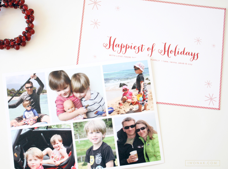
Our holiday cards arrived this week, and I couldn’t be more excited! Each year I design our cards and this year was no exception. I originally wanted a simple one-photo holiday card as I feel that reflects the personality and lifestyle of a family but I couldn’t decide which image is best. I guess we had way too much fun last year! Multi picture layout was the necessary solution.

I designed a clean front with holiday message typed in a calligraphy font and added multiple photos on the back of the card. I like that I was able to choose a few favorite photos… Last year, our extended family and friends were excited to see what we have been up to over the previous year and we wanted to tell a lot of stories with our card this year too. Our cards were printed on a heavy white cotton stock and matched with a red envelopes lined with a stripey liner. Happy Holidays!

HappiestHolidaysCard_IwonaK HolidayCardsWithPhotos_IwonaK

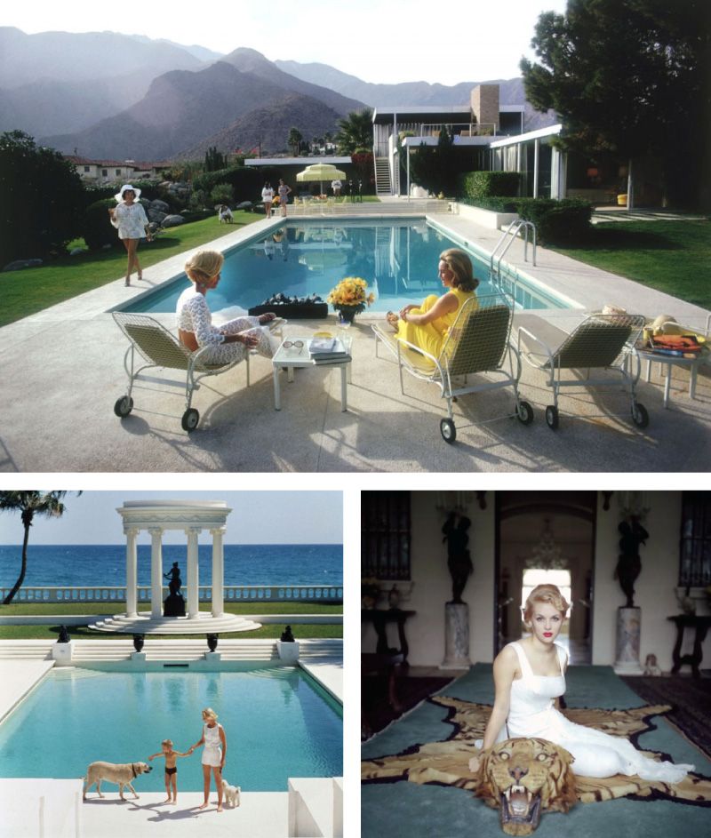
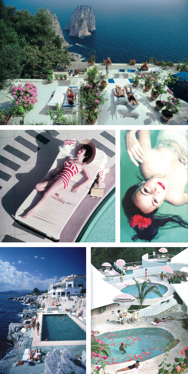
I’ve never actually heard of Slim Aarons until I recently started seeing amazing photos on Pinterest, all tagged with his name. I had to do my research… Slim Aarons is an American photographer noted for photographing the glamorous lifestyles of world’s wealthiest: socialites, royalty, jet-setters and celebrities. He perfectly captured the kind of life that most of us dream of living. The motto for his work was “photographing attractive people doing attractive things in attractive places.” I’m really enjoying his amazing work, so beautiful, full of splendor, luxury and opulence. The images still feel modern, moody and sophisticated but not stuffy. I could look at his photos for hours. Enjoy them.


SlimAarons SlimAaronsPhotograps

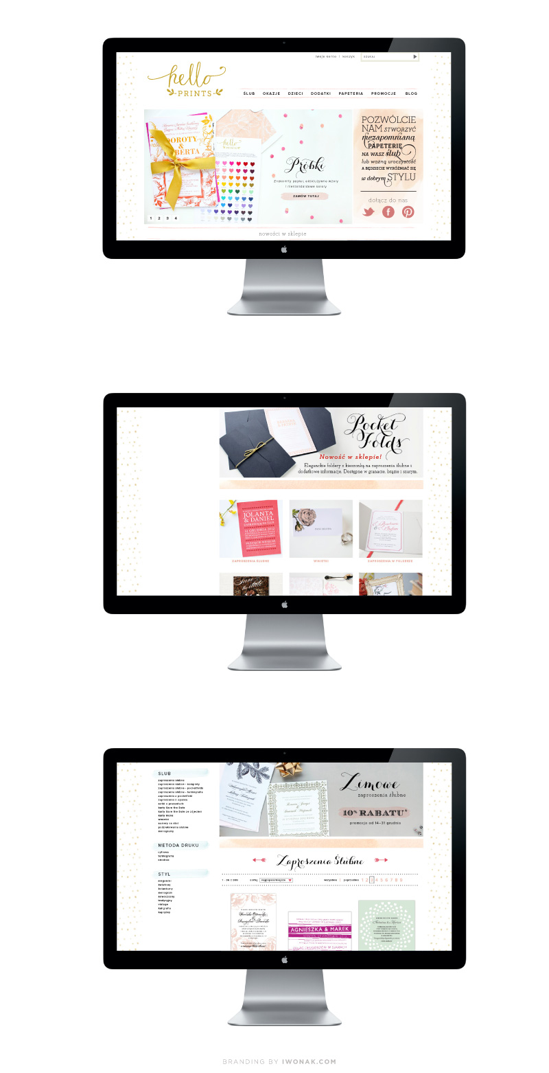
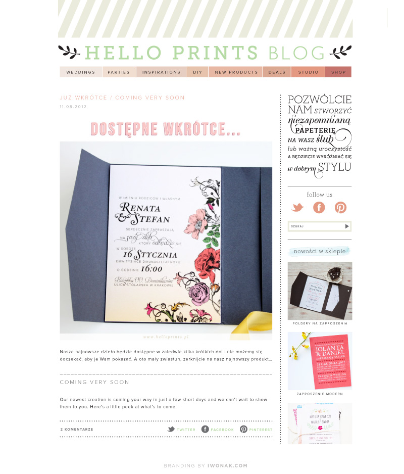
I’m absolutely thrilled to share with you this special project of mine. Hello! Prints is an online stationery shop filled with beautiful and unique stationery designs. It desperately needed a brand refresh and I had a blast redesigning the site and rebranding it. You can see it in its entirety right here. For now, the designs are avaialable for purchase in Poland and Europe only but I plan to open an online store here, in the U.S. Every visit and purchase means so much to us – please take a peek!

HelloPrints.pl website and branding

HelloPrints.pl Website and Blog design

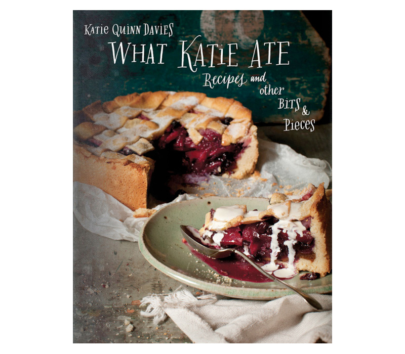
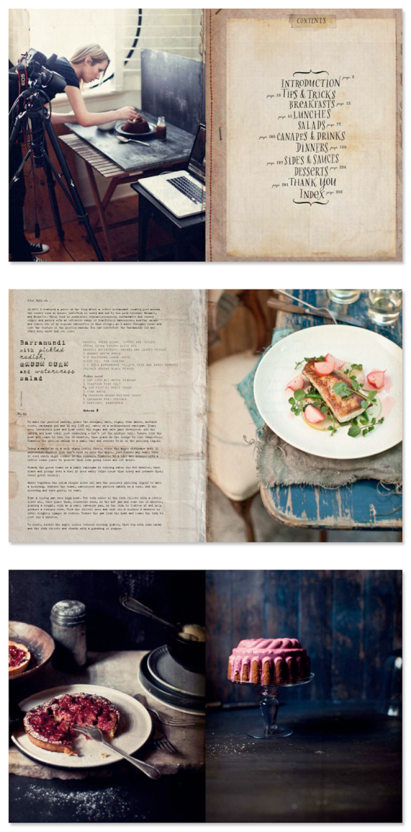
I have been an avid follower of Katie Quinn Davies’ hugely successful blog What Katie Ate for some time and was counting down the days until this book’s release. Katie is a photographer, food stylist, graphic designer, recipe-writer and her debut cookbook is one of the most beautiful cookbooks I’ve seen. It’s really a feast for the eyes! If you are looking for a visually stunning cookbook that is filled with mouthwatering recipes, then look no further! Katie herself designed it and styled and shot every photo in the book. I admire her style of photography and food styling, rustic yet polished, and incredibly inviting. Besides, this amazing book is packed with recipes I actually want to make. I would recommend this book to anyone who loves food and food photography, and I think it would make the perfect gift for all foodies.WhatKatieAteCookbook WhatKatieAteCookbookReview

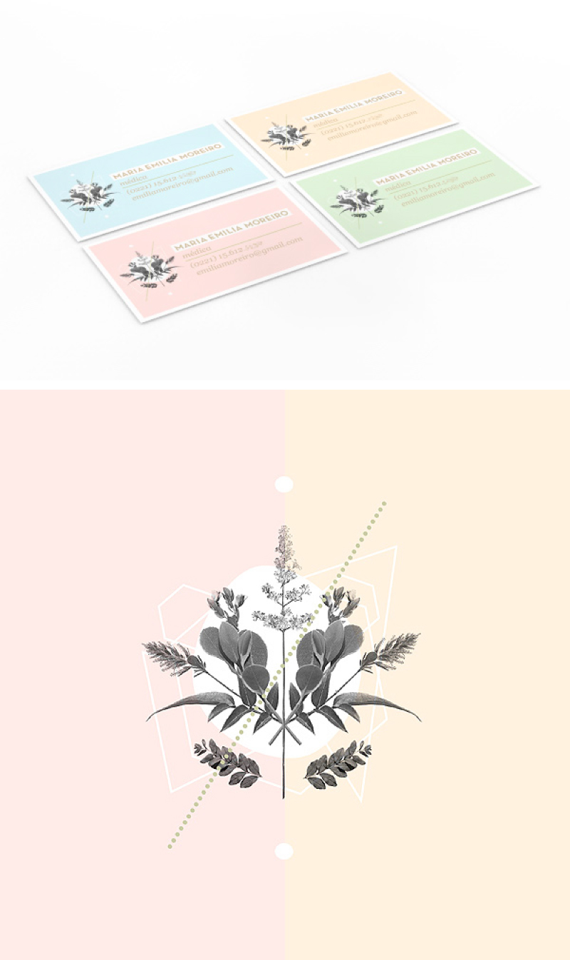
I have been seeing these lovely cards on Pinterest lately. They are so beautiful… Designed for an orthopedic
surgeon, they’re very feminine and delicate. The composition of colors, graphics and lines is very inspiring.
Don’t you think? It makes me want to work on my branding now…

ValeriaMoreiroBusinessCards

Designed by  Valeria Moreiro.

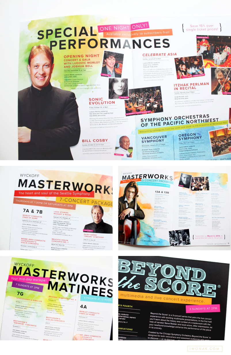
1213 Seattle Symphony brochure cover by Iwona Konarski

1213 Seattle Symphony brochure inside pages by Iwona Konarski

1213 Seattle Symphony brochure pages by Iwona Konarski

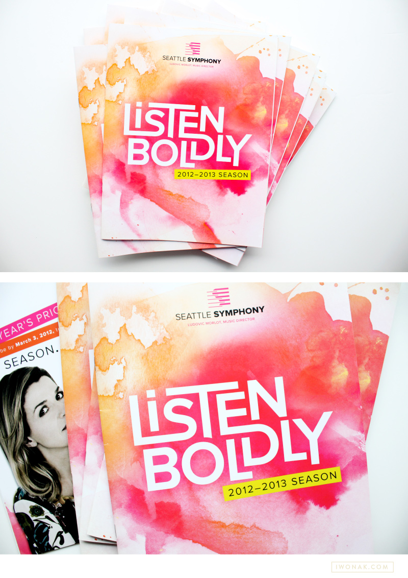
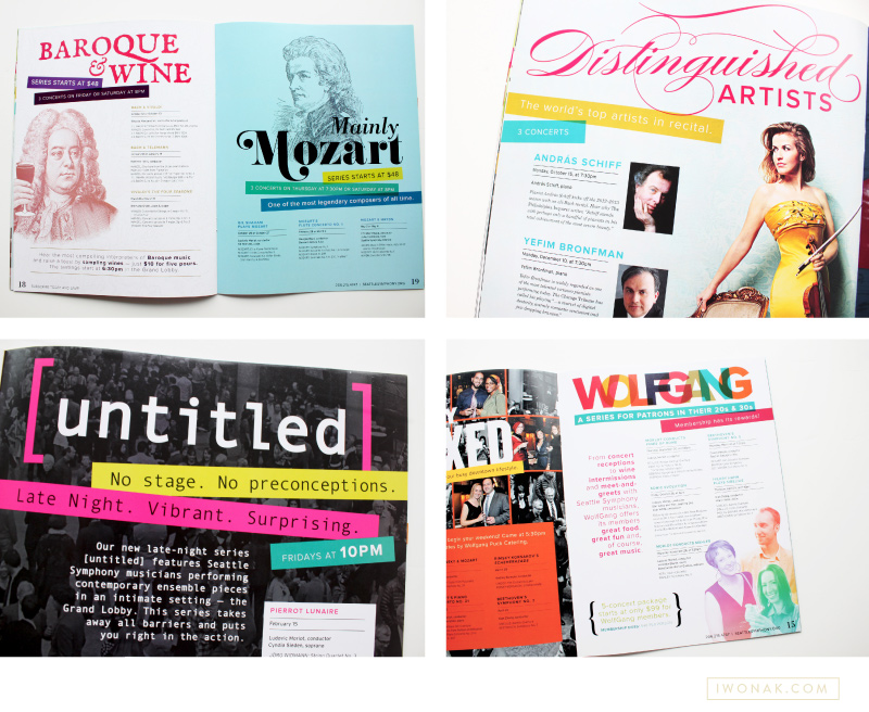
Today, I wanted to share with you a brochure I recently completed for the Seattle Symphony. You can see a sneak preview of it here. On the cover I featured the Symphony’s tagline – Listen Boldly – which was designed as a logo and paired with artsy watercolor. The mood for this season was joyful, romantic, welcoming with bold typography, bright color palette and large artist photos. Turns out, working with color makes me so excited! Working on something this cheery was definitely refreshing and it will be so much fun for the remaining of the season. I had lots of fun with watercolors and this whole do-it-yourself thing was a blast. This was a really fun project to work on and it might be my favorite design to date.

Simon Woods, Seattle Symphony Executive Director, calls this season “… a simply sensational season. … The programing is inspiring, innovative and stimulating, and with a big emphasis on informality and accessibility. … another exciting validation of the tremendous energy that we and so many others are experiencing under Ludovic Morlot’s leadership.” Looks like 2012-2013 season will be amazing! Please come to Benaroya Hall to listen to fantastic music and check my designs in person.

To see the whole brochure head over to issuu.